
Qualy Logo Font: a stripped-back geometric sans built for wordmarks
Design style
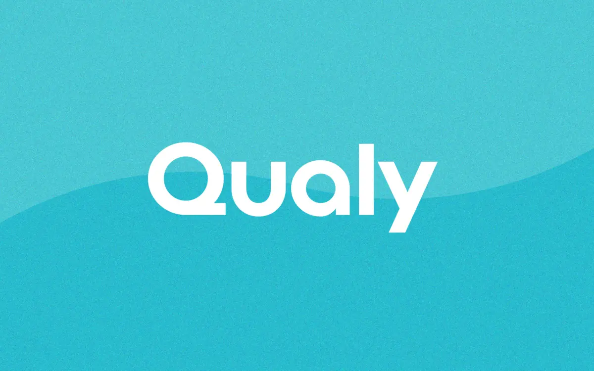
Qualy is a geometric sans reduced to its bare structural bones. Circles read as circles, verticals are dead straight, and there’s almost no variation in stroke weight across the character set. The letterforms lean on a small set of repeated shapes rather than individual personality per glyph, which gives the whole face a manufactured, almost stencil-adjacent consistency. It sits closer to a construction kit than a text typeface, and that’s clearly the point: this is a face designed to be assembled into a wordmark, not read in a paragraph.
The joints are where the design decisions actually show. Curves meet stems at slightly unconventional angles in a few letters, giving the face a bit of quirk rather than pure Bauhaus severity. Counters are generous and open, which helps at small sizes but also means the letters can look slightly hollow when set loosely. Spacing has clearly been tuned for tight, logo-style kerning rather than comfortable running text — letters sit close, almost touching in places, which reads as intentional and current rather than sloppy.
Character set and features
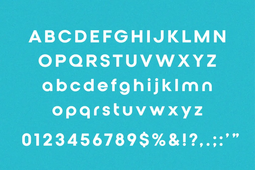
The seller states extensive language coverage across Latin, Cyrillic, Greek and Vietnamese, claiming support for over 230 languages. That’s a genuinely useful spread if accurate, since it means a wordmark built in Qualy doesn’t need to be redrawn for a Cyrillic-market rebrand or a Greek subsidiary logo. Beyond language coverage, the brief doesn’t specify OpenType features such as ligatures or alternates, so treat the character set as solid basic coverage rather than a feature-rich family with swaps and stylistic sets.
What matters more here is restraint. The design explicitly discourages long-text use, and the letterforms back that up — at paragraph sizes the sameness of stroke weight and tight default spacing works against comfortable reading. This isn’t a flaw so much as an honest scope limitation: Qualy was drawn to solve one problem, and it doesn’t pretend to solve others.
Use cases
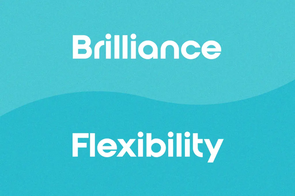
Wordmarks and short brand names are the obvious fit. Set a two- or three-word company name at large size, adjust the kerning by eye, and the geometric consistency does a lot of the identity work for you — it reads as confident and current without needing embellishment. Tech, wellness, and lifestyle brands chasing a clean, global-feeling mark will find this a fast route to something usable.
App icons, favicon lockups, and packaging front-of-pack type are other reasonable applications, since the open counters hold up when scaled down aggressively. Where it struggles is anywhere beyond the headline: taglines, body copy, or UI text at small sizes will expose the lack of textural variation that makes long-form reading comfortable. Pair it with a proper text face for supporting copy rather than pushing Qualy into that role itself.
What we liked, and what we didn’t
Strengths
- Consistent geometric structure gives wordmarks an immediate sense of order
- Open counters hold their shape at small sizes like favicons and app icons
- Broad claimed language coverage across Latin, Cyrillic, Greek and Vietnamese
Trade-offs
- Uniform stroke weight and tight default spacing make it uncomfortable for anything beyond a few words
- No stated OpenType features like alternates or ligatures to add flexibility
Qualy does one job — logo type — and does it competently, with tight, deliberate spacing and a consistent geometric structure that scales well down to icon size. It's not built for anything beyond short brand marks, and it says so itself, so judge it only on that job.
Verdict

Tantype reviews typefaces in depth — every font is tested in real branding, editorial and screen layouts before a word gets written. 555+ fonts reviewed and counting.