
Lightshift: A Funky Sans Display Face With Four Style Variants
Design style
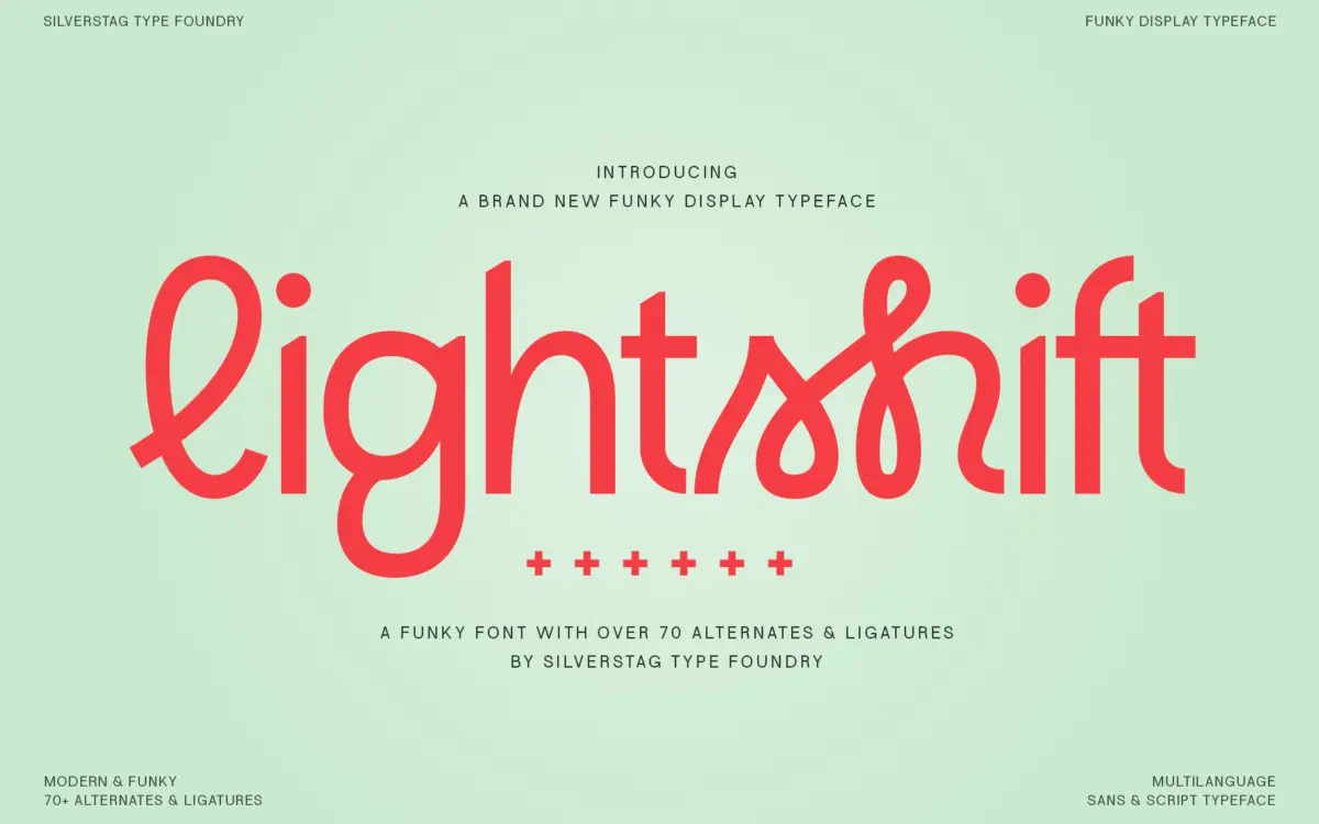
Lightshift sits in that crowded corner of type design where sans-serif geometry gets loosened up with script-style connections. The bones are simple: thick, even strokes, rounded terminals, a fairly generous x-height. What makes it read as “funky” rather than just rounded-sans is the joinery — certain letter pairs link up like a script, giving otherwise blocky letterforms a sense of motion. It’s a familiar move in the current wave of retro-inflected display fonts, but Lightshift executes it with more restraint than most, keeping the connections legible rather than decorative for their own sake.
The four styles — Regular, Round, Outline, and Round Outline — are really one skeleton dressed four ways. Regular has flat-ish stroke endings and a slightly firmer stance; Round softens every corner and terminal, pushing it further into bubble-letter territory; the two Outline versions strip the fill and let the contour do the work, which changes the character considerably at small sizes since the counters open up. Having all four in one purchase is useful for testing which flavour actually suits a given brand rather than committing sight unseen.
Character set and features
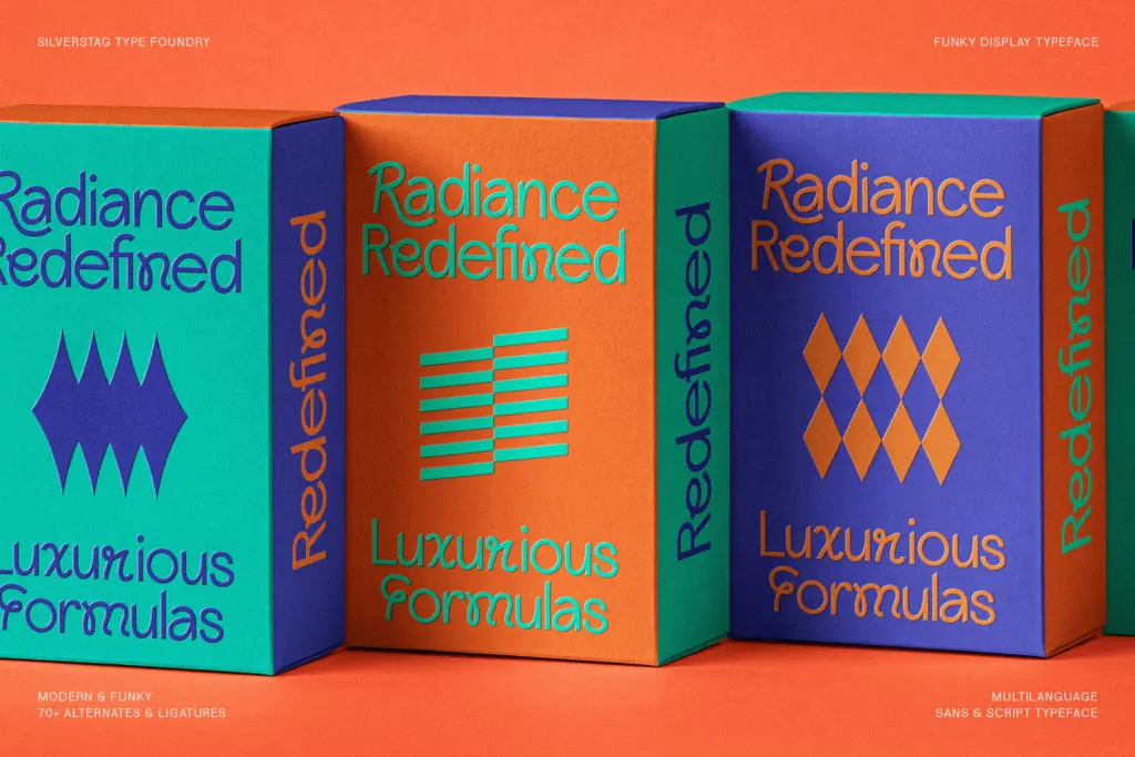
The alternate and ligature set is the most substantial part of the package — over 70 of them. In practice this means several letters have a standard form and at least one swash or connecting alternative, and certain letter combinations trigger custom ligatures that behave like little flourishes rather than default kerning fixes. This is where the typeface earns its keep: set a word with the defaults and it’s a decent funky sans; run it through the alternates and it starts to look hand-assembled, with joins that feel considered rather than templated. That said, the ligature system asks for manual attention. Left on autopilot in a body of running text, results can look inconsistent, since not every letter pair has been treated with the same care.
Language coverage is broad, which matters more than it sounds for a display font — funky faces often get pressed into service for branding that needs accented characters, and it’s good to see that handled rather than left as an afterthought. There’s no indication this is a variable font or that it carries a huge weight range beyond the four named styles, so designers wanting a full weight axis for a system will need to look elsewhere.
Use cases
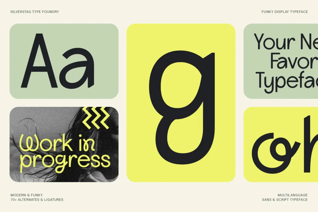
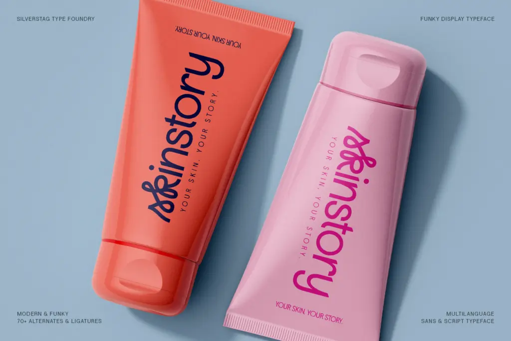
Lightshift is built for short bursts of text: logotypes, headline treatments, packaging call-outs, social graphics, merch. At those sizes and lengths, the rounded strokes and playful connections have room to work, and the outline variants give you a lighter-touch option for layering over photography or texture. It is not a font for body copy or long-form editorial work — the joins and alternates that make it interesting at large sizes will just create noise in a paragraph.
It suits brands that want warmth and a bit of retro bounce without going full script — food and drink packaging, youth-oriented product lines, event graphics, anything that wants to feel handmade but still needs to be set digitally with some consistency. Pair it with a plain, quiet sans or serif for supporting text; Lightshift should stay the loud one in the room.
What we liked, and what we didn’t
Strengths
- Four style variants (Regular, Round, Outline, Round Outline) give real flexibility from one purchase
- 70+ alternates and ligatures let letter combinations feel hand-joined rather than templated
- Broad language support makes it usable beyond English-only branding work
Trade-offs
- Ligature and alternate coverage is inconsistent, so autopilot-set text can look uneven without manual adjustment
- Not built for body copy or long-form text — legibility drops fast below display sizes
Lightshift is a competent funky display sans that earns its personality through a deep alternate and ligature set rather than through the base letterforms alone. It's best used sparingly, at large sizes, for short bursts of branding or packaging text — not for anything that needs to hold a paragraph together.
Verdict

Tantype reviews typefaces in depth — every font is tested in real branding, editorial and screen layouts before a word gets written. 555+ fonts reviewed and counting.