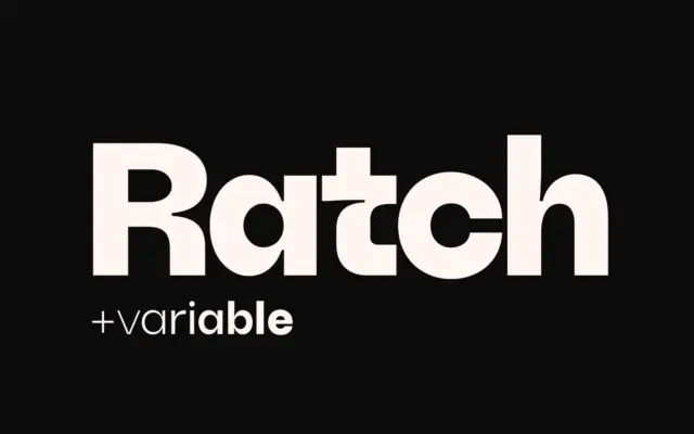
Ratch: A Geometric Grotesk with Personality for Brand Systems
Design style Ratch sits in familiar geometric grotesk territory but doesn’t stay quietly there. The circular bowls, near-monolinear strokes, and…
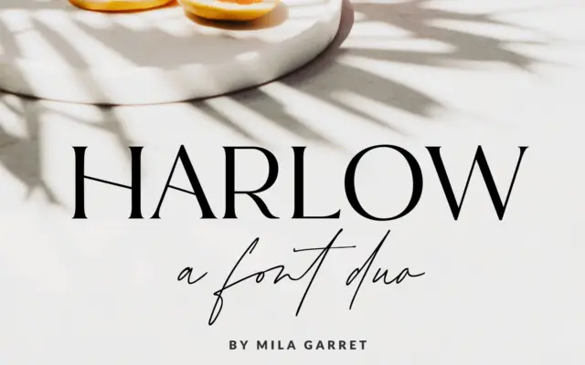
Design style Harlow is a two-part release: a pared-back serif and a casual handwritten script meant to sit alongside it.…
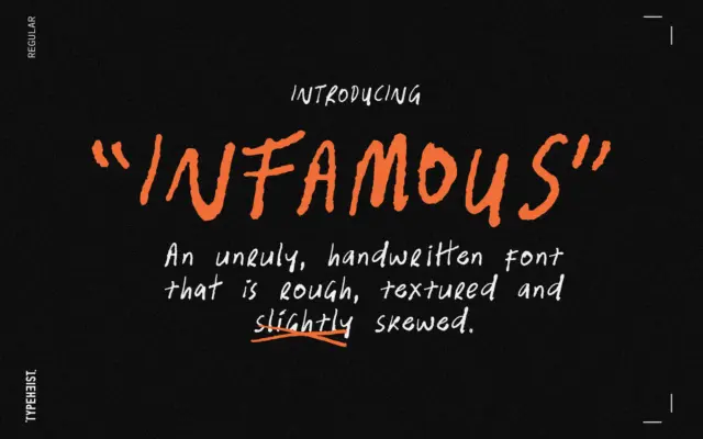
Design style Infamous is handwriting turned up too loud. The strokes wobble, the baseline drifts, and letters lean at inconsistent…
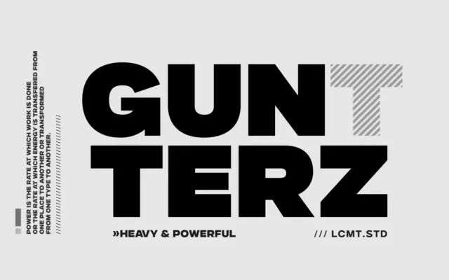
Design style Gunterz sits squarely in the geometric-heavy sans tradition: tight, near-circular counters, blunt terminals, and a construction that reads…
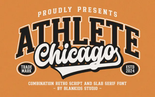
Design style Chicago Athlete pulls from the collegiate athletics playbook: thick slab serifs, squared bowls, and a deliberate wobble in…
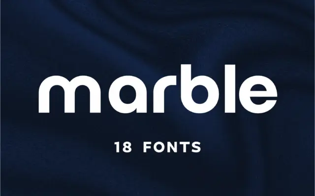
Design style Marble sits in the geometric-minimalist camp of sans serifs, the family of letterforms built from near-perfect circles and…
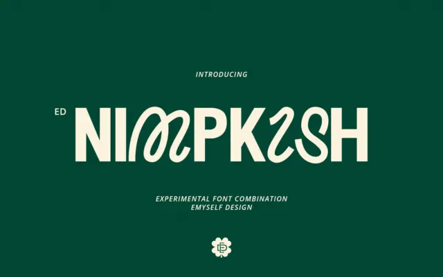
Design style ED Nimpkish is built on a single, slightly odd premise: the uppercase and lowercase don’t belong to the…
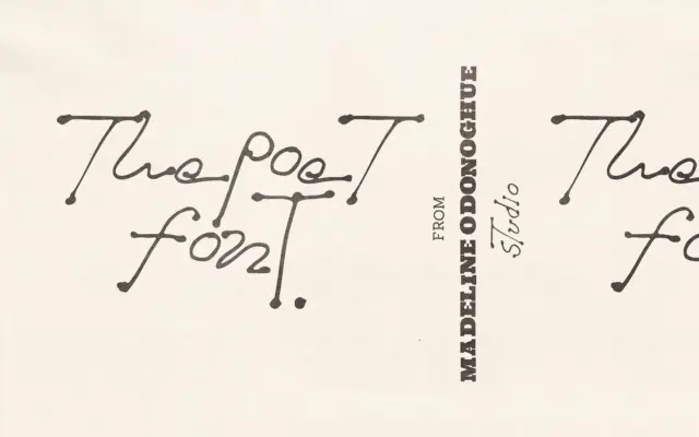
Design style The Poet leans hard into the idea that handwriting shouldn’t be tidied up before it becomes a font.…
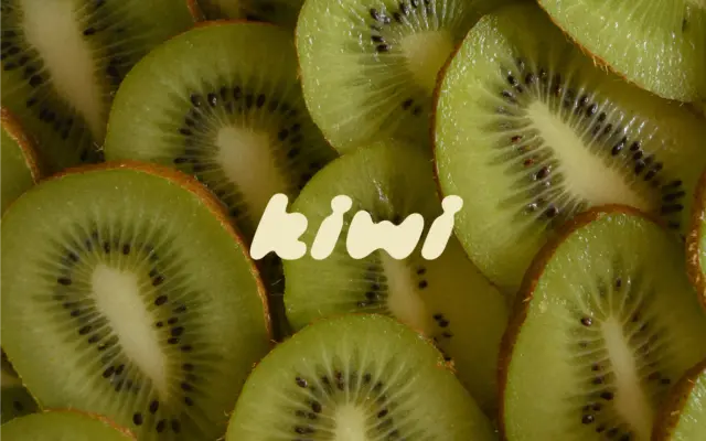
Design style Kiwi Juicy Display is a hand-drawn, slanted display face built from thick, rounded strokes that all lean the…