
Perandory: a sharp-edged vintage-inspired serif for display work
Design style
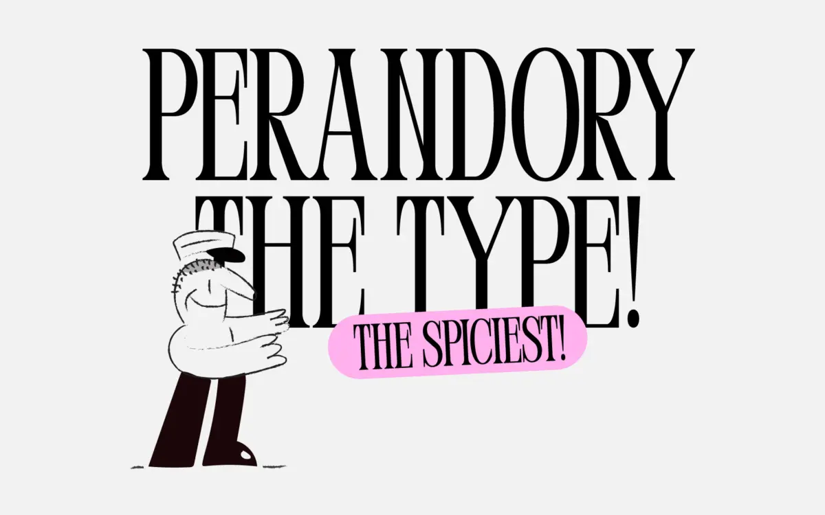
Perandory is a display serif built around tension rather than comfort. The brief describes it as inspired by vintage Albanian typography and lettering, and that shows in the way the letterforms mix old-fashioned proportions with unexpectedly sharp, almost blade-like turns. Where you’d expect a soft bracket or a rounded terminal, Perandory tends to cut instead. Serifs come to a point, junctions are tight, and the overall rhythm is angular rather than flowing.
That combination gives it a hybrid feel — part period lettering, part contemporary poster type. It doesn’t sit comfortably in either camp, and that’s clearly the intention. The seller frames it as keeping an older typographic tradition alive while nodding toward something more current, and the letterforms back that up: classic serif skeletons roughened up with modern, deliberately imperfect edges.
Character set and features
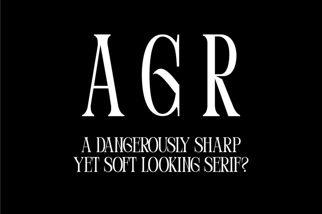
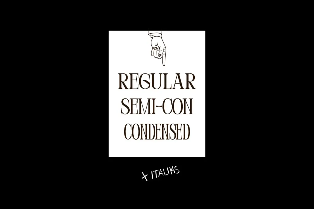
Perandory ships in a couple of styles, running from a standard width through to a Condensed cut, but only in a single weight. There’s no bold or light to lean on for hierarchy within the family itself — whatever contrast you need has to come from size, colour, or pairing with something else entirely. The Condensed version is useful in its own right, letting you fit more into tight headline spaces without losing the character of the sharper serifs, though it does compress the letterforms enough that the pointed details start to feel a bit cramped at small sizes.
The set is currently uppercase only. That’s a real limitation to plan around rather than a stylistic choice you can work with — there’s no lowercase to fall back on for anything requiring mixed-case setting, so any layout using Perandory has to be built entirely around capitals, whether that’s a single word, a short phrase, or a stacked headline treatment.
Use cases
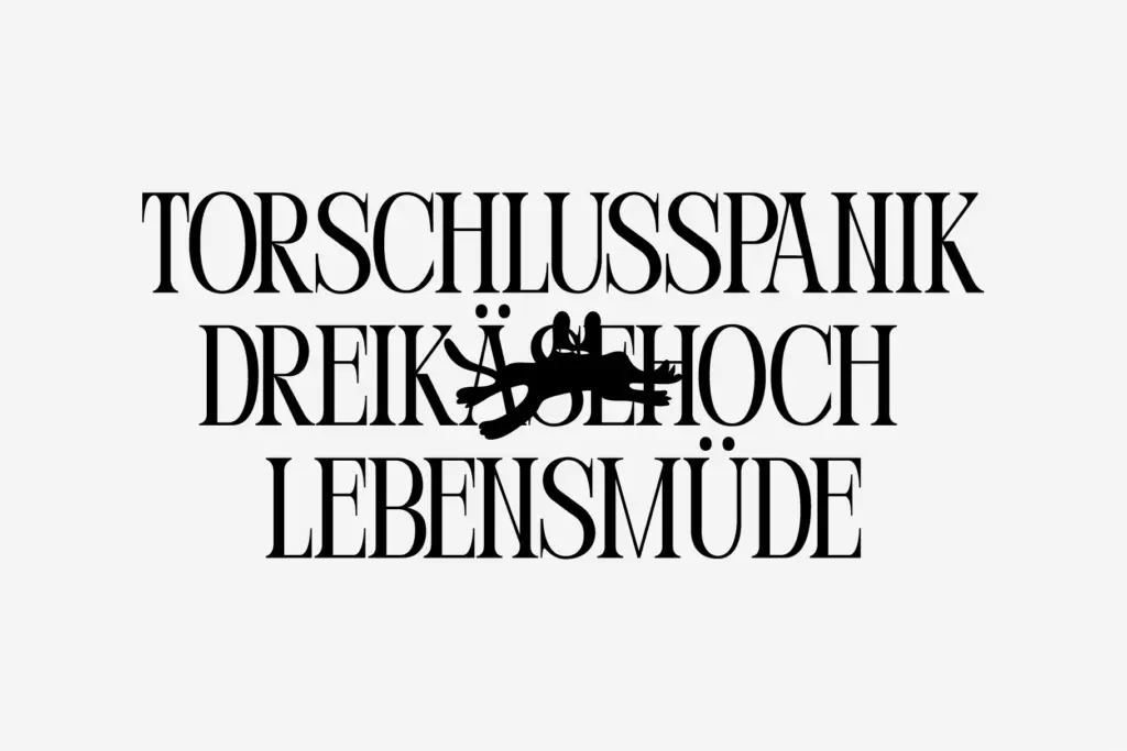
This is a font for moments, not paragraphs. With one weight and capitals only, it was never going to handle body copy, and it shouldn’t be asked to. Where it earns its keep is in short-burst display work: a masthead, a logotype, a single line on a poster or packaging front, a title card. The sharp serifs and vintage-leaning structure suit projects that want a sense of heritage without looking like a straightforward revival — restaurant branding with an old-world angle, editorial titling for a feature with some cultural or historical weight, or packaging that wants a stamped, engraved feel rather than a soft one.
Because there’s no lowercase and no weight range, Perandory works best as a supporting voice rather than the whole system. Pair it with a plain, well-behaved sans or text serif for anything that needs to actually be read, and let Perandory handle the header where its personality can do the work. Given the uppercase-only, single-weight constraint, it’s worth testing at your actual display size before committing — the sharper details that give it character can also crowd it at small scale, particularly in the Condensed cut.
What we liked, and what we didn’t
Strengths
- Distinctive sharp, pointed serif terminals that read as vintage without feeling like a straight revival
- Condensed cut adds real flexibility for tight headline spaces
- Strong fit for heritage-leaning branding, packaging, and editorial titling
Trade-offs
- Uppercase only, so it can't handle mixed-case or body-length setting
- Single weight offers no built-in contrast for hierarchy within the family
Perandory is a characterful headline serif with sharp, vintage-inspired edges, but the uppercase-only, single-weight set limits it to short bursts of display work. It's a strong choice for a masthead or logotype with some heritage in mind, less useful as a standalone system. Worth pairing with a quieter text face for anything beyond a headline.
Verdict

Tantype reviews typefaces in depth — every font is tested in real branding, editorial and screen layouts before a word gets written. 555+ fonts reviewed and counting.