
Summer in Seville: a hand-drawn sans and script duo for retro branding
Design style
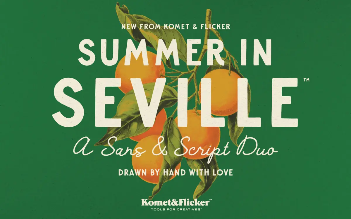
Summer in Seville pairs two hand-drawn faces built around the same idea of worn, old-world lettering. The sans is bold and blocky, with slightly uneven stroke widths and rounded corners that read as hand-inked rather than vector-drawn. The script sits alongside it as a looser, more casual counterpart, with connected lowercase and enough variation in letter angle to avoid feeling stamped out by a single brush stylus. Neither face aims for precision. The charm here is in the wobble: baselines drift a little, terminals don’t quite match stroke to stroke, and that’s clearly deliberate rather than a drawing flaw.
The pairing works because the two styles share a temperature rather than a construction method. The sans reads heavy and confident, almost like hand-painted signage; the script reads breezier, like something scrawled on a postcard. Put together they suggest a specific mood — sun, plaster walls, faded awnings — more than they suggest a specific era. That’s a deliberate trade against precision, and it mostly pays off if you’re after atmosphere rather than a strict revival of a particular period style.
Character set and features
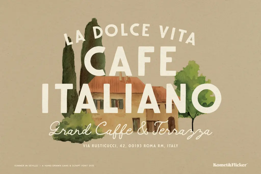
The sans covers uppercase A–Z only, which limits it mostly to short-word display use rather than continuous setting. The script goes further, with full upper and lowercase, giving it more flexibility for headlines that need sentence case or for accompanying phrases. Both include select European characters, so basic accented setting in several languages is possible, though full multilingual support isn’t the selling point here.
The standout inclusion is the set of eleven connecting word glyphs, offered in both sans and script versions. These are pre-built ligature-style combinations meant to look hand-lettered rather than typeset — useful for common words that show up constantly on packaging and signage work, where a plain kerned word can look flat next to hand-drawn neighbours. The sans also carries ten alternate characters, giving some relief from repetition when a word uses the same letter twice. Two styles of fraction glyphs round out the technical set, more of a nice-to-have than a core feature. Access to the extras requires opening the glyphs panel in Illustrator or Photoshop — nothing is automatic, so designers unfamiliar with OpenType features should expect a bit of manual digging.
Use cases
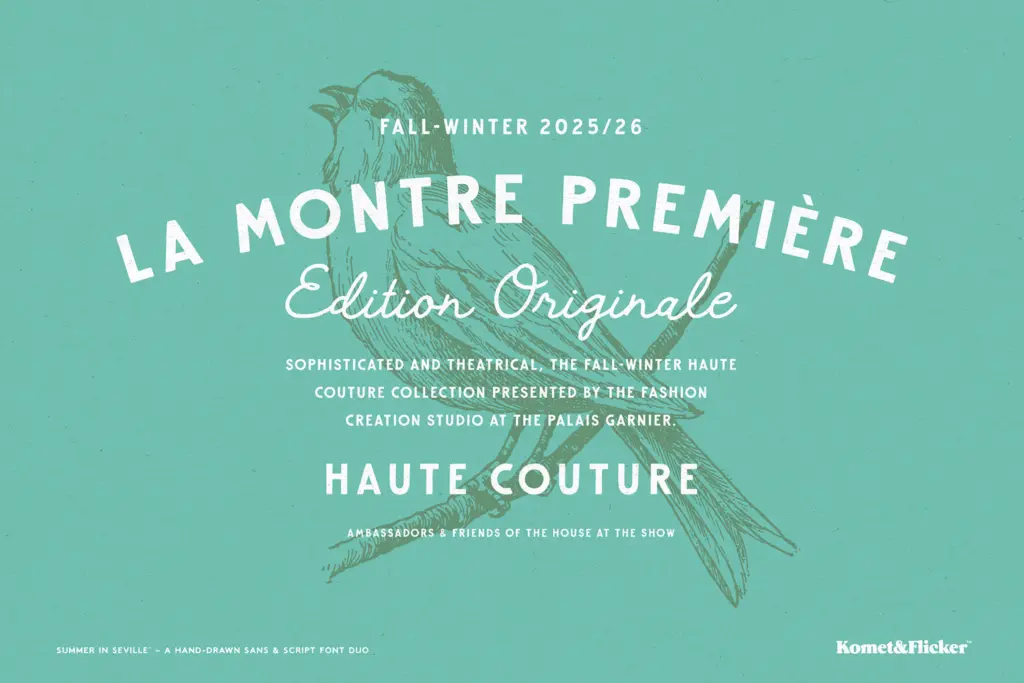
This duo is built for short-format work: logotypes, packaging labels, travel-poster type treatments, café and market signage, menus, and wedding stationery that wants a lived-in, European feel rather than polished modern minimalism. The sans’s uppercase-only limitation makes it best suited to headlines, wordmarks, and single words rather than anything requiring lowercase nuance. The script can carry a bit more text — a tagline, a short greeting — but its irregularity means it will struggle in long paragraphs or small print, where the hand-drawn variation starts working against legibility.
For branding projects that want warmth without looking generic, the connecting word glyphs are worth building a layout around. This isn’t a font family for corporate or highly legible interface work; it’s a mood-setting pair for anyone chasing a sun-bleached, handmade aesthetic in a limited amount of text.
What we liked, and what we didn’t
Strengths
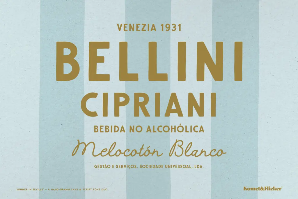
- The sans and script share a consistent hand-drawn temperament without feeling like the same letterforms recolored
- Eleven connecting word glyphs in both styles solve the common-word ligature problem seen in hand-lettered branding
- Alternate characters in the sans help avoid obvious letter repetition in short wordmarks
Trade-offs
- The sans includes uppercase only, restricting it to headline and logotype use rather than continuous setting
- The script's deliberate irregularity limits legibility at small sizes or in longer passages of text
Summer in Seville is a well-matched hand-drawn duo that nails a sun-bleached, old-world mood in short bursts of type. It's not built for body copy or multilingual precision, but for logos, labels and signage chasing warmth, it delivers texture that feels genuinely hand-made rather than templated.
Verdict

Tantype reviews typefaces in depth — every font is tested in real branding, editorial and screen layouts before a word gets written. 555+ fonts reviewed and counting.