Sans Serif
3.9
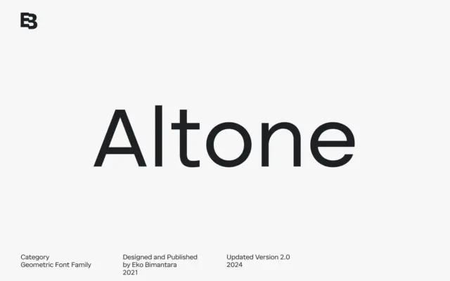
Altone: A 9-Weight Geometric Grotesk for Corporate and Brand Work
Design style Altone sits closer to grotesque territory than to the geometric-purist camp its category label suggests. The seller draws…
 Tantype

Design style Altone sits closer to grotesque territory than to the geometric-purist camp its category label suggests. The seller draws…
Tantype
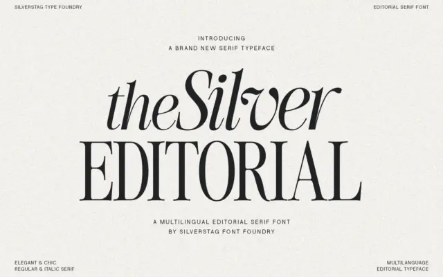
Design style The Silver Editorial is a high-contrast serif built for attention rather than for reading paragraphs. Its debt to…
Tantype
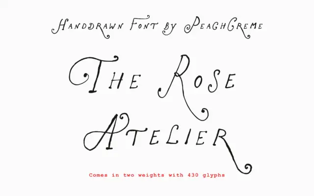
Design style The Rose Atelier is a hand-drawn display script built around loose, curling capitals and a lighter, more restrained…
Tantype
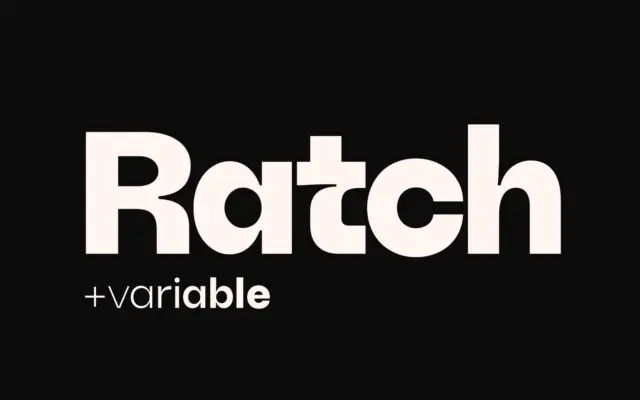
Design style Ratch sits in familiar geometric grotesk territory but doesn’t stay quietly there. The circular bowls, near-monolinear strokes, and…
Tantype
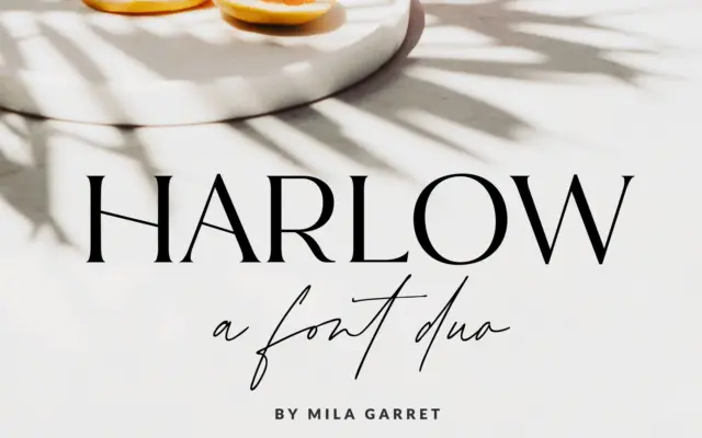
Design style Harlow is a two-part release: a pared-back serif and a casual handwritten script meant to sit alongside it.…
Tantype
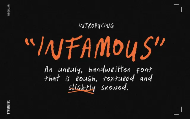
Design style Infamous is handwriting turned up too loud. The strokes wobble, the baseline drifts, and letters lean at inconsistent…
Tantype
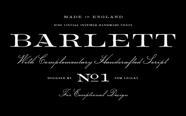
Design style Barlett No.1 leans hard on the look of 19th-century English typefounding — the kind of serif you’d expect…
Tantype
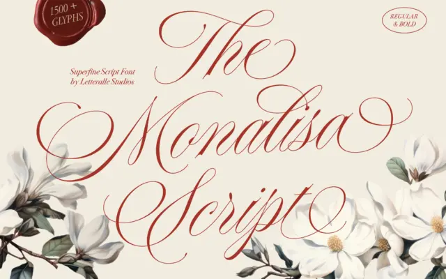
Design style Monalisa Script sits squarely in the fine-nib calligraphy tradition — thin, tapering strokes, high contrast, and a slant…
Tantype
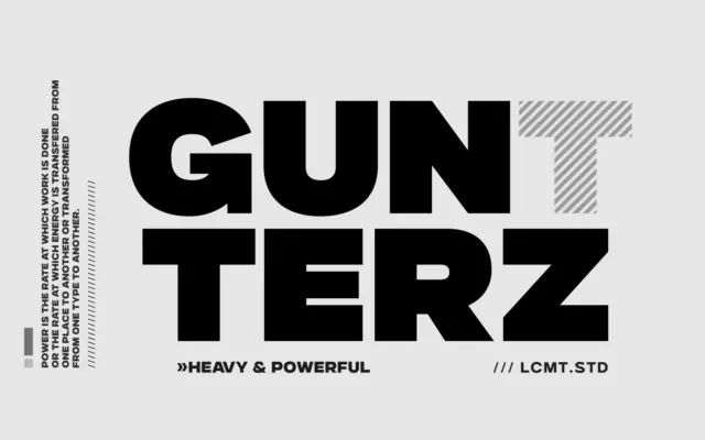
Design style Gunterz sits squarely in the geometric-heavy sans tradition: tight, near-circular counters, blunt terminals, and a construction that reads…
Tantype