
Limoncello Recipe: a casual handwritten script for recipe cards and cookbook branding
Design style
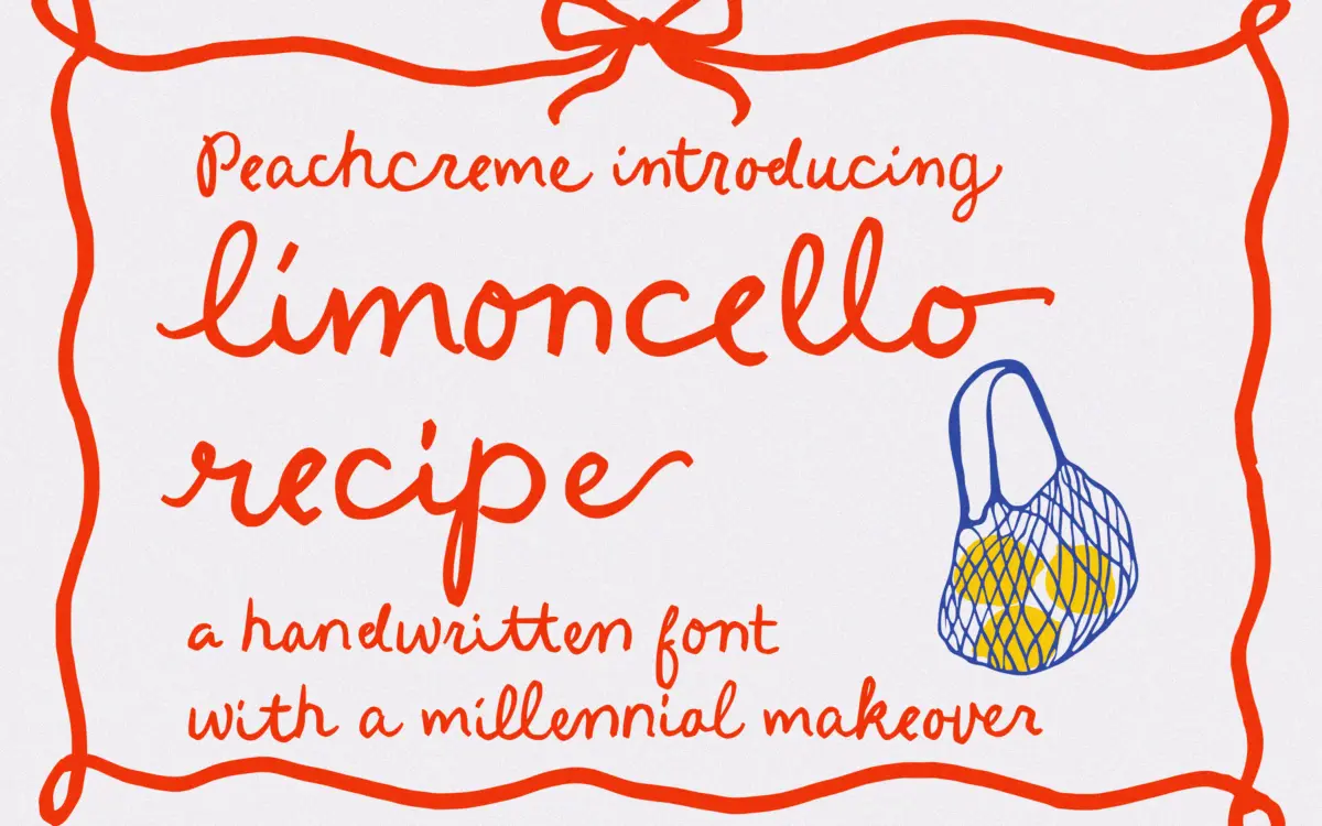
Limoncello Recipe belongs to the loose, cookbook-note school of script: a monoline-ish pen line with deliberately uneven baselines, letters that tilt slightly off their axis, and joins that feel dashed off rather than engineered. It reads as handwriting rather than as a script font trying to look like handwriting, which is a harder trick than it sounds. The x-height sits low and the ascenders and descenders swing generously, giving the whole thing a relaxed, slightly sprawling rhythm rather than a tight cursive one.
Where it earns its charm is in the irregularity itself. Strokes vary in weight and angle from letter to letter in a way that suggests a fast-moving hand rather than a template. Where that same irregularity works against it is in longer stretches of type: a paragraph set in this face starts to wander, and the eye has to work slightly harder to stay on the baseline than it would with a script that fakes its imperfection more consistently.
Character set and features
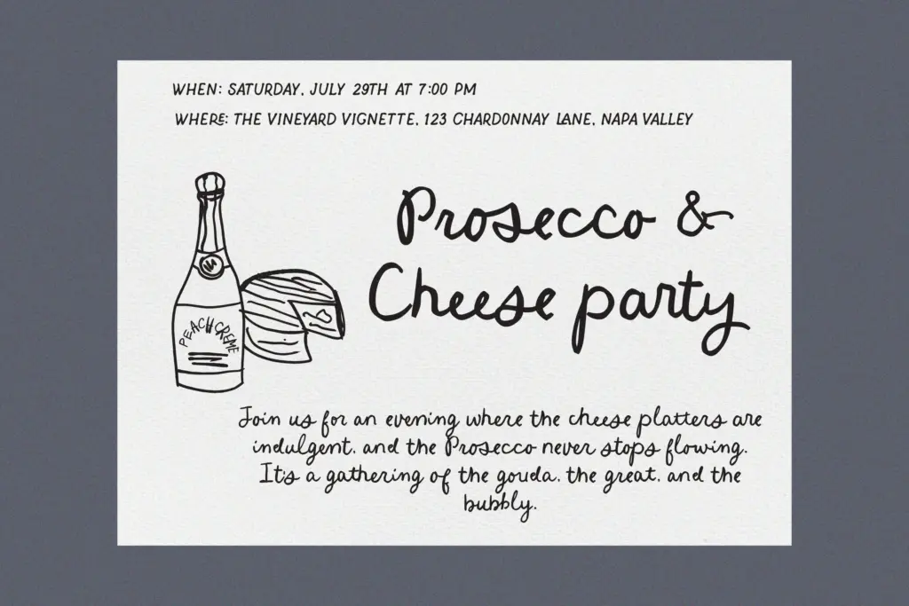
The headline feature is 84 standard ligatures, which do real work here — connecting letter pairs and clusters so that words look continuously written rather than assembled from static glyphs. This is the difference between a script that looks handwritten and one that just looks slanted, and it’s the strongest technical argument for using this over a generic cursive font.
There’s also a set of beginning and ending swashes for flourished capitals and closing letters, giving some control over how a word starts and finishes without needing to hand-kern alternates in. Used sparingly — first letter of a headline, last letter of a sign-off — these swashes add a bit of lift. Used on every word, they start to compete with each other and the page gets busy fast. The font rewards restraint more than most scripts do, because its baseline is already doing a lot of visual work.
No details are given on multilingual coverage, so treat this as a Latin-alphabet display script rather than an internationally proofed one, and check accented characters before committing to a multilingual layout.
Use cases
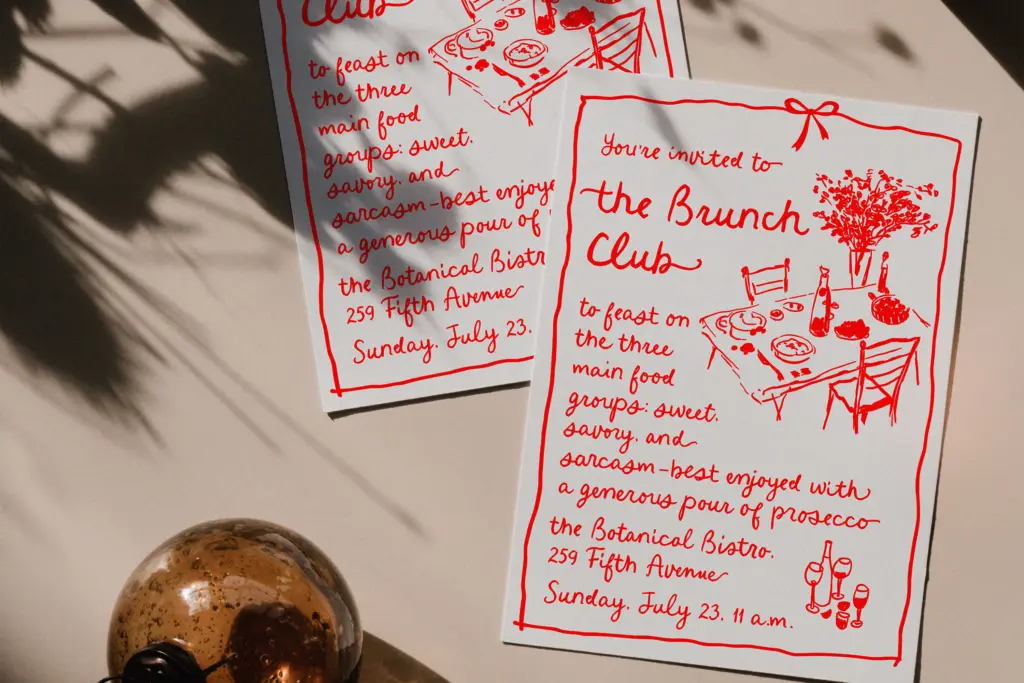
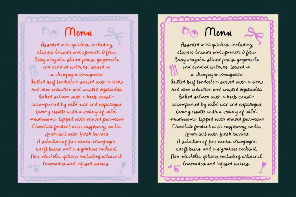
This is a font for short bursts of text where personality matters more than neutrality: recipe cards, cookbook or bakery branding, jam-jar and sauce-bottle labels, farmers’-market signage, handwritten-style quote overlays, and the odd line of copy on packaging that wants to feel like a note from the maker. It also suits wedding stationery that’s leaning informal — a save-the-date or menu card rather than a formal invitation suite.
It is not a body-copy font, and it will fight you if you try to set more than a sentence or two at a time. Pair the ligature-heavy connected words with a plain sans or slab for supporting information, and let this one do the emotional lifting in a headline, a signature line, or a single evocative word on a label.
What we liked, and what we didn’t
Strengths
- 84 ligatures give genuinely connected, handwritten-looking words rather than static slanted letters
- Uneven baseline and stroke weight read as an authentic hand, not a template imitation
- Swash alternates offer a controlled way to add flourish to headlines and sign-offs
Trade-offs
- Extended paragraphs wander and become harder to read than a more disciplined script
- No stated multilingual support, so accented and non-Latin text should be checked before use
Limoncello Recipe delivers a convincing, unforced handwritten feel thanks to its heavy ligature set, and it suits food and craft branding well. It's not built for long text and needs a disciplined hand with the swashes, but as a short-burst display script it does its job with real character.
Verdict

Tantype reviews typefaces in depth — every font is tested in real branding, editorial and screen layouts before a word gets written. 555+ fonts reviewed and counting.