
Brown Sugar: an uppercase display serif for posters and badges
Design style
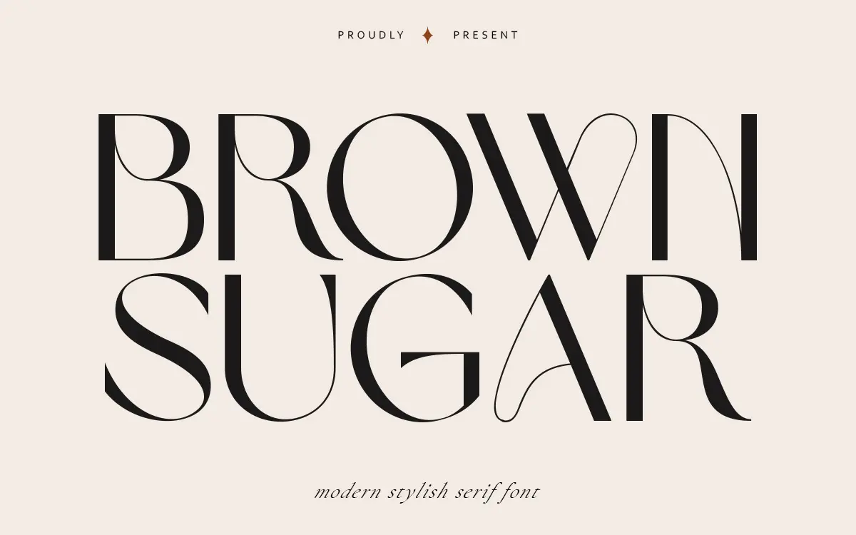
Brown Sugar is a display serif built around a single case of capitals. The letters carry a modern, slightly compressed structure — narrow apertures, crisp bracketed serifs, and a contrast between thick and thin strokes that reads as tidy rather than dramatic. It sits somewhere between a fashion headline face and a badge or stamp lettering style, which explains the seller’s own description of it as both a serif and a stylish sans hybrid. In practice it leans serif: the terminals and stroke modulation are the dominant character trait, not the absence of serifs.
The drawing is clean and consistent stroke to stroke, which matters more in a face like this than flourish. There’s no attempt at calligraphic looseness or hand-drawn wobble — every letter sits on the same baseline logic, which gives the set a manufactured, poster-ready feel rather than a personal one.

Character set and features
The set covers uppercase letters, numerals, and a wide range of punctuation. There is no lowercase included, which is the single biggest thing to know before specifying this for anything beyond short lines. That means Brown Sugar works as a headline, a monogram, a badge lockup, or a short brand word — not as a font for setting sentences or paragraphs.
Numeral shapes follow the same contrast logic as the capitals, so they read consistently alongside letterforms in things like invitation dates or product codes. Punctuation coverage is generous enough for pull quotes and short taglines, which suggests the designer anticipated it being used for quote cards and social graphics as much as print.
Because it’s caps-only, kerning and spacing become the real test of quality here, and Brown Sugar holds up reasonably well at that — letters don’t crowd or gap oddly when set in short bursts. Push it into long all-caps lines, though, and the density of the serifs starts to compete with itself; it wants breathing room, ideally with generous tracking.
Use cases
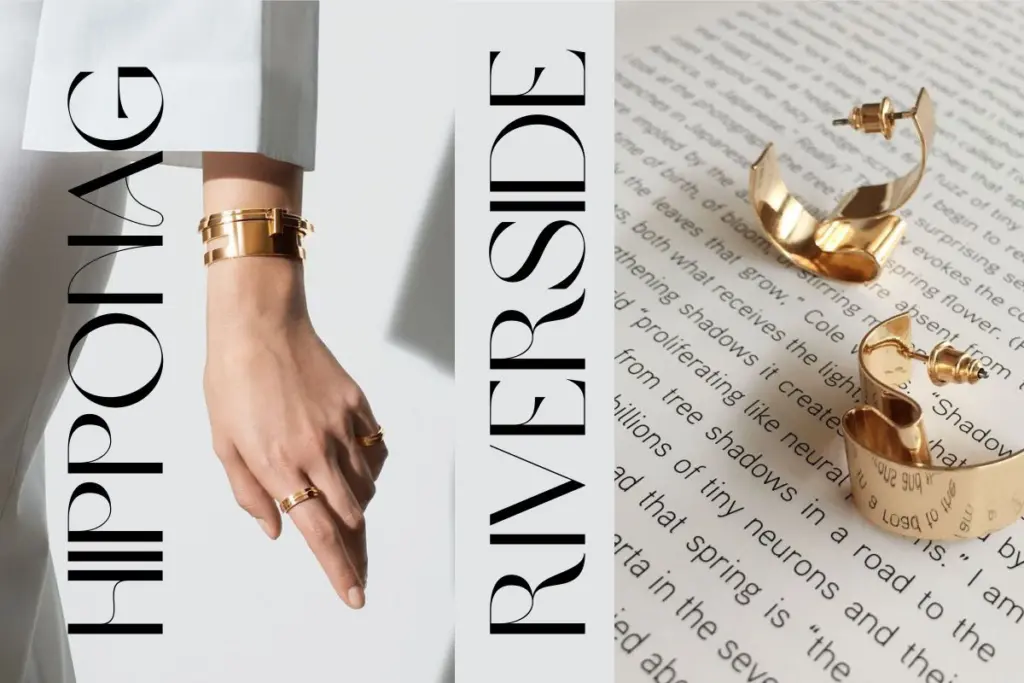
This is a font for short, declarative type: poster headlines, badge and stamp designs, logotypes built from a single word, illustration labels, and quote graphics for social media. It photographs well at large sizes on packaging or signage where a handful of capital letters need to carry visual weight without shouting through a heavy weight or an ornate script.
It is not a candidate for anything that requires lowercase — body copy, longer headlines, or multi-line invitation text will all hit its ceiling immediately. Designers working on wedding stationery or editorial layouts should plan to pair it with a separate text face for anything beyond the couple’s names or a section header. Used within that lane — a monogram, a short brand name, a badge — it does its job cleanly and without fuss.

What we liked, and what we didn’t
Strengths
- Clean, consistent stroke contrast across the capital set
- Generous punctuation and numeral coverage for short compositions
- Reads well on badges, stamps and poster headlines at large sizes
Trade-offs
- No lowercase letters, ruling out body text and longer headlines
- Dense serifs in tight all-caps lines need extra tracking to stay legible
Brown Sugar is a tidy, well-drawn set of capitals with a modern serif structure, good for badges, posters, and short brand marks. The lack of a lowercase set narrows its range considerably, so it's best treated as a headline or logotype tool rather than a general-purpose typeface.
Verdict

Tantype reviews typefaces in depth — every font is tested in real branding, editorial and screen layouts before a word gets written. 555+ fonts reviewed and counting.