
Shelten Font Vintage: a rustic display serif for badges and labels
Design style
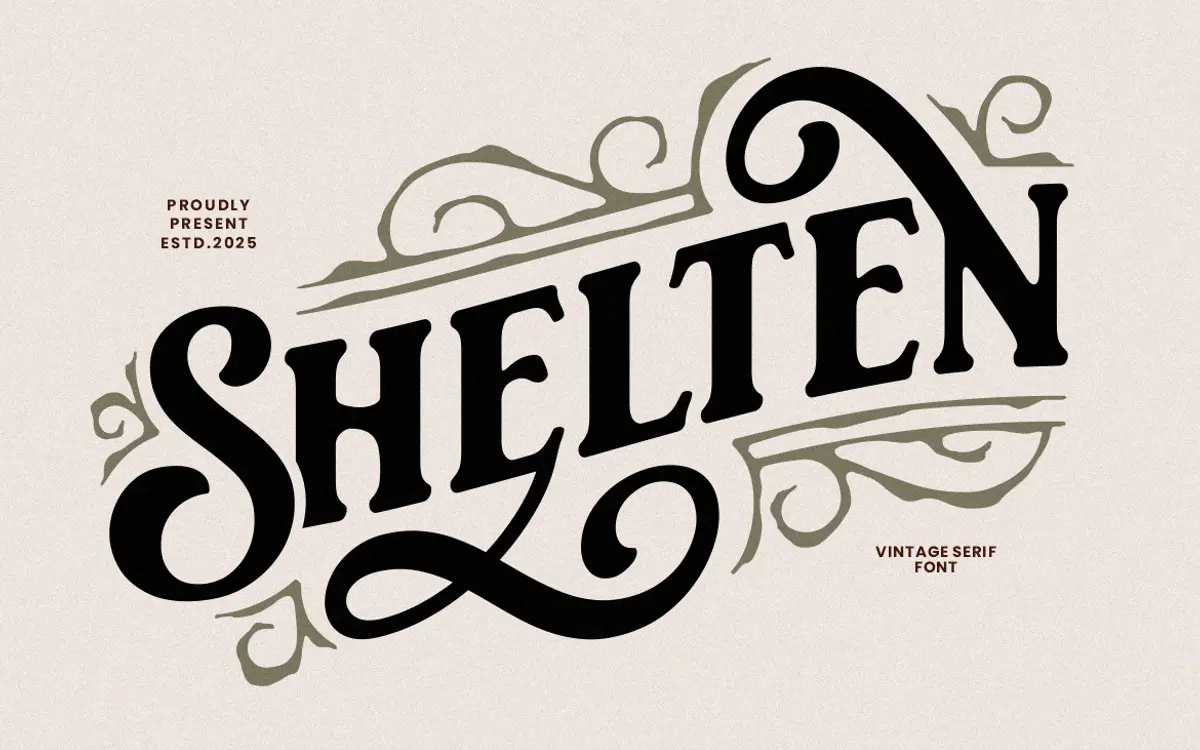
Shelten Font Vintage sits in the well-worn tradition of American vintage lettering — the kind you see stamped on old apothecary tins and barbershop signage. The strokes carry a deliberate roughness: edges that aren’t quite straight, serifs that flare unevenly, terminals that look cut rather than drawn with a compass. It’s not trying to be a clean revival of a historical serif; it’s trying to look handmade, slightly weathered, and a little proud of its imperfections.
That rough treatment is consistent across the letterforms, which helps the face read as a coherent style rather than a novelty gimmick. The contrast between thick and thin strokes is moderate, giving it enough structure to work as a display face without collapsing into a solid block at larger sizes. It leans decorative rather than restrained — this is a font with a personality, and it wants to be seen as such.
Character set and features
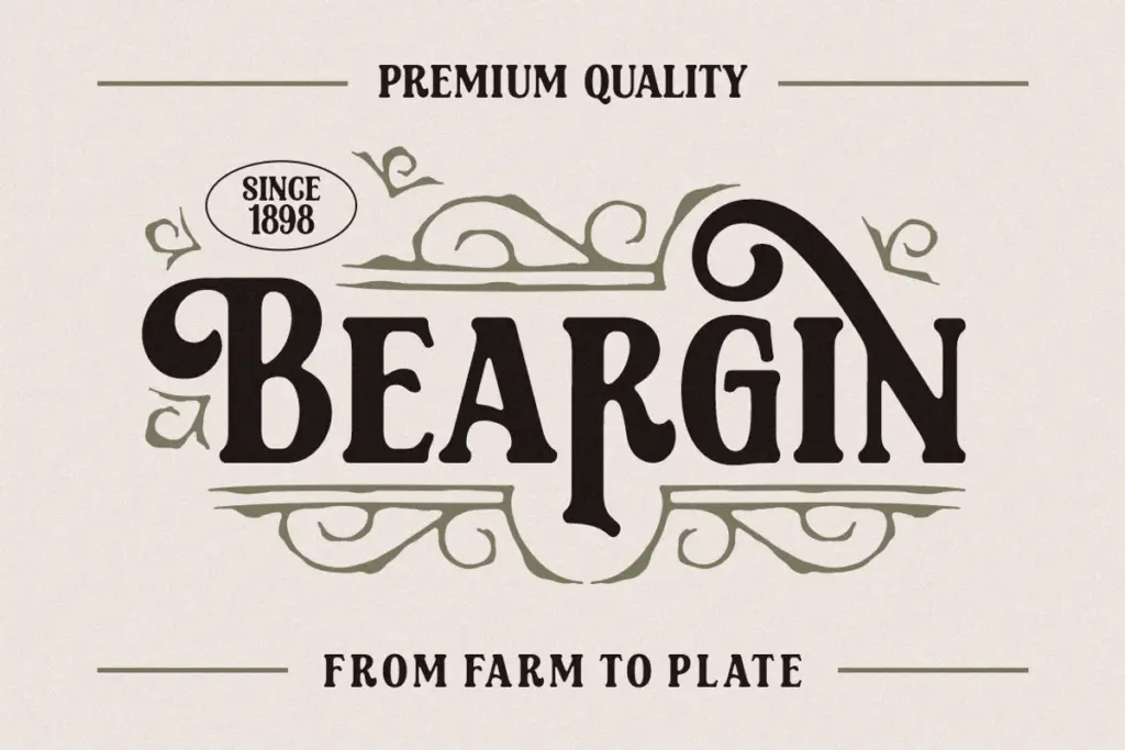
The set covers uppercase, lowercase, numerals, and standard punctuation, with alternate characters available for some letters, which is worth digging into if you’re building a wordmark. The alternates give you a way to vary repeated letters or swap in a swash-like form for a more dynamic ligature-style word, though realising this depends on your software’s support for OpenType features — Adobe apps and Corel Draw will show the glyph panel properly, while simpler editors may leave those alternates inaccessible. The seller mentions multilingual support in general terms, but there are no specifics on which diacritics or language sets are covered, so anyone working outside basic Latin should check the glyph list before committing.
There’s no companion sans or script paired with it here — this is a single vintage display face, and it should be treated as one. It doesn’t come with an ornament or badge-frame set built in, so anything decorative around the type — the ribbons, the sunbursts, the frame lines you’d expect on a label — has to be sourced or drawn separately.
Use cases
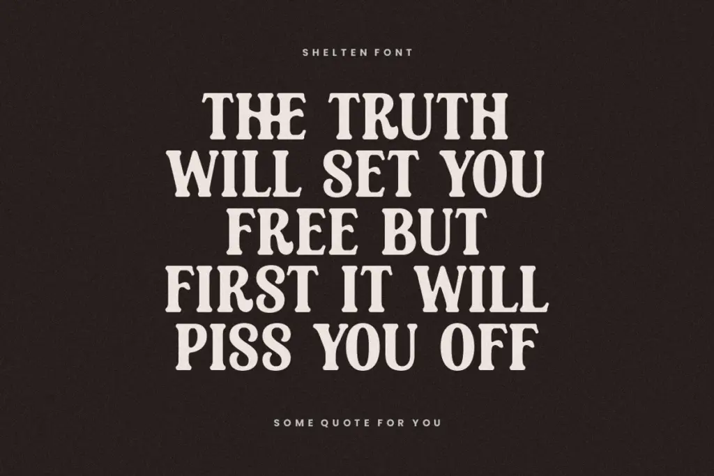
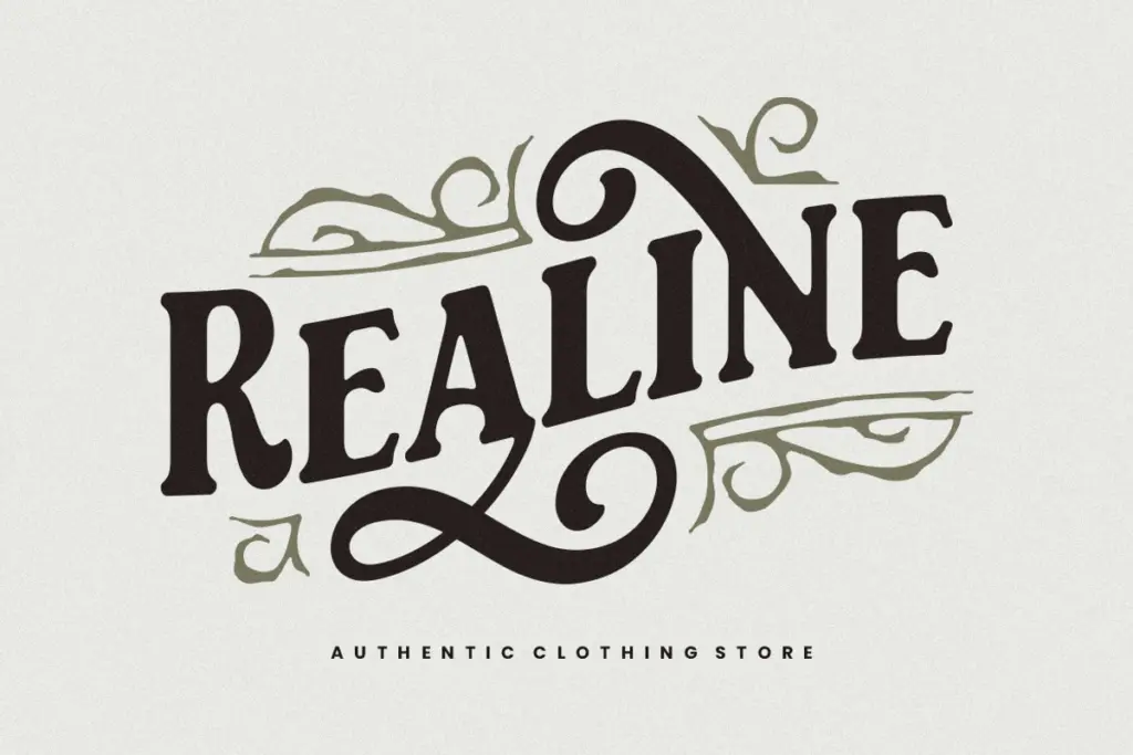
This is a font for short bursts of text: a product name, a wordmark, a headline on a poster or a badge. Its texture and irregularity make it unsuitable for body copy or anything that needs to be read comfortably at small sizes — the roughness that gives it character at 60pt turns into noise at 10pt. Where it earns its keep is in exactly the contexts the seller lists: pomade tins, coffee packaging, barbershop signage, craft labels, poster headlines — anywhere a design wants to signal
What we liked, and what we didn’t
Strengths
- Consistent rough-edged texture that reads as handmade rather than digitally distressed
- Alternate characters give some room to vary repeated letters in a wordmark
- Moderate stroke contrast keeps it legible as a display face at larger sizes
Trade-offs
- Roughness that works at headline size turns illegible at small sizes or in body text
- No accompanying ornament, frame, or badge elements, so decorative surrounds must be sourced elsewhere
Shelten Font Vintage does one job well: giving short pieces of text an old-rustic, handmade texture suited to labels and badges. It's not built for reading at length or for flexible branding systems, but within its lane — pomade tins, barbershop signs, craft packaging — it delivers convincingly.
Verdict

Tantype reviews typefaces in depth — every font is tested in real branding, editorial and screen layouts before a word gets written. 555+ fonts reviewed and counting.