
TAN – Twilight: A Streamlined Blackletter for Modern Branding
Design style
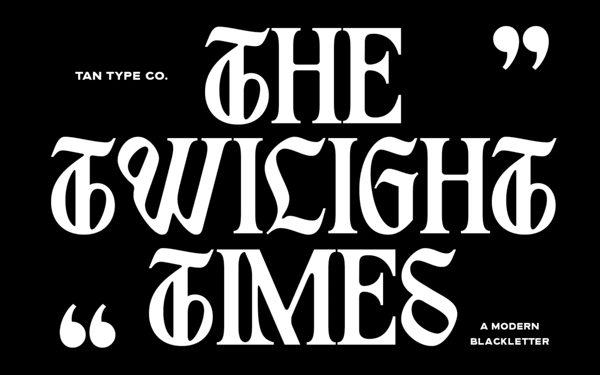
TAN – Twilight takes the bones of blackletter and files off most of the ornament. Traditional gothic forms carry a lot of visual weight: broken strokes, dense fracturing, diamond-shaped serifs that clot at small sizes. Twilight keeps the pointed rhythm and the vertical emphasis of the style but simplifies the construction into cleaner, more geometric strokes. The result reads as blackletter at a glance, but it behaves more like a display sans once you look closely at the joins and curves.
This is a deliberate trade-off. Purists who want the texture and drama of a full gothic face will find Twilight thin on that front. But the simplification is what makes it usable outside of album covers and tattoo flash — it’s blackletter with the aggression turned down and the polish turned up.
Character set and features
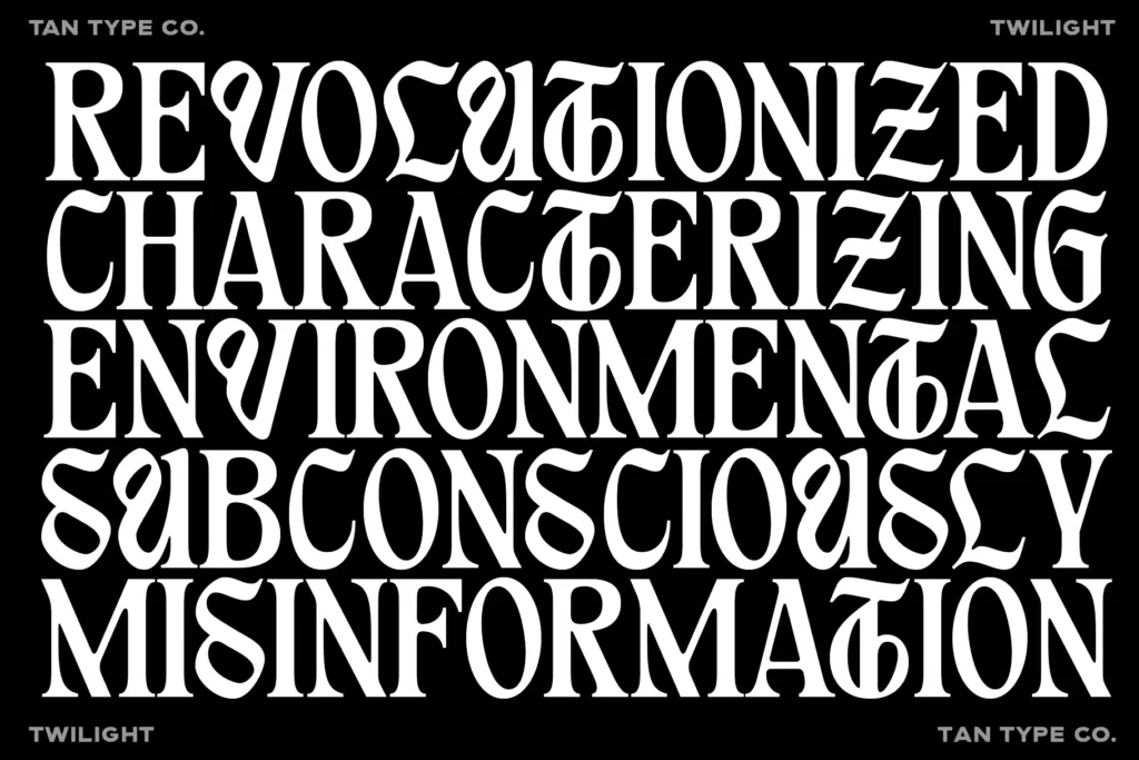
The letterforms are consistent in their logic: sharp terminals, minimal stroke contrast, and curves that are rounded rather than angular where the original gothic model would fracture. Uppercase letters carry most of the personality — tall, assertive, with enough idiosyncrasy in letters like G and K to give a wordmark some character without tipping into illegibility. Lowercase is more restrained, functioning as a support cast rather than a co-lead.
Because the forms are simplified, spacing feels even rather than clumped, which is not always true of blackletter revivals. The font includes multilingual support, useful if your work needs accented characters, though the brief doesn’t specify which OpenType features beyond that are included. Anyone planning to use ligatures or alternates should check that their software reads OpenType features properly — the seller notes Canva in particular won’t expose the advanced set.
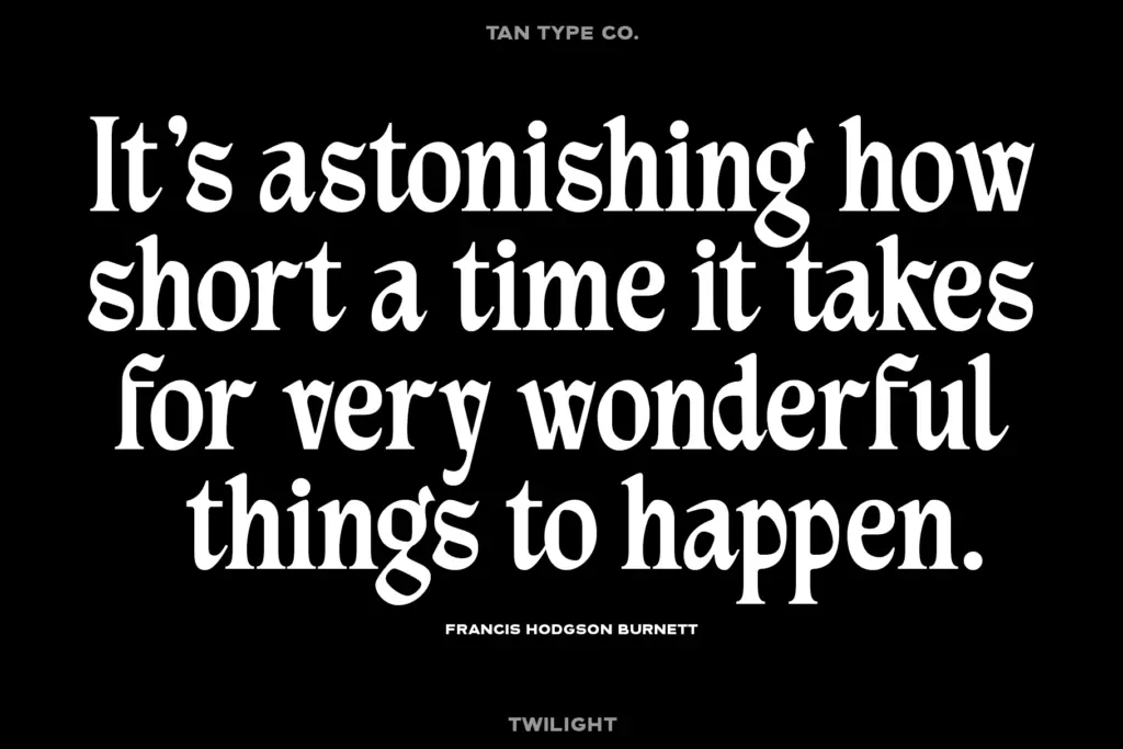
At small sizes the strokes hold together reasonably well for a blackletter-adjacent face, though this is still a style built for scale. Body text is not the intended job here, and pushing it there would undercut the very clarity the simplification was meant to buy.
Use cases
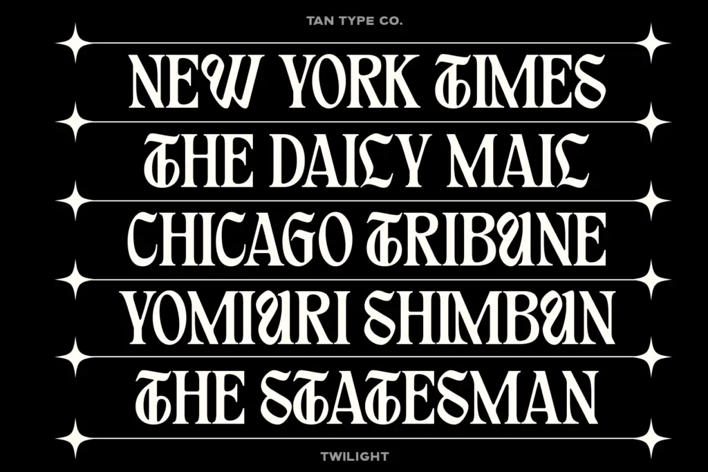
Twilight is built for headlines, logotypes, and short-form display work — the kind of context where a word or two needs to carry tone rather than convey paragraphs of information. Fashion branding is an obvious fit: the face has enough edge to feel current without reading as costume-shop gothic. Streetwear labels, music branding, poster headlines, and packaging that wants a contemporary-but-slightly-rebellious mark will all get good mileage from it.
It’s less suited to anything that needs warmth or approachability — wedding stationery or anything softly editorial will fight the face’s inherent severity, however toned-down. And it’s not a workhorse; this is a typeface for a handful of words at a time, not a flexible family meant to run a whole brand system top to bottom. Used within those limits, it does its job cleanly and without the visual noise that usually comes with the blackletter territory.
What we liked, and what we didn’t
Strengths
- Simplified strokes make blackletter usable in modern branding without heavy fracturing
- Uppercase letters have enough personality to anchor a logotype on their own
- Even spacing avoids the clumping common in gothic revival fonts
Trade-offs
- Loses much of the texture and drama that define traditional blackletter
- Not built for body text or long-form use, strictly a short-word display face
TAN – Twilight is a competent, contemporary reworking of gothic letterforms aimed squarely at logos and headlines. It trades the drama of full blackletter for cleaner, more usable shapes, which makes it more versatile in branding contexts but less interesting to anyone chasing the style's original texture.
Verdict

Tantype reviews typefaces in depth — every font is tested in real branding, editorial and screen layouts before a word gets written. 555+ fonts reviewed and counting.