
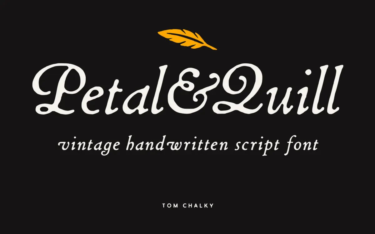
Petal & Quill: a workhorse hand-drawn script for warm, welcoming branding
Design style
Petal & Quill sits in the well-trodden territory of vintage-flavoured hand scripts, but it earns its keep by offering two distinct moods instead of one. The Rounded styles soften the joins and open up the counters, giving a friendlier, more contemporary read. The Regular styles pull the letters tighter and let the strokes taper more sharply, landing closer to old-world signwriting than modern lettering. Having both under one roof means you’re not stuck forcing a single mood onto every job.
The connecting strokes are drawn with a light hand — you can see the pen lifts and slight inconsistencies that keep it from reading as vector-perfect, which is the point of a script like this. It’s not aiming for the wet-ink drama of a calligraphy pen; it’s closer to a confident, casual handwriting style dressed up for retail shelves and wedding suites. The bold weights thicken the strokes without losing the looseness, which is useful, since a lot of scripts turn stiff the moment you add weight.
Character set and features
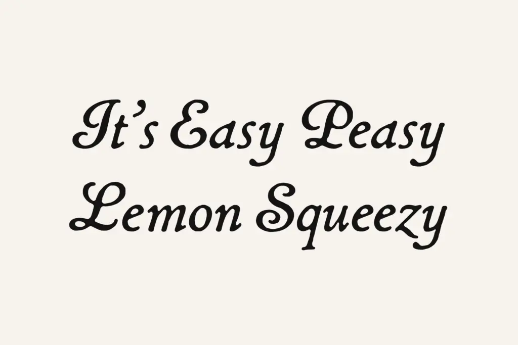
The family includes stylistic alternates and ligatures, plus what the foundry calls custom catchwords — decorative word-forms rather than individual glyphs, which is a nice touch if you’re building a single hero line rather than paragraphs. These extras genuinely change how the script reads in practice: swapping in alternates for repeated letters (the double l’s, the terminal y’s) is what keeps a script from looking like it was typed with the same three keys over and over.
Multilingual Latin support is included, so accented characters across most European languages are covered, which matters more than it sounds for a script sold into wedding and packaging markets where names carry diacritics. Both Regular and Bold weights exist across both styles, giving four total combinations to work with — not a huge range, but enough to build a hierarchy without reaching for a second typeface.
Where it shows its limits is at small sizes. Like most connected scripts, the joins start to clot when set much under 18–20pt, and the thinner rounded style loses its warmth if it’s shrunk into a body-copy role it was never built for. This is a headline and accent font, not a paragraph setter, and it doesn’t pretend otherwise.
Use cases
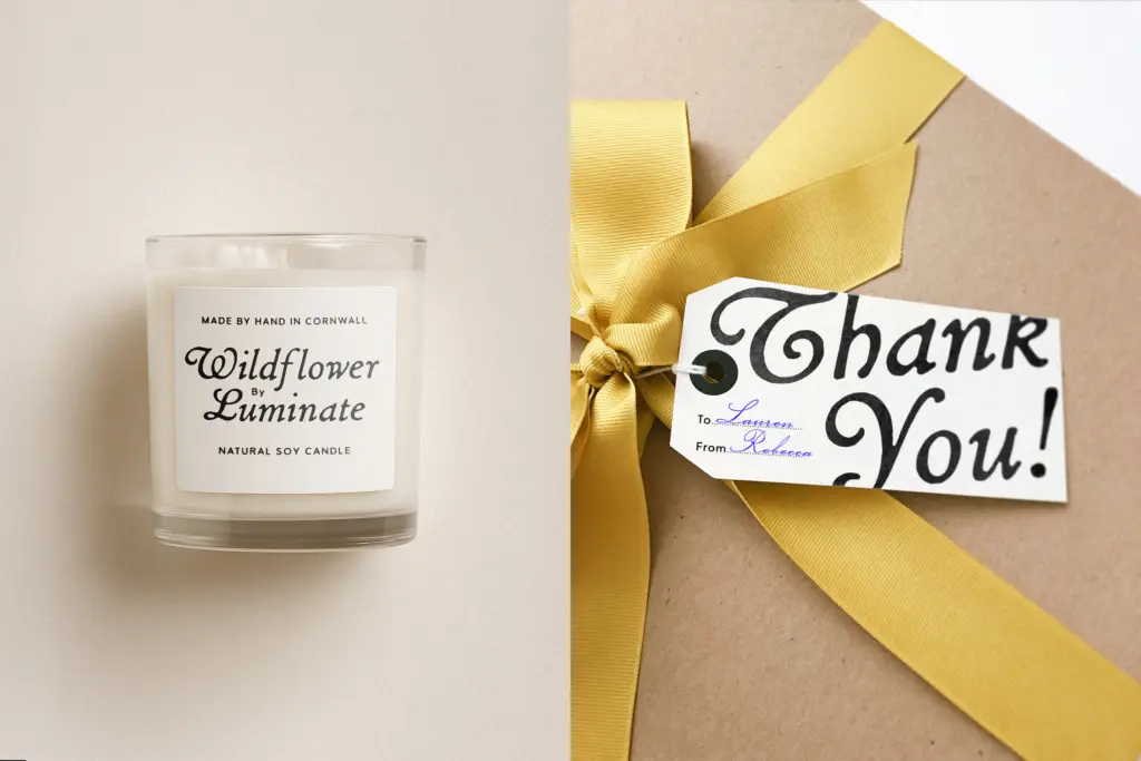
This is squarely a branding and packaging script — the kind of typeface that ends up on a jam label, a bakery sign, or a save-the-date, and does the job without demanding much fuss. The rounded style leans into boutique and small-business branding where friendliness matters more than formality; the regular style suits rustic or vintage-market positioning, farm shops, craft goods, that sort of thing.
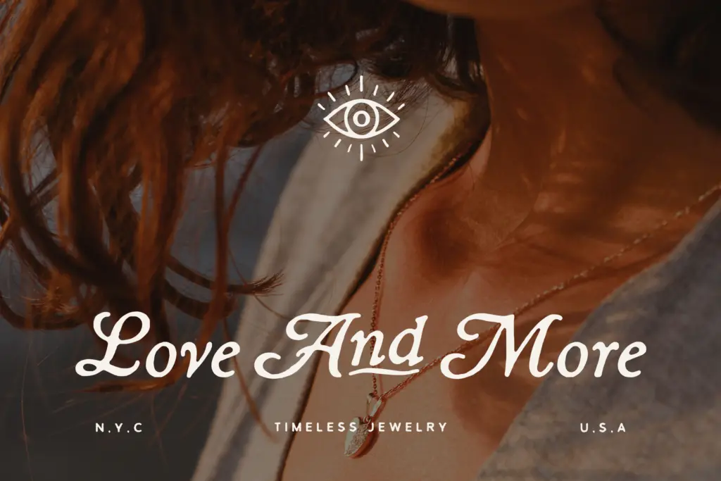
For wedding stationery, the alternates and catchwords give a designer enough variation to avoid the flat, repetitive look that cheaper single-style scripts fall into. As a logotype it works best short — a name, a word, maybe two — rather than as a long tagline. It’s a dependable, unpretentious script rather than a showpiece, and that’s a fair description of what it’s for.
What we liked, and what we didn’t
Strengths
- Two genuinely distinct styles (rounded and regular) cover both friendly and rustic branding moods
- Stylistic alternates and catchwords help avoid repetitive letterforms in short headline settings
- Bold weights keep the loose, hand-drawn character instead of turning stiff
Trade-offs
- Connected strokes clot and lose clarity below roughly 18-20pt, limiting it to headline and label use
- The overall style is familiar territory for vintage hand scripts and doesn't push much beyond the genre's conventions
Petal & Quill is a competent, well-rounded hand script that covers two moods — soft and rustic — with enough alternates to avoid obvious repetition. It won't surprise anyone who's seen a dozen vintage scripts before, but it's built to actually work in branding and packaging jobs rather than just look good in a specimen.
Verdict

Tantype reviews typefaces in depth — every font is tested in real branding, editorial and screen layouts before a word gets written. 555+ fonts reviewed and counting.