
Mocha Bubble+Sans: a four-weight playful duo for casual branding work
Design style
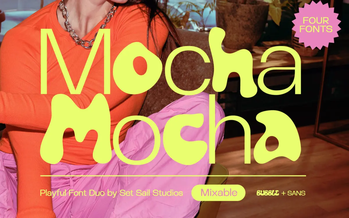
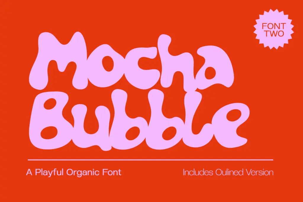
Mocha is a four-font set built around one idea: a bouncy, hand-drawn bubble letter paired with a clean, contrasted sans that shares its proportions. The bubble font is the personality piece. Its strokes swell and taper unevenly, corners round off into soft blobs, and the overall effect reads as hand-drawn rather than vector-perfect — you can see where a nib or brush pressure would have varied if this were actually inked. That looseness is the point, and it’s handled with enough consistency that the alphabet still reads as one family rather than a set of random doodles.
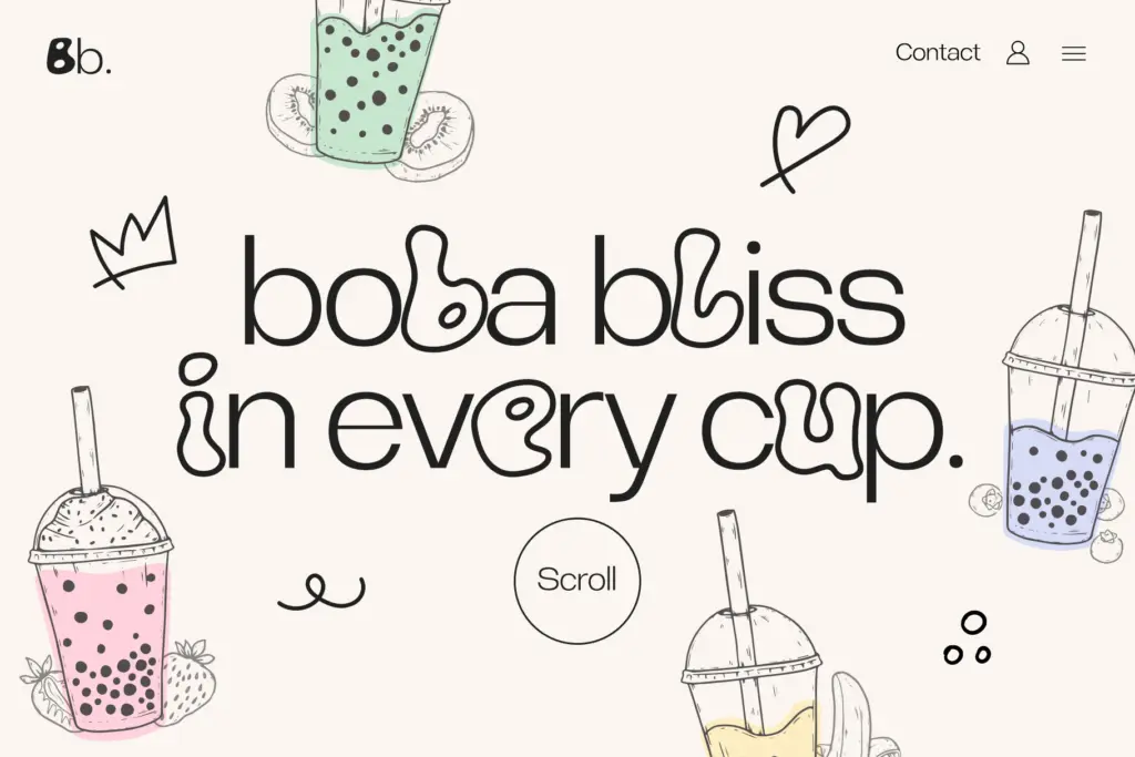
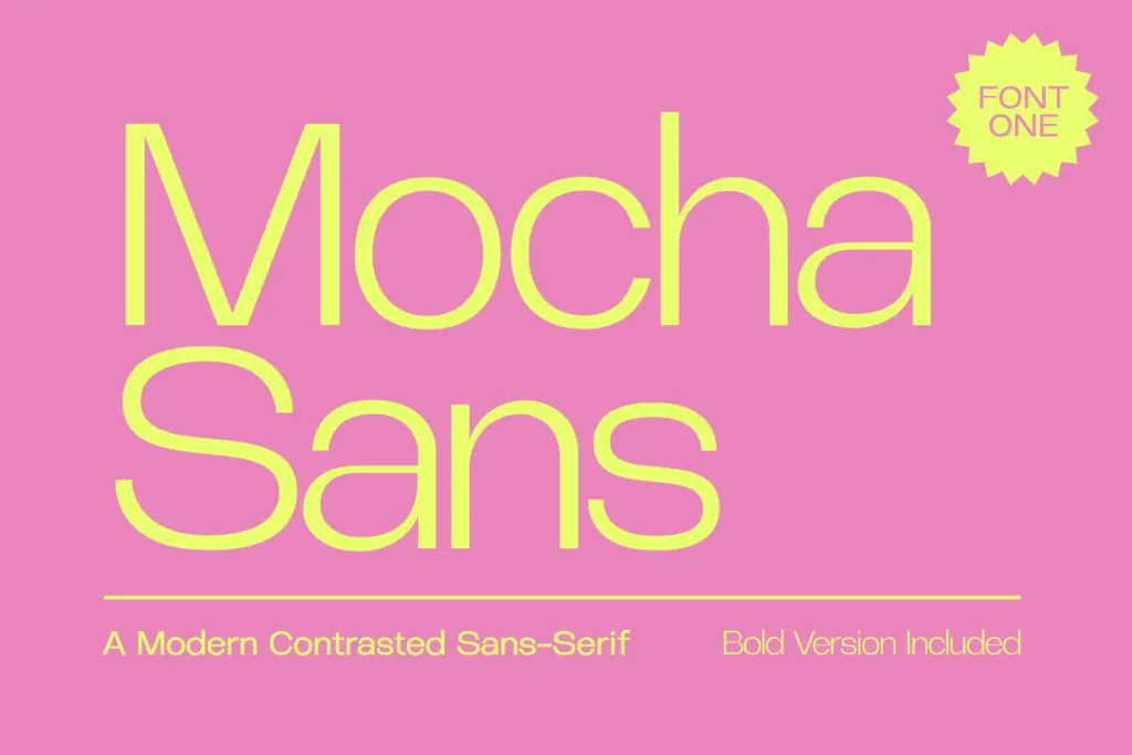
The sans half is more restrained: a contemporary grotesque with visible stroke contrast, built to sit quietly next to the bubble letters without competing with them. It shares x-height and cap height with the bubble font closely enough that the two can be mixed inline, which is clearly the intended trick — swap letters between the two styles within a single word and get a kind of typographic collage effect. A bold sans and an outline version of the bubble font round out the set, giving four total styles from what is really two structural designs.
Character set and features
Each font ships with a full uppercase and lowercase set plus punctuation, and the family supports a wide spread of Latin-based European languages — useful if a project needs accented characters beyond basic English. There’s no mention of ligatures, alternates or stylistic sets here, and nothing in the material suggests this is a font built around OpenType features; it reads as a straightforward four-style package rather than a feature-rich system font. That’s not a knock, just a scope note: the interest here is in the letterforms and how the styles combine, not in swash variants or contextual substitution.
The bubble font’s hand-drawn irregularity is charming at display sizes but starts to work against it below a certain point — the soft terminals and uneven stroke widths blur together once the letters get small, so this is a headline and short-word font, not a body-copy one. The sans is more forgiving and could plausibly hold a paragraph, though its contrast means it wants some size and space to breathe rather than being set tight.
Use cases
This is a duo for projects that want warmth and a bit of handmade energy without going full script or calligraphy — think packaging for a small-batch food or drinks brand, a café or bakery identity, kids’ product branding, or social graphics that need a friendly, approachable voice rather than a polished corporate one. The outline version gives a lighter-weight option for layering over photography or textured backgrounds, and the bold sans handles supporting text like taglines or pricing without dropping the sans down to body-copy duty.
It’s less suited to anything that needs restraint or gravitas — luxury branding, editorial body text, or long-form reading will all outgrow it quickly. Within its lane, though, the four-style structure gives a designer real room to mix and layer before reaching for another typeface entirely.
What we liked, and what we didn’t
Strengths
- The bubble and sans styles share proportions closely enough to mix mid-word convincingly.
- Four styles from two structural designs gives real layout flexibility without extra typefaces.
- Broad European language support beyond basic English.
Trade-offs
- The bubble font's uneven terminals blur together at small sizes, limiting it to headline use.
- No stated OpenType features like ligatures or alternates, so the design relies on the base letterforms alone.
Mocha does one thing well: a bubbly, hand-drawn display face that mixes cleanly with a matching sans across four total styles. It's a solid pick for playful branding and packaging work, but the bubble font's charm fades fast below display size, and neither style stretches into more formal territory.
Verdict

Tantype reviews typefaces in depth — every font is tested in real branding, editorial and screen layouts before a word gets written. 555+ fonts reviewed and counting.