
Montpellier Script: a playful calligraphy face with generous swash alternates
Design style
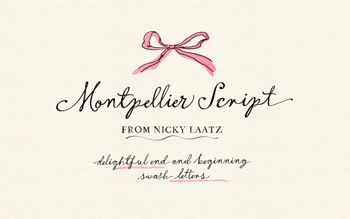
Montpellier Script sits in the casual calligraphy camp rather than the formal copperplate one. The strokes have that slightly wet, brush-loaded quality — thick downstrokes that taper into thin, wiry hairlines, with a visible variance from letter to letter that reads as handwriting rather than a rigid calligraphic system. Nicky Laatz has kept the baseline loose; letters bounce up and down slightly as they would if written quickly by hand, which gives the face its lighthearted, unbothered character rather than the poise of a bridal engraver’s hand.
The overall mood is more “posh doodle” than “formal invitation script.” Ascenders and descenders loop generously, and the beginning and ending letters are drawn with extra flourish to give words a sense of movement and finish. It’s a script that wants to be noticed at the start and end of a line, not one that disappears into a paragraph.
Character set and features
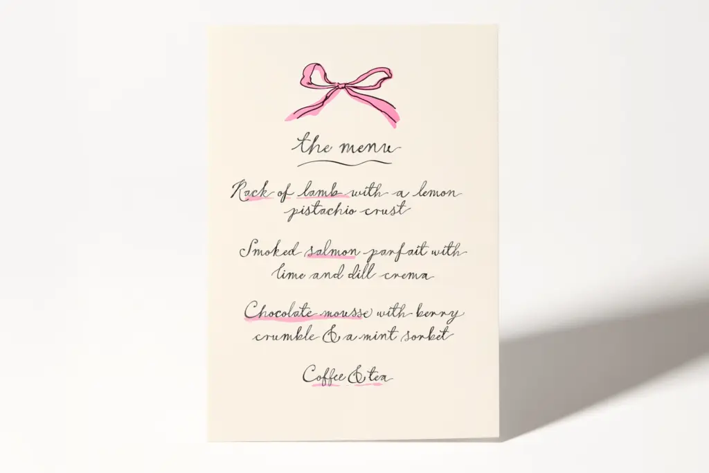
The OpenType feature set is the real substance here. There’s a large bank of flourished beginning and ending alternates, letting you swap a plain lowercase or capital for a version with an extended entry or exit stroke — useful for giving a name or title a proper flourish without hand-editing the outlines. Alongside these sit a set of ligatures that join common letter pairs into more naturally connected forms, plus general stylistic alternates for varying repeated letters within a word so it doesn’t look stamped.
Accessing all of this requires an application with OpenType support — Illustrator, InDesign, Photoshop’s newer versions, Affinity apps. If your software doesn’t expose these features, you’re stuck copying glyphs one at a time from Font Book or Character Map, which is workable for a single word on a card but tedious for anything longer. This is a font that rewards the extra ten minutes spent in the Glyphs panel; used with only the default characters, it looks flatter and loses a good deal of its personality.
Use cases
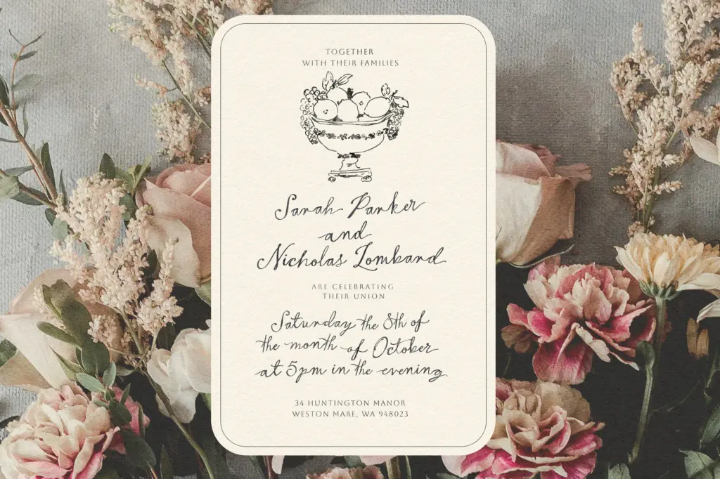
This is a short-word specialist. It’s built for greeting card sentiments, invitation headlines, monograms, logotypes for boutique or lifestyle brands, and packaging accents where a single playful word or name needs to carry some warmth. The swash alternates make names and titles feel considered rather than generic, and the slightly imperfect baseline suits anything aiming for a handmade, approachable tone — birthday cards, baby announcements, casual wedding stationery for couples who want charm over formality.
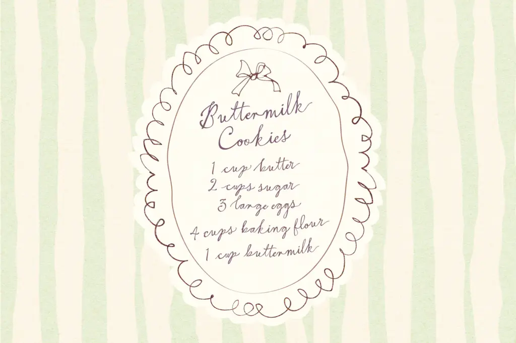
It’s less suited to long-form use. Set a full sentence or a paragraph in it and the bounce and swash energy that works in a two-word heading starts to work against readability — the eye has to do more work tracking a wandering baseline over multiple lines. Pair it with a plain sans or a quiet serif for body copy and let Montpellier Script do the header work only. For anyone doing volume production — cards with variable customer names, for instance — budget time for glyph substitution, since the good alternates aren’t automatic in every layout tool.
What we liked, and what we didn’t
Strengths
- Large set of flourished beginning and ending alternates gives real variety to names and short headlines
- Ligatures and letter alternates help avoid repetitive, stamped-looking words
- The loose, bouncing baseline gives it a distinct handmade character among script fonts
Trade-offs
- Without OpenType feature access, the default glyph set looks noticeably flatter than the previews suggest
- The wandering baseline and heavy flourishes make it tiring to read in anything longer than a few words
Montpellier Script delivers a genuinely playful, hand-drawn calligraphic feel backed by a strong set of swash and ligature alternates. It's built for short headlines and names rather than paragraphs, and getting the best out of it means working in OpenType-capable software.
Verdict

Tantype reviews typefaces in depth — every font is tested in real branding, editorial and screen layouts before a word gets written. 555+ fonts reviewed and counting.