
Silk Serif: a high-contrast editorial serif for fashion and luxury branding
Design style
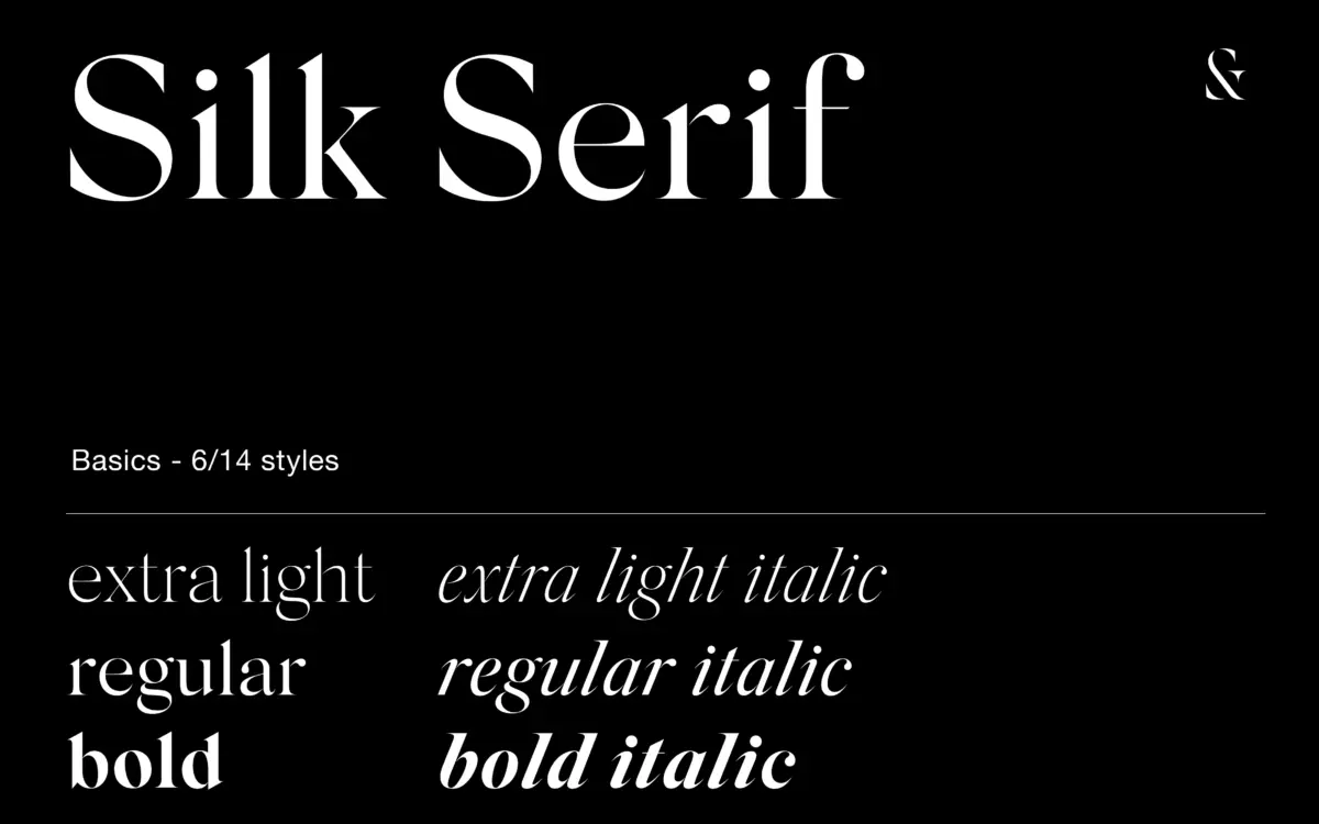
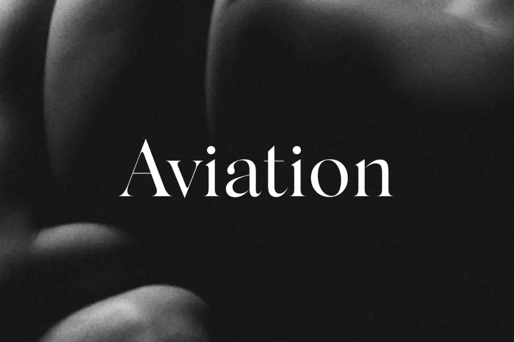
Silk Serif belongs to the current wave of fashion-editorial serifs built on sharp contrast and thin, pointy serifs. The bracketing is generous rather than hairline, which keeps the letters from looking brittle even at the thinnest weight. The signature move here is the treatment of bowls: on letters like a, e, and g, the bowl sits close to the stem without actually touching it. From a normal reading distance the gap reads as a connection, a bit of visual sleight of hand that gives the face a slightly hand-finished quality without tipping into calligraphic territory. Ball terminals show up on the usual candidates — a, c, f, r, y — and the junctions elsewhere are bracketed rather than sharp, which softens the overall rhythm.
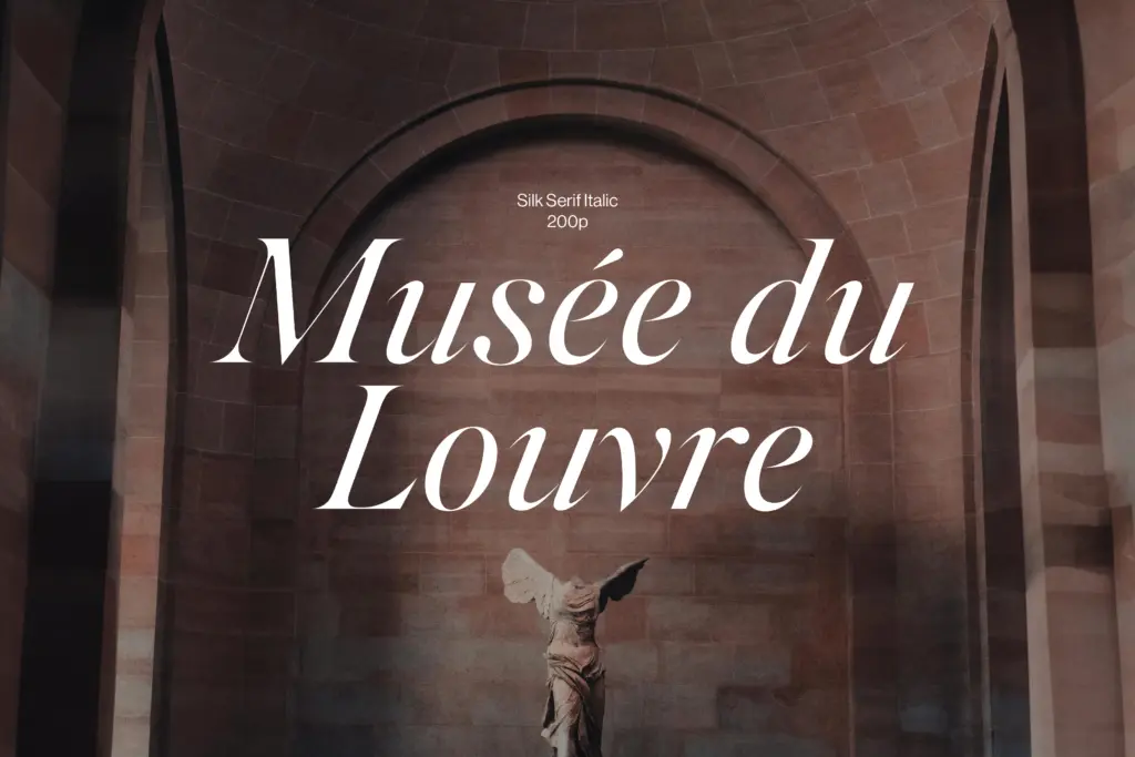
The family spans six styles: Extra Light, Regular and Bold, each with a matching italic. That’s a narrower range than some competitors in this space, but it covers the two jobs high-contrast serifs are usually asked to do — thin, elegant setting for headlines and a bolder option for emphasis or contrast within a layout. The italics are worth singling out; they’re not simply obliqued romans but genuinely redrawn, with a proper cursive slant and narrower proportions, which matters if you plan to use the italic for anything beyond the odd pull quote.
Character set and features
As an OpenType serif aimed at branding and editorial work, Silk Serif carries the features you’d expect from this category of display font: standard punctuation, figures, and the accented characters needed for basic European-language setting. The seller doesn’t specify ligatures or alternates, so treat the set as functional rather than expansive — don’t expect swash capitals or a deep stylistic-alternate menu. What’s there is drawn consistently across weights, and the high contrast holds its character from Extra Light through to Bold without the thin weight collapsing into hairlines or the bold turning heavy-handed.
The delicacy the seller mentions is real, but it’s also the trade-off. At small sizes the thin strokes and near-touching bowls start to lose definition, particularly in the Extra Light. This is a face built for size, not for body copy.
Use cases
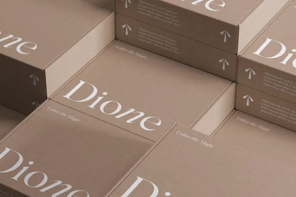
Silk Serif is suited to the work it was clearly drawn for: fashion logotypes, magazine mastheads, packaging copy that needs a touch of polish, and headline treatments in editorial layouts. The bold weight can carry short display lines on its own, while the extra light pairs well as a refined subhead against a plainer sans body text. Because the family is compact, it won’t cover every register a brand identity needs — there’s no condensed or extended option, no black weight for heavy contrast work — so larger identity systems may need to borrow a workhorse sans or serif for supporting text. Within its lane, though, it does a clean, specific job: sophisticated headline setting where a bit of visual tension in the letterforms is an asset rather than a distraction.
What we liked, and what we didn’t
Strengths
- The near-touching bowl-and-stem detail gives the letterforms a subtle hand-finished quality
- Bracketed serifs and junctions keep the high contrast from looking brittle
- Genuinely redrawn italics rather than slanted romans
Trade-offs
- The Extra Light weight loses definition at small sizes
- Only three weights with italics means no condensed, extended, or black options for larger identity systems
Silk Serif is a well-drawn high-contrast display serif with a distinctive bowl-and-stem trick that gives it personality without gimmickry. It's built for headlines and branding, not body text, and the six-style range is enough to do that job but not much more.
Verdict

Tantype reviews typefaces in depth — every font is tested in real branding, editorial and screen layouts before a word gets written. 555+ fonts reviewed and counting.