
Apothecary Serif: a distressed period serif for old-book branding
Design style
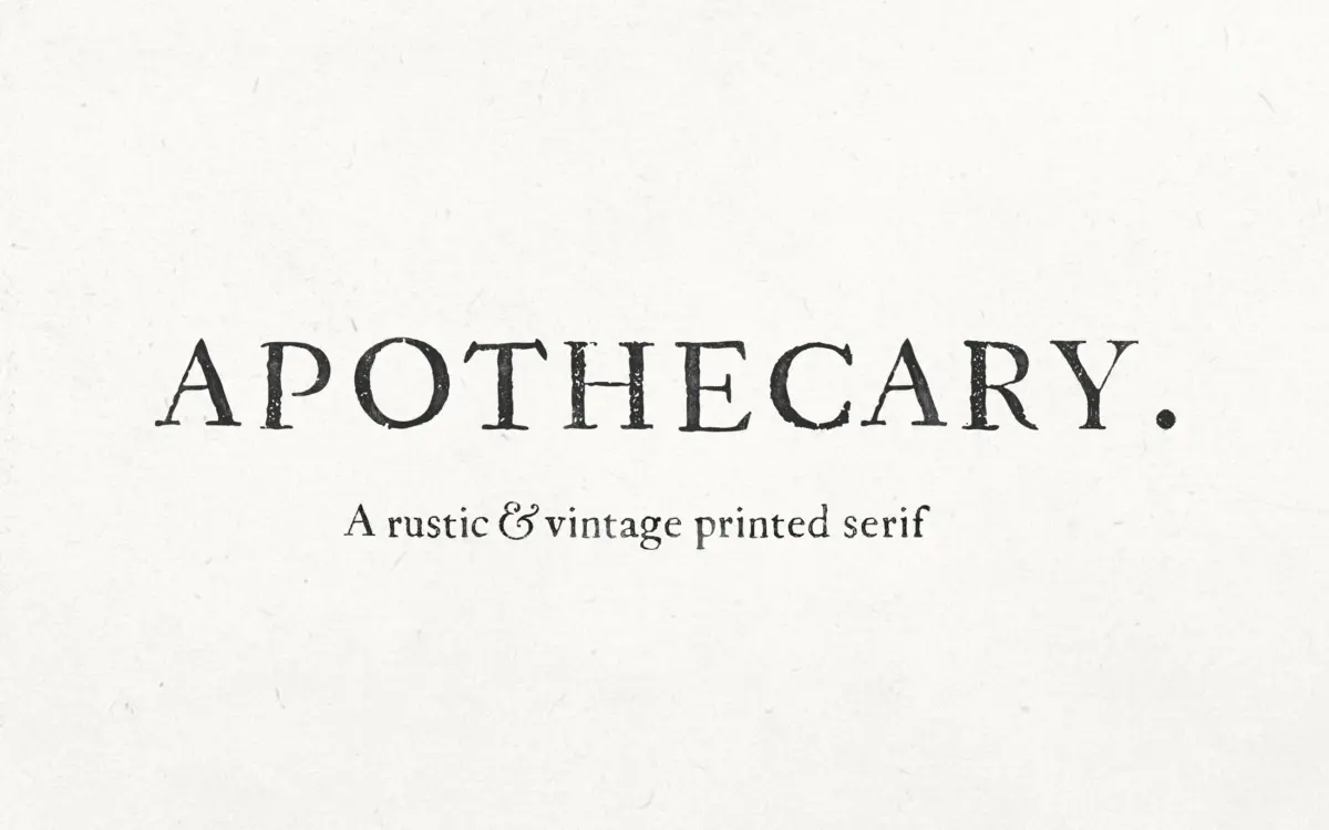
Apothecary Serif takes its cues from eighteenth-century print press texts, and it wears that reference plainly. The letterforms carry the soft, uneven edges of ink bleeding into damp paper: strokes thicken irregularly, corners round off where you’d expect a sharp serif, and the overall texture reads as printed rather than drawn. This is not a clean revival of an old face; it’s a deliberately rough one, closer to a rubbing than a scan.
The serifs themselves are modest and bracketed, with a moderate contrast between thick and thin strokes that nods to transitional-era type without trying to be historically precise. Nicky Laatz has leaned into imperfection as the主 feature here — no two instances of the same letter look quite identical in feel, even if the underlying structure is consistent. That inconsistency is the whole point. If you want a serif that looks machine-perfect, this isn’t it.

Character set and features
The face covers the accented characters needed for English, French, German, Spanish, Swedish and Norwegian, which puts it within reach for most Western European branding jobs without extra workarounds. Because the letterforms already carry irregular edges, kerning and letterspacing become part of the design decision rather than an afterthought — tightening the spacing intensifies the ink-bleed illusion, while opening it up lets the rustic texture breathe and feels closer to a stamped label.
At small sizes the roughened edges can blur into the counters, particularly on tighter settings, so this isn’t a typeface to drop into a paragraph of running text and forget about. It wants generous size and space to let its texture register as character rather than noise. There’s no indication of a matching italic or a range of weights in the brief, so treat this as a single-weight display serif rather than a full text family.
Use cases
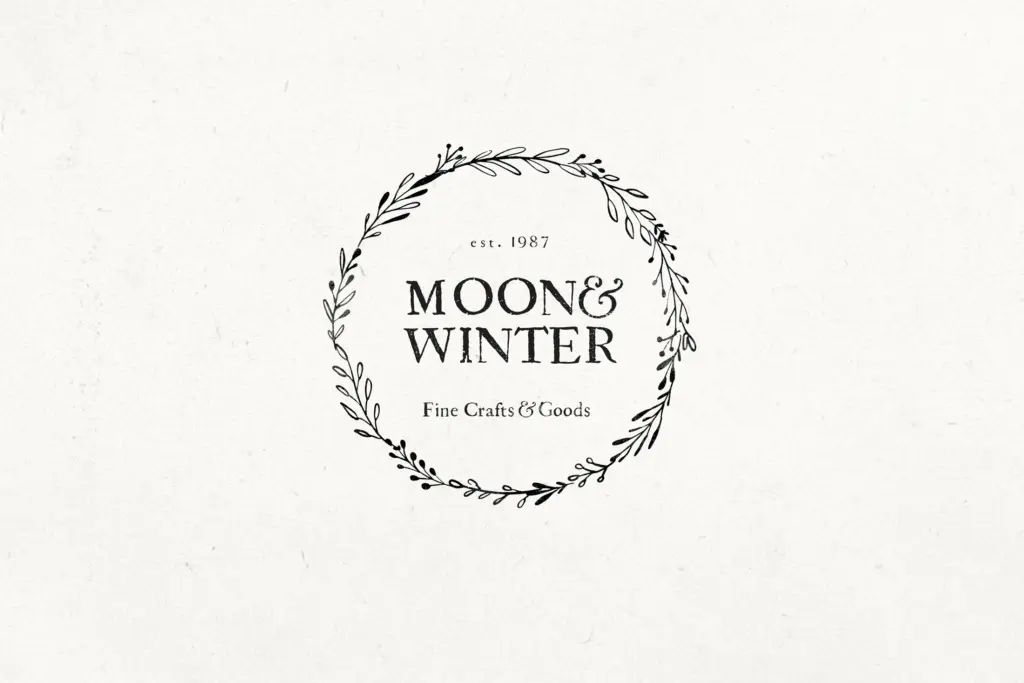
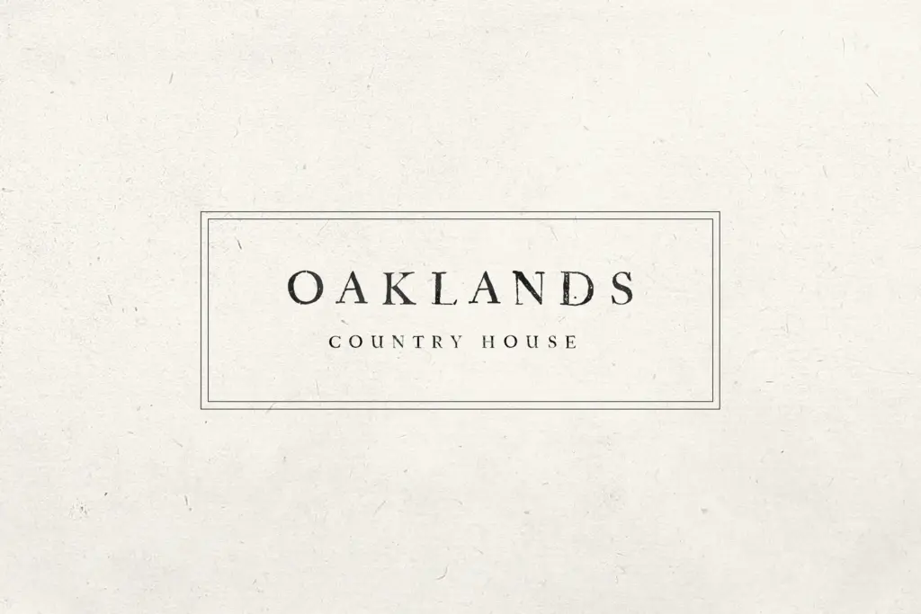
This is a font for surfaces where age and handcraft are the message: apothecary-style packaging (the name is not accidental), wine and spirits labels, wedding stationery that leans rustic rather than formal, quote cards, and logotypes for businesses trading on heritage or craft. It sits comfortably alongside watercolour illustration, loose botanical linework, or kraft-paper textures — anywhere a slightly worn, printed-by-hand feel is the goal.
It is less suited to corporate branding that needs to read as contemporary or precise, and it won’t hold up as a body-copy workhorse. Use it for headlines, short lines, and single words where the ink-bleed texture can be appreciated at a readable size. Pair it with a plain sans or a clean text serif for supporting copy, since Apothecary Serif’s job is to set tone, not to carry paragraphs.
What we liked, and what we didn’t
Strengths
- Convincing ink-bleed texture that reads as genuinely printed rather than digitally distressed
- Covers accented characters for several major Western European languages
- Letterspacing changes the character of the face meaningfully, giving range from tight to airy settings
Trade-offs
- Rough edges blur at small sizes, so it's unsuited to body copy or dense text
- Appears to be a single weight with no confirmed italic, limiting it to display and headline use
Apothecary Serif does one thing — a worn, hand-printed period look — and does it with conviction. It's not built for text setting or corporate polish, but for labels, packaging and stationery chasing an antique feel, it delivers texture that's hard to fake with a clean revival face.
Verdict

Tantype reviews typefaces in depth — every font is tested in real branding, editorial and screen layouts before a word gets written. 555+ fonts reviewed and counting.