
Belvare: a condensed retro serif built for headlines and branding
Design style
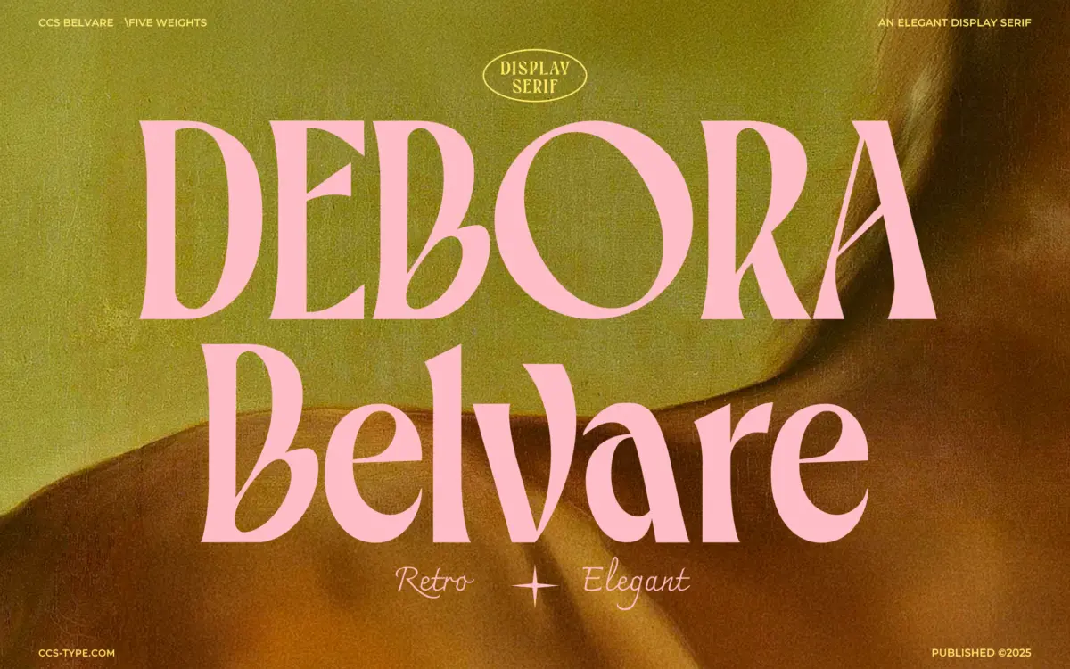
Belvare sits in that familiar territory of condensed retro serifs that borrow from mid-century advertising lettering without fully committing to any one decade. The proportions are narrow and upright, which gives it a columnar quality on the page, but the letterforms themselves are rounded rather than sharp. That combination is the font’s main trick: tight spacing that reads as disciplined, paired with soft, bulbous curves on the O and C that keep it from feeling severe.
The three weights move from a Light that’s almost delicate at display sizes, to a Regular with enough presence for standalone headlines, to a Bold that starts to feel closer to a slab in its stroke weight without changing the underlying skeleton. The serifs themselves are small and blunt rather than bracketed and ornate, which keeps the design from tipping into pastiche. It reads as retro-adjacent rather than a costume-drama pastiche of a specific era.
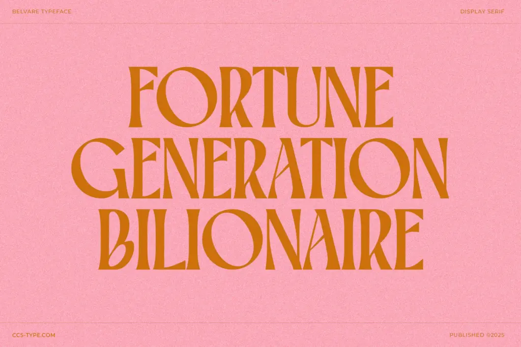
Where the design earns its keep is in the rhythm of the condensed setting. Narrow serifs can easily collapse into a grey mass, but Belvare’s generous x-height and rounded counters keep individual letters legible even when tracked tight, which is clearly the point.
Character set and features
Belvare ships with stylistic alternates and ligatures, and the alternates are where the personality really lives — the large, rounded O and C variants in particular shift the tone from tidy magazine serif to something closer to a hand-cut sign letter. Swapping a handful of alternates into a headline changes the character noticeably without breaking the overall texture of the word, which is a useful thing to have available rather than a gimmick bolted on for the sake of a feature list.
The font is described as multilingual, so extended language support is presumably built in, though exact coverage isn’t something to take on faith without checking the glyph panel yourself before committing to a project with specific diacritic needs.
Three weights is a modest but sensible range for a display-oriented family. There’s no italic mentioned, which is a real gap if you’re hoping to use Belvare for anything beyond headline-and-subhead pairings — you’ll need to source an italic elsewhere or lean on the alternates to introduce variation instead.
Use cases
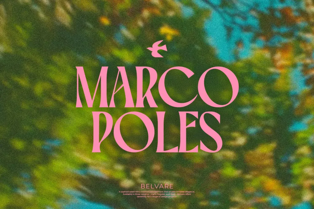
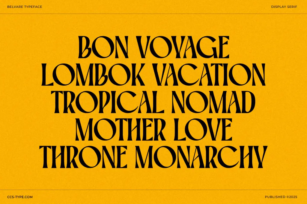
This is a headline font first. It’s built for the condensed, punchy line — a magazine title, a product name on packaging, a poster headline, a logotype that needs some retro warmth without going full vintage. The narrow proportions make it efficient in tight spaces, which is exactly where a lot of branding and packaging work needs a serif to perform.
It’s less suited to body copy or long-form reading; the condensed width and small serifs that make it work at display sizes will fight you at paragraph sizes. Treat it as a headline-and-accent tool, paired with a plainer text face for the reading copy, and it does its job well.
What we liked, and what we didn’t
Strengths
- The rounded O and C alternates give it a distinct sign-painted character
- Condensed proportions stay legible even when tracked tight
- Three weights offer real range for headline hierarchy
Trade-offs
- No italic is included, limiting use in mixed-style layouts
- Not designed for body copy — condensed width strains at small sizes
Belvare is a solid condensed retro serif that earns its personality through rounded alternates rather than heavy styling. It's a headline and branding tool, not a text face, and the absence of an italic limits how far you can stretch it across a full project.
Verdict

Tantype reviews typefaces in depth — every font is tested in real branding, editorial and screen layouts before a word gets written. 555+ fonts reviewed and counting.