
Cammron Serif Font Family: a display serif for headlines and branding
Design style
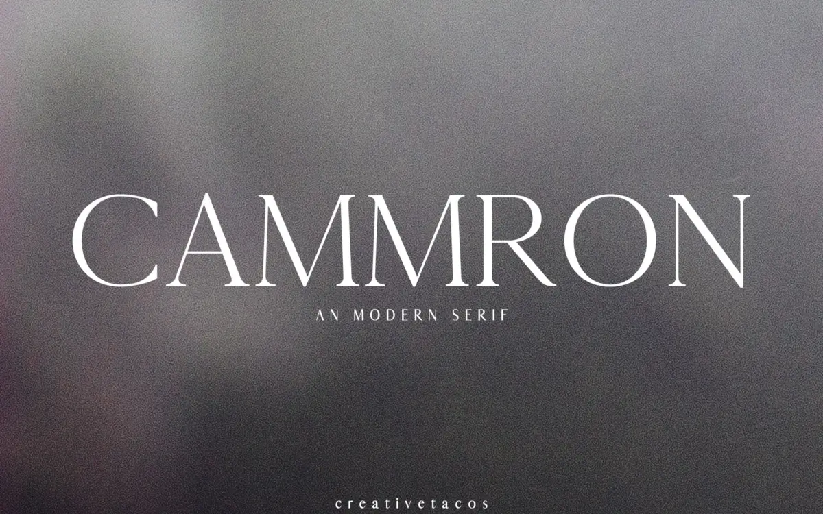
Cammron is a display serif built for size, not for setting paragraphs. The letters carry a moderate stroke contrast — thick stems against thinner hairlines — with terminals that flare just enough to suggest a chisel without tipping into full slab territory. It reads as a contemporary take on classic serif proportions: the x-height is generous, the counters are open, and the overall rhythm feels tuned for headline scale rather than body copy.
The family ships in four weights — Light, Regular, Round and Bold — which gives it more range than most single-cut display serifs. The Round variant softens the terminals into something closer to a serif-slab hybrid, useful if the Regular’s crisper edges feel too formal for the job. Bold pushes the contrast further and works well as a standalone headline face rather than as a companion to the lighter cuts.
Character set and features
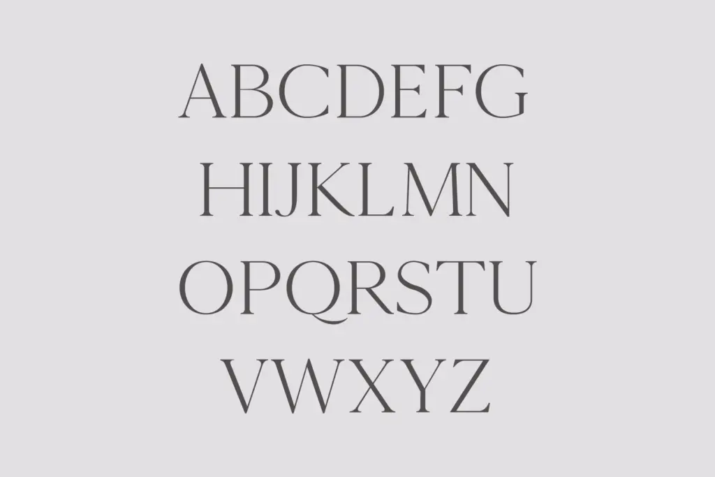
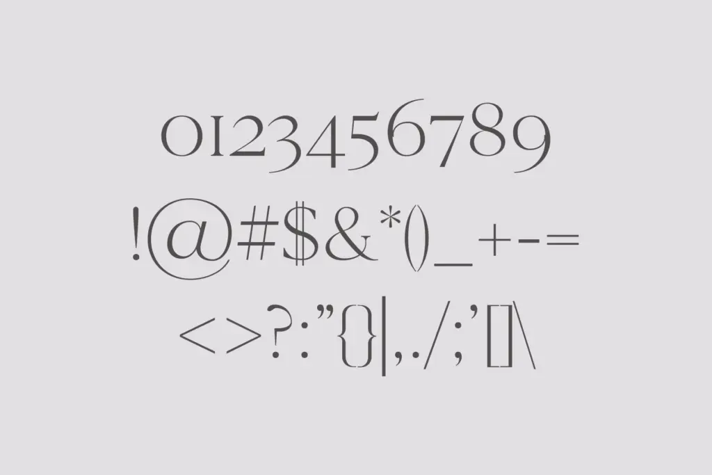
The set covers uppercase and lowercase Latin, numerals, and standard punctuation, along with Latin Extended-A support for accented Western European languages. That’s a practical range for branding and editorial work outside pure English-only projects, though it stops short of full multilingual coverage — no Cyrillic, no Greek, no extended diacritic sets beyond Latin Extended-A. There’s nothing here in the way of ligatures, alternates or discretionary swash characters, which is worth flagging: this is a font family built on weight variation rather than stylistic depth. If you’re expecting the kind of contextual alternates that give hand-lettered or script-adjacent serifs their personality, Cammron doesn’t offer that layer.
Delivered in TTF, OTF and web font kit formats, it’s set up to move straight into a design system without conversion headaches, which matters more in practice than any amount of glyph trivia.
Use cases
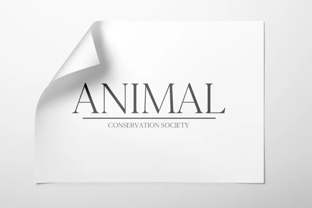
Cammron’s natural home is short-form and headline-scale text: logotypes, magazine mastheads, poster type, packaging call-outs, invitation headers. The contrast and open counters hold up cleanly at large sizes, and the four-weight spread gives a designer enough room to build a hierarchy — Light for a subtitle, Bold for the anchor word — without reaching for a second typeface. At small sizes, the stroke contrast starts to work against it; thin hairlines lose crispness in print at low resolution and can flicker on screen, so this isn’t a font to set running text in. Pairing it with a script or handwriting face, as the brief suggests, plays to its strength as a formal counterpoint rather than asking it to do everything alone. For branding work, editorial headers, and invitation suites where a confident, slightly old-fashioned serif is the goal, Cammron does the job cleanly. For anything requiring body-text stamina or a wide language footprint, look elsewhere.
What we liked, and what we didn’t
Strengths
- Four distinct weights give real hierarchy options without needing a second typeface
- Open counters and generous x-height keep it legible at poster and headline scale
- Delivered in TTF, OTF and web kit formats ready for immediate use
Trade-offs
- No ligatures or alternate characters, so it reads as functional rather than characterful
- Stroke contrast makes it unsuitable for body text or small-size print
Cammron is a competent display serif with a useful four-weight spread, best suited to headlines, logotypes and short branding copy. It lacks the alternate glyphs and extended language support that would make it stand out, and its contrast limits it firmly to large sizes.
Verdict

Tantype reviews typefaces in depth — every font is tested in real branding, editorial and screen layouts before a word gets written. 555+ fonts reviewed and counting.