
Pavilion Serif: a single-weight editorial serif for headlines and short copy
Design style
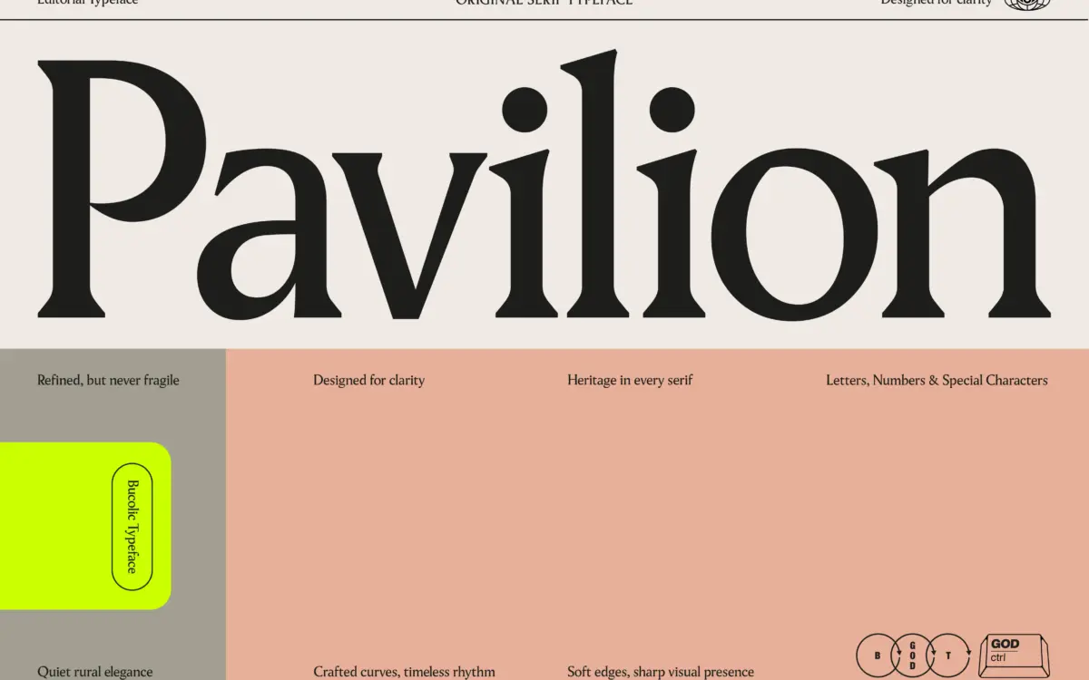
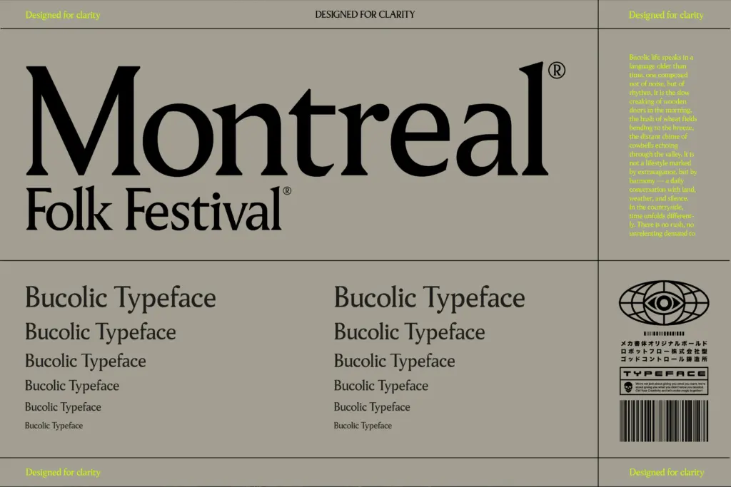
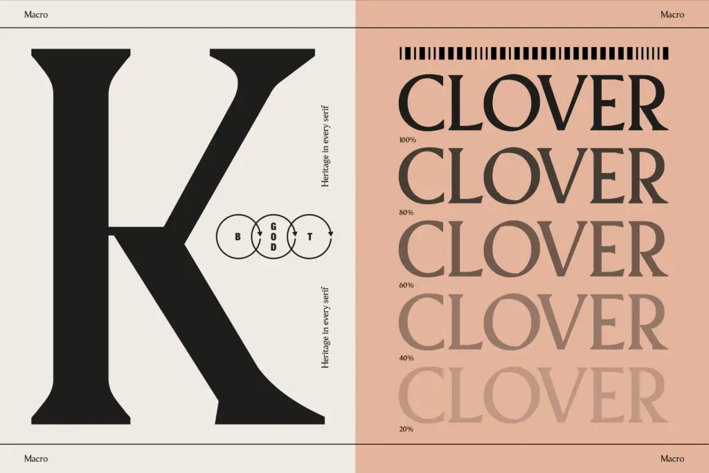
Pavilion sits in the contemporary editorial-serif lane: moderate contrast, blunt-ish terminals, a structure that reads as tidy rather than expressive. It doesn’t lean hard into any one historical model — no bracketed slab weight, no old-style calligraphic swing — which gives it a slightly generic quality but also makes it easy to place next to other design elements without fighting them. The uppercase carries most of the personality: the strokes are firm and evenly weighted, with a confidence that reads well at large sizes without tipping into heaviness. Lowercase forms are calmer, built around a generous x-height that keeps short blocks of text legible rather than fussy.
It’s a one-weight release. That’s worth stating plainly because it shapes everything else about how this font behaves. There’s no light companion to soften a subhead, no bold to anchor a headline against body text set in the same family. What you get is a single register, and the design has to do all its work — from display to caption — inside that one register.
Character set and features
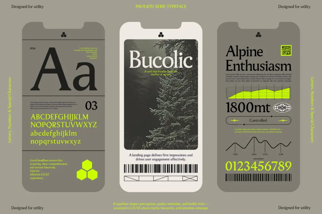
The set is compact: 215 characters covering uppercase, lowercase, numerals, and standard punctuation, plus what the seller describes as special characters. That’s enough for setting headlines, pull quotes, and short editorial copy in common Latin-script languages, but there’s no indication of extended language support, ligatures, alternates, or small caps. Buyers working in multilingual contexts or needing typographic extras like old-style figures or discretionary ligatures should treat this as a plain, no-frills character set rather than a feature-rich family.
The punctuation and quote marks are worth checking on your own layout before committing — the seller flags quotes as a use case, and pull-quote setting is genuinely a strength here, since the serif’s moderate contrast holds up cleanly at the larger sizes quotes tend to use. But with only one file format per weight and no italic, there’s no built-in way to add emphasis within a paragraph other than color or size tricks in your layout software.
Use cases
This is a headline-and-short-copy font first. It reads well in magazine-style titles, pull quotes, packaging call-outs, and branding lockups where you need a serif with a bit of editorial polish but don’t need it to disappear into long paragraphs. The x-height and rhythm the seller praises for body text are real, and it will hold up in a few paragraphs of set copy — but without a bold or italic, using it as your actual body typeface for anything longer than a page means you lose the usual tools for hierarchy and emphasis.
Pair it with a workhorse sans or a more utilitarian serif for body text and let Pavilion carry the mastheads, headers, and quote callouts. For logo work and short branding marks, its evenness and lack of stylistic flourish are actually assets — it won’t compete with a wordmark or a badge design. Treat it as a display and accent tool rather than a full editorial system, and it performs exactly as advertised.
What we liked, and what we didn’t
Strengths
- Even, confident uppercase that holds up well at large display sizes
- Generous x-height keeps short paragraphs and pull quotes readable
- Neutral enough in style to slot into varied editorial and branding layouts
Trade-offs
- No bold, italic, or alternate weights limits typographic hierarchy within a single family
- Compact 215-character set with no visible small caps, ligatures, or extended language support
Pavilion Serif is a competent, tidy editorial serif that does headlines and pull quotes well but asks a lot of a single weight. Without a bold or italic, it's better used as an accent typeface than a full-system body font. Good for branding marks, magazine titles, and short-form display work.
Verdict

Tantype reviews typefaces in depth — every font is tested in real branding, editorial and screen layouts before a word gets written. 555+ fonts reviewed and counting.