
Portal: a thin cut-serif display face for invitations and headers
Design style
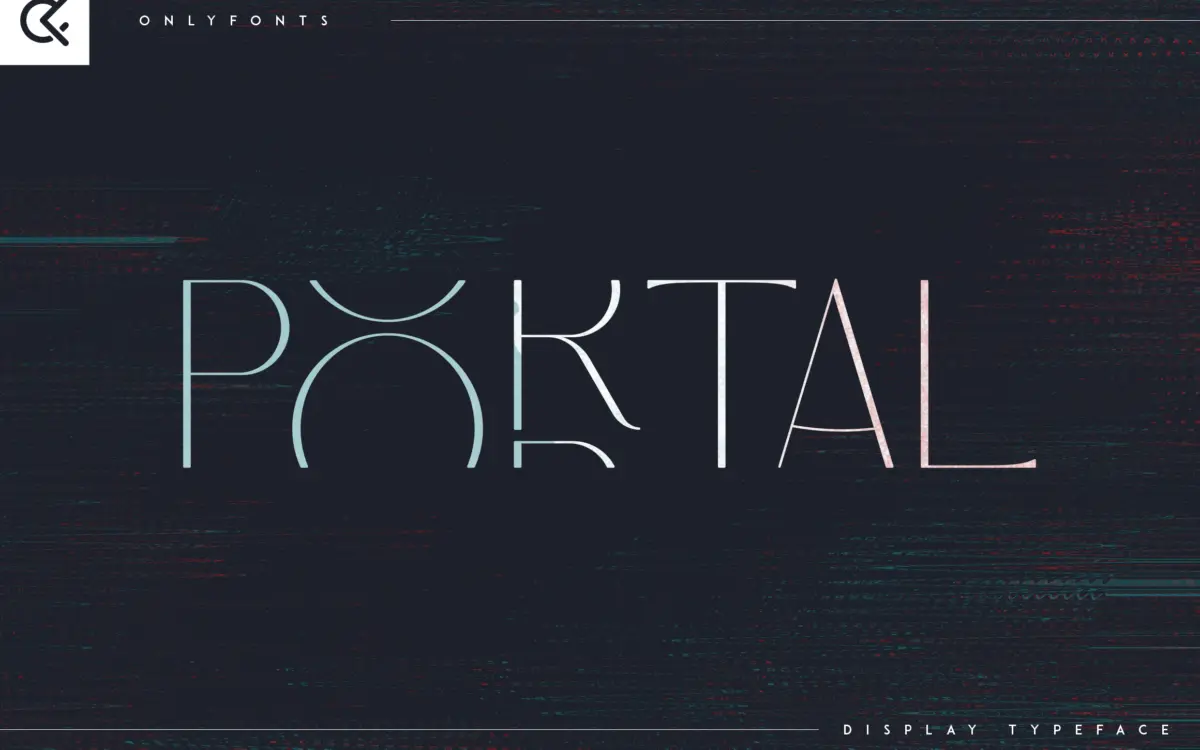
Portal belongs to the current wave of thin serif display faces built around fine strokes and sharp, almost incised terminals — the kind of letter that looks cut into a surface rather than drawn with a pen. The contrast is high: hairline strokes pair with thicker verticals in a way that gives the letters a jewelled, decorative quality rather than a workhorse one. It comes in regular and italic, and the italic leans more ornamental, with a slight forward slope and narrower counters that push the whole thing further into display territory.
The serifs themselves are the personality here — long, tapering, occasionally bracketed in a way that recalls engraving plates or letterpress specimen sheets rather than a text serif. It’s a font with a clear point of view, but that point of view is narrow. This is not a face built for restraint; it’s built to be noticed at a glance.
Character set and features
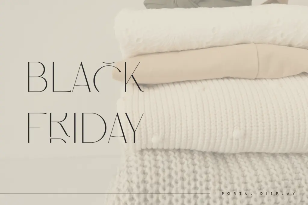
Portal ships as uppercase only, with numerals, punctuation and a set of symbols rounding out the character set — there’s no lowercase to speak of, which immediately tells you how it’s meant to be used: as a headline, a monogram, a single word set large, not as a paragraph face. The seller notes multilingual support, which extends the uppercase set to accented characters, useful for European-language branding work without needing a second font.
Because the letterforms are so thin, spacing matters more than usual. At smaller sizes the hairlines start to disappear or fight with background textures, so this is a face that wants generous tracking and a clean, high-contrast surface behind it — white space, not busy imagery. It’s listed as Canva-friendly and needs no special software to access the standard characters, which matters if you’re not comfortable digging through a glyph panel for alternates.
Use cases
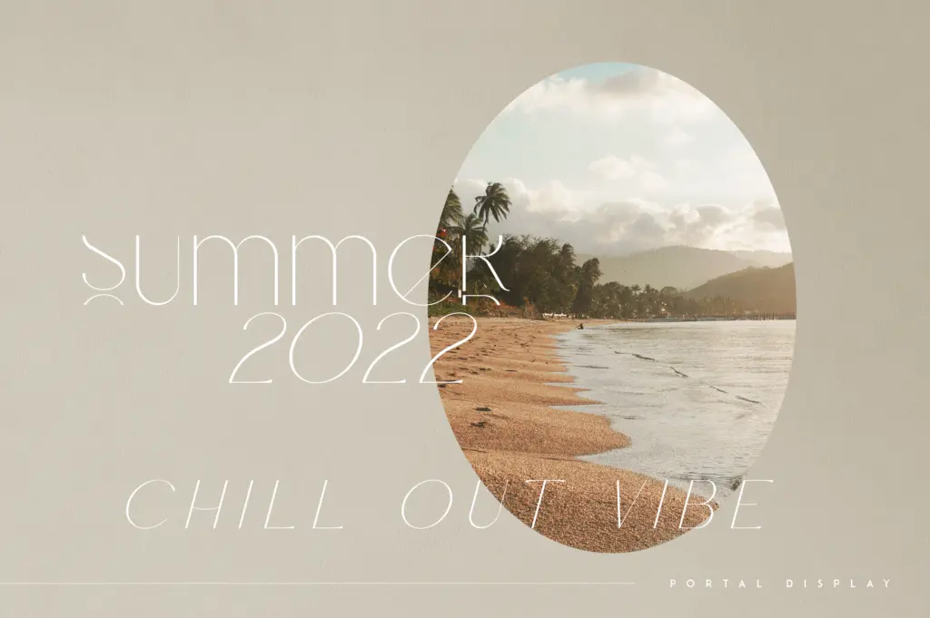
Portal reads best as a short-word display piece: a wordmark, a monogram, a single line on an invitation or a packaging label. The seller’s suggested applications — branding, home-ware, product packaging, magazine headers — all share a common thread: large sizes, minimal competing text, and room to let the thin strokes breathe. Wedding stationery is an obvious fit too, since the combination of fine serifs and an ornamental italic gives it the formal, engraved feel that invitation designers tend to reach for.
It’s less suited to anything that needs a full sentence set small — body copy, captions, dense signage — because the uppercase-only set and delicate strokes simply weren’t drawn for that job. Treat it as a specialist headline font rather than a flexible family, and it does its narrow job well.

What we liked, and what we didn’t
Strengths
- The tapering, incised serifs give it a distinct engraved character rather than a generic thin-serif look.
- Multilingual accented uppercase makes it usable for European-language branding without extra work.
- Canva compatibility lowers the barrier for quick invitation or packaging mockups.
Trade-offs
- Uppercase-only character set rules out any use requiring a matching lowercase or running text.
- The fine hairlines lose definition at small sizes or against busy backgrounds, limiting it to large, clean placements.
Portal is a decorative, thin-stroked serif built for short bursts of large type — wordmarks, invitations, packaging labels. It has real character in its cut-serif detailing, but the uppercase-only set and hairline strokes narrow its usefulness considerably.
Verdict

Tantype reviews typefaces in depth — every font is tested in real branding, editorial and screen layouts before a word gets written. 555+ fonts reviewed and counting.