
Classical: a vintage serif with deliberately uneven proportions
Design style
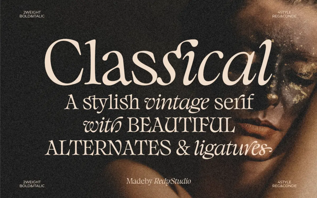
Classical leans into the irregularities that old metal type used to carry as a matter of course. The ascenders, descenders and x-height are not tuned to a tidy ratio; letters sit with a slight imbalance that reads as handset rather than machine-drawn. It is a stylistic choice rather than a flaw, and it gives the face a worn, editorial character that a more disciplined revival serif would sand away.
The serifs themselves are bracketed and a touch heavier than you’d find in a transitional text face, which keeps the imbalance from tipping into fragility. Stroke contrast is moderate — enough to give the letters some swing at display sizes, not so much that thin strokes vanish when the type gets small. It reads as a display-leaning serif with vintage intent rather than a working text face that happens to look old.
Character set and features
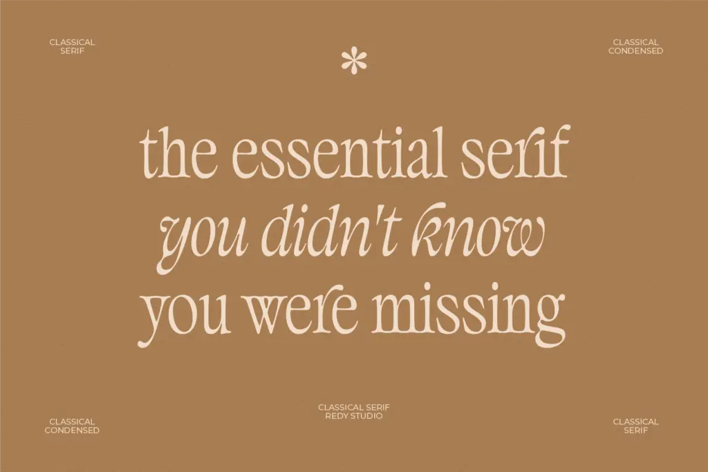
The set includes alternative characters and ligatures accessed through OpenType features, along with multilingual support. The alternates are where the personality lives — swapped terminals and connecting strokes let you push individual words further into the retro-label register without touching the base letterforms elsewhere in a layout. Ligatures do similar work on a smaller scale, smoothing over a few of the more awkward letter pairings that come with any deliberately irregular design.
Because the skeleton is uneven by design, tracking matters more here than in a standard serif. The seller’s own advice to adjust letter spacing is worth taking seriously — tightened up, the imbalance can look cramped; opened out, it settles into the kind of loose, confident spacing you see on old packaging and shopfronts. This is a font that rewards a bit of manual kerning attention rather than one you drop in at default settings and walk away from.
Use cases
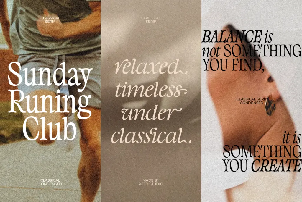
This is a display and short-copy face, not a paragraph setter. The uneven proportions that make single words or short lines interesting are the same thing that would make a page of body text tiring to read — the irregularity accumulates instead of settling into rhythm. Keep it to headlines, logotypes, invitation lines, packaging copy, and the kind of poster or label work where a handful of words carry the whole composition.
Branding work suits it particularly well: the alternates give a mark room to feel custom without commissioning custom lettering, and the vintage inflection fits categories that already trade on heritage cues — food and drink, craft goods, apparel. Wedding stationery is another reasonable fit, especially for a couple wanting something with more edge than a conventional script pairing. On web headers or T-shirt graphics it holds up fine at large sizes; just don’t ask it to do the job of a body-copy face anywhere in the same layout.
What we liked, and what we didn’t
Strengths
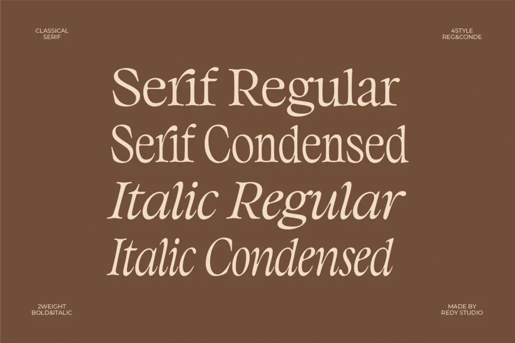
- Deliberately uneven proportions give it a handset, vintage feel rather than a generic revival look
- Alternate characters and ligatures let individual words feel custom without extra drawing
- Holds up well at large display sizes on packaging, posters and branding marks
Trade-offs
- The irregular skeleton makes it unsuitable for body text or long-form setting
- Default spacing is tight and the font needs manual tracking adjustments to look its best
Classical trades a tidy skeleton for character, and mostly it pays off at display sizes. It's a font for headlines, logotypes and short vintage-flavoured copy, not for setting paragraphs, and it needs a little spacing attention to look its best.
Verdict

Tantype reviews typefaces in depth — every font is tested in real branding, editorial and screen layouts before a word gets written. 555+ fonts reviewed and counting.