
The Minimalist Font Free Download
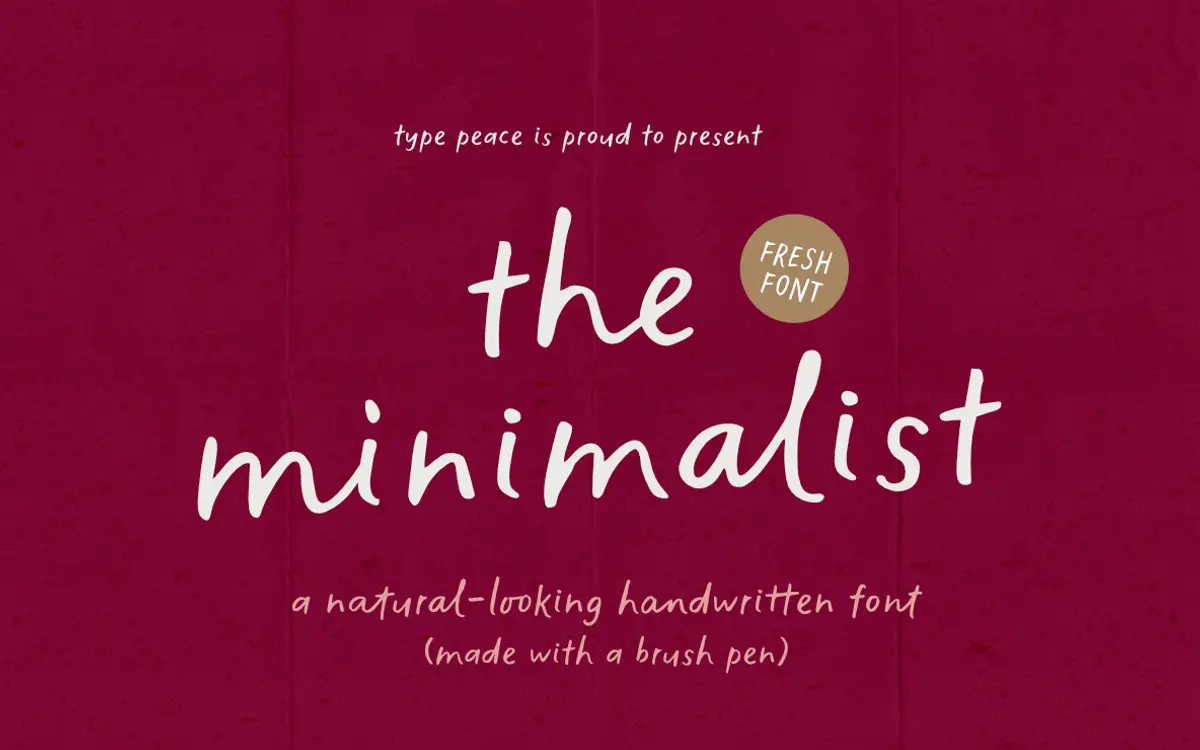
Is The Minimalist free to download?
The Minimalist is a commercial font sold on Creative Market, so the full version needs a paid license. Get it from the official listing: The Minimalist font download.
Need something free? These handwritten fonts from Google Fonts are free for personal and commercial use:
Design style
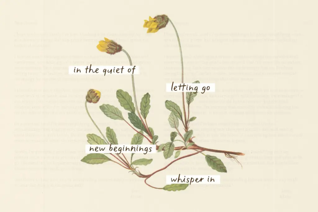
The Minimalist is drawn from real brush pen strokes, and it shows in the way the letters taper and catch at the edges rather than running in clean mechanical lines. The tilt is gentle, the baseline is relaxed rather than ruler-straight, and the overall feel sits closer to a quick note written with a decent brush than to formal calligraphy. There’s visible texture at the stroke edges — small breaks and inconsistencies that read as ink rather than vector, which is the point of this kind of font and it’s handled with restraint here rather than overdone grit.
What separates it from a lot of single-style handwritten fonts is that every letter exists in two drawn versions, swapped in automatically when identical letters sit next to each other. That’s a small technical decision with a real payoff: double letters are one of the fastest ways a handwritten font gives itself away as a font, and this one has a built-in fix for it. The name fits the execution — it’s not a loud, expressive script, it’s a calm, legible hand with just enough looseness to avoid looking typed.
Character set and features
The package includes two complete fonts, a default Regular and an Alt set accessed through a stylistic set, plus numerals, punctuation and symbols across roughly 700 glyphs. Multilingual support extends across Western, Central and South Eastern European character needs along with Vietnamese and some South American diacritics, so the font isn’t limited to plain English copy.
The OpenType feature set — standard and discretionary ligatures, stylistic sets, stylistic alternates — is where the font earns its keep. Beyond the automatic double-letter swap, you can manually mix glyphs from both fonts to break up repetition further, which matters a lot in a typeface built on a single handwriting style. Without that kind of variation, handwritten fonts tend to look suspiciously regular in longer passages; with it, word shapes stay more varied and the hand feels less like it’s tracing the same template twice. Getting the ligatures to fire does require an app that actually supports OpenType features properly — something worth checking before you build a layout around it.
Use cases
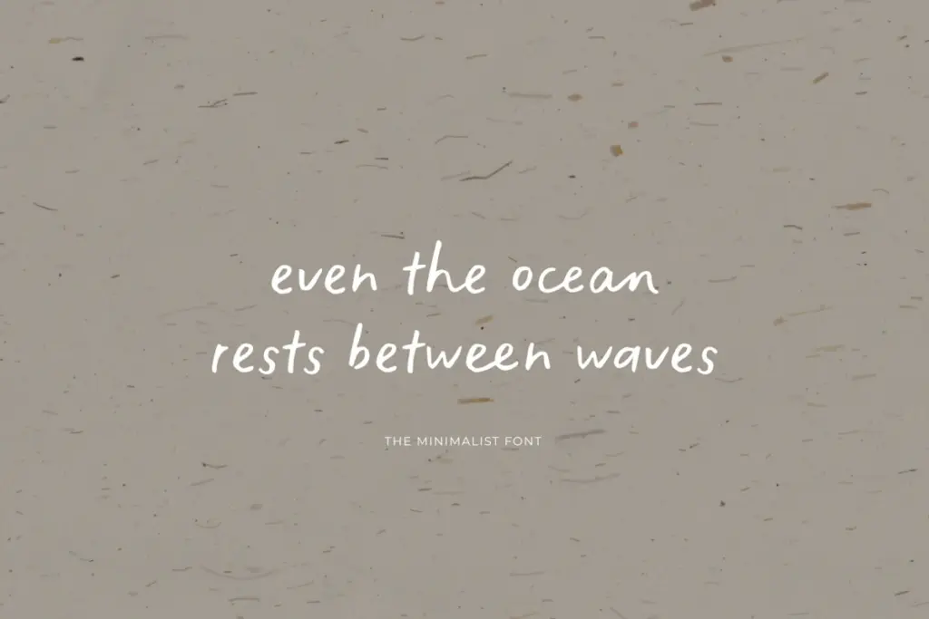
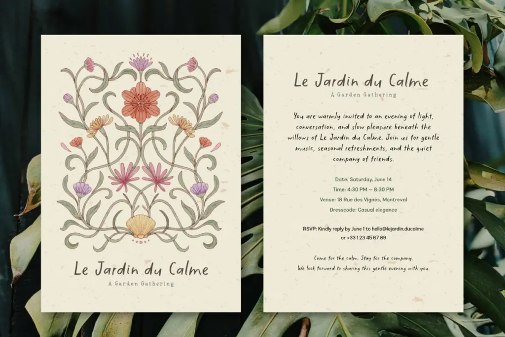
This is a font for short-to-medium runs of text where a personal, handwritten voice does real work: quote graphics, social posts, packaging call-outs, greeting cards, blog headers, the occasional pull quote in an editorial layout. The restrained texture means it won’t fight busy backgrounds the way a heavier brush script might, and the calm baseline keeps it readable at smaller sizes better than more expressive scripts typically manage.
It’s less suited to long-form body copy — handwritten fonts rarely are — and it’s not aiming for the elegance of a formal script, so weddings and luxury branding are probably the wrong brief for it. Where it earns its place is anywhere a brand wants to sound approachable and human without tipping into novelty: food packaging, casual branding, children’s or educational materials, Instagram captions turned into graphics. The alternate set and ligature logic make it genuinely more useful for that work than a single-style handwritten font would be.
What we liked, and what we didn’t
Strengths
- Automatic double-letter alternates genuinely reduce the repetitive look common to handwritten fonts
- Restrained brush texture keeps it legible at smaller sizes unlike heavier script faces
- Broad multilingual glyph support beyond basic Latin
Trade-offs
- Ligature and alternate features depend on software with proper OpenType support, which not all design tools offer
- Too plain-spoken for formal or luxury branding work where a more elegant script would fit better
The Minimalist does what a lot of handwritten fonts promise but few deliver: it avoids the obvious tell of repeated double letters through genuine alternate glyphs. It's calm rather than flashy, which suits casual branding and editorial accents better than big decorative display work. Not a font for long text or formal occasions, but a solid, well-built choice for its lane.

Tantype writes independent reviews of typefaces: what each font does well, where it falls short, what it suits, and where it is sold.