
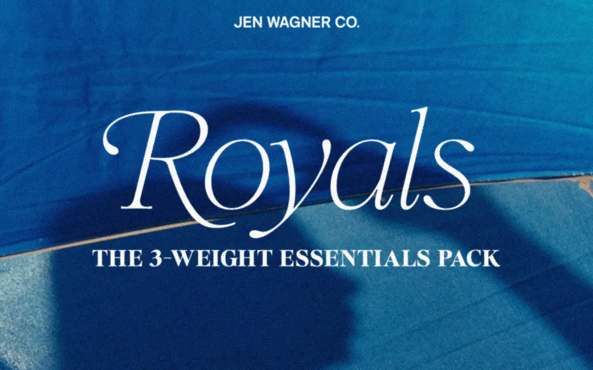
Royals Serif Essentials Pack Free Download
Is Royals Serif Essentials Pack free to download?
Royals Serif Essentials Pack is a commercial font sold on Creative Market, so the full version needs a paid license. Get it from the official listing: Royals Serif Essentials Pack download.
Need something free? These serif fonts from Google Fonts are free for personal and commercial use:
Design style
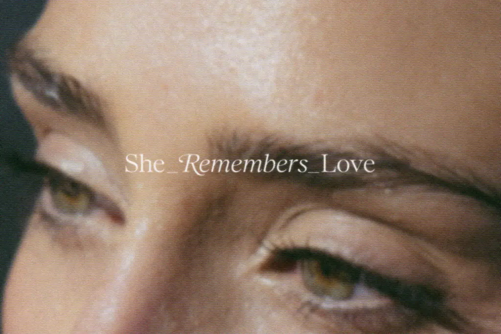
Royals Serif belongs to the current wave of soft-contrast serifs built for branding rather than long-form reading. The cap serifs are rounded rather than bracketed to a point, which takes the edge off what would otherwise be a fairly classical structure. Curves in the bowls and shoulders read as organic, not geometric, so letters like the lowercase a and g have a slight hand-finished feel even though the overall skeleton stays disciplined and upright. It’s a serif that wants to look composed rather than decorative, with restraint built into the drawing rather than added as an afterthought.
The italic is the more expressive half of the pairing. It’s soft in angle rather than aggressively slanted, and it carries enough calligraphic motion to work as a quiet counterpoint to the uprights without tipping into script territory. Across the three weights — Thin, Regular, Bold — the contrast between thick and thin strokes shifts proportionally, so the Bold doesn’t just look like a thickened Regular; it reads as its own statement weight, useful for a masthead or a single dominant word on a cover.
Character set and features
The pack covers numbers, punctuation, and Latin foreign-language characters, which is enough for most European-language branding jobs without needing a workaround. Swash alternates are available on capital B, D, E, F, K, P, R, giving a handful of words or monograms a flourish when the brand needs one accent letter rather than a fully ornamented wordmark. Used sparingly, these swashes are the difference between a plain logotype and one with a bit of personality; used across every capital in a line, they’ll fight each other for attention, so restraint matters here.
The kerning alternates built for the VA, Aw and similar combinations are a practical touch, particularly for anyone assembling type in Canva rather than a full type-aware layout tool, where automatic kerning isn’t always reliable. It’s a small inclusion but it solves a real, specific annoyance rather than a theoretical one.
Use cases
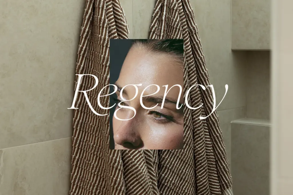
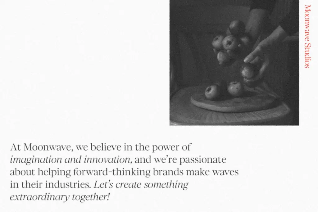
This is a display serif first. The soft serifs and rounded terminals that give it warmth at large sizes will blur together at body-copy sizes, so treat it as a header, title, or short-statement font rather than a paragraph setter. At 60pt and above — brand headers, product packaging callouts, cover lines, invitation headlines — it holds its shape well and the italic pairs comfortably against the uprights for hierarchy.
Given the three weights and their italics, it’s flexible enough to carry a brand’s full visual system: Thin for a subhead, Regular for a logotype, Bold for a standout statement, all drawn from the same hand so nothing feels mismatched. It suits boutique branding, editorial mastheads, wedding stationery, and social graphics where a few words need to look considered rather than loud. It’s less suited to anything requiring dense text or small-size legibility, where a companion text serif would do the heavier lifting.
What we liked, and what we didn’t
Strengths
- Rounded cap serifs and soft italics give it warmth without tipping into novelty
- Three weights with matching italics cover a full brand hierarchy from one family
- Built-in Canva kerning alternates solve a real layout annoyance for non-professional tools
Trade-offs
- Legibility drops off quickly below display sizes, so it's unsuitable for body text
- Swash alternates on only seven capitals limit how far the flourish can be pushed across a wordmark
Royals Serif Essentials is a competent, well-mannered display serif with enough personality in its swashes and italics to earn a spot in brand headers and short statements. It's not built for body copy and the swashes need a light hand, but as a three-weight header system it does its job cleanly.

Tantype writes independent reviews of typefaces: what each font does well, where it falls short, what it suits, and where it is sold.