
Hudson NY Pro: a redrawn display workhorse for sports and beverage branding
Design style
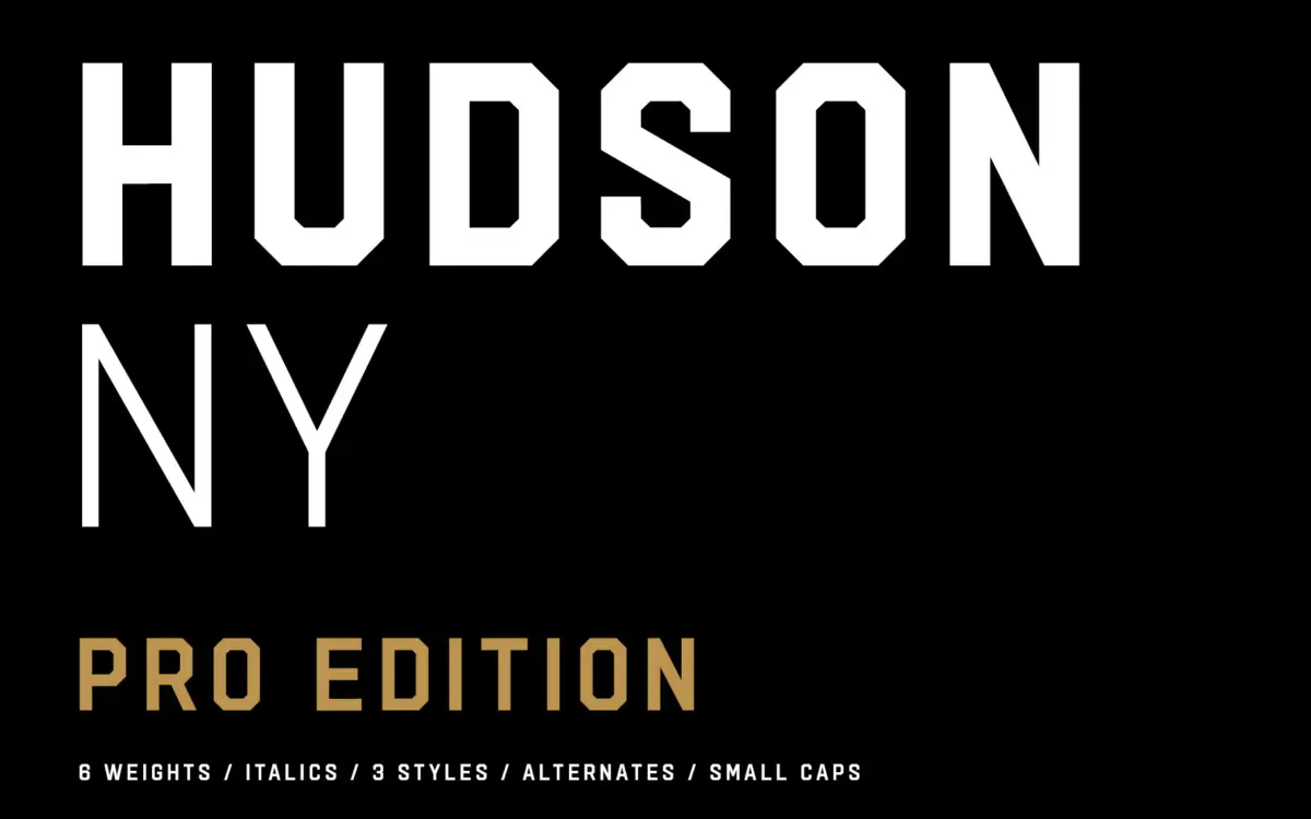
Hudson NY Pro is a display family built around condensed, high-contrast letterforms that lean toward vintage American sportswear and packaging references rather than anything Swiss or neutral. The Regular, Serif and Slab variants share the same underlying skeleton, so the family reads as one design wearing three different jackets rather than three unrelated typefaces bundled together. That shared structure is the smartest part of the redesign: it means a brand can move between a slab headline and a serif subhead without the letterforms fighting each other.
The drawing itself is confident but unapologetically blunt. Terminals are cut square, curves are kept tight, and the overall texture is dense — this is a typeface built to be set big, tracked tight, and looked at from across a room or a can label. It does not try to be quiet. There’s a directness to the forms that will read as either muscular or heavy-handed depending on the brief.
Character set and features
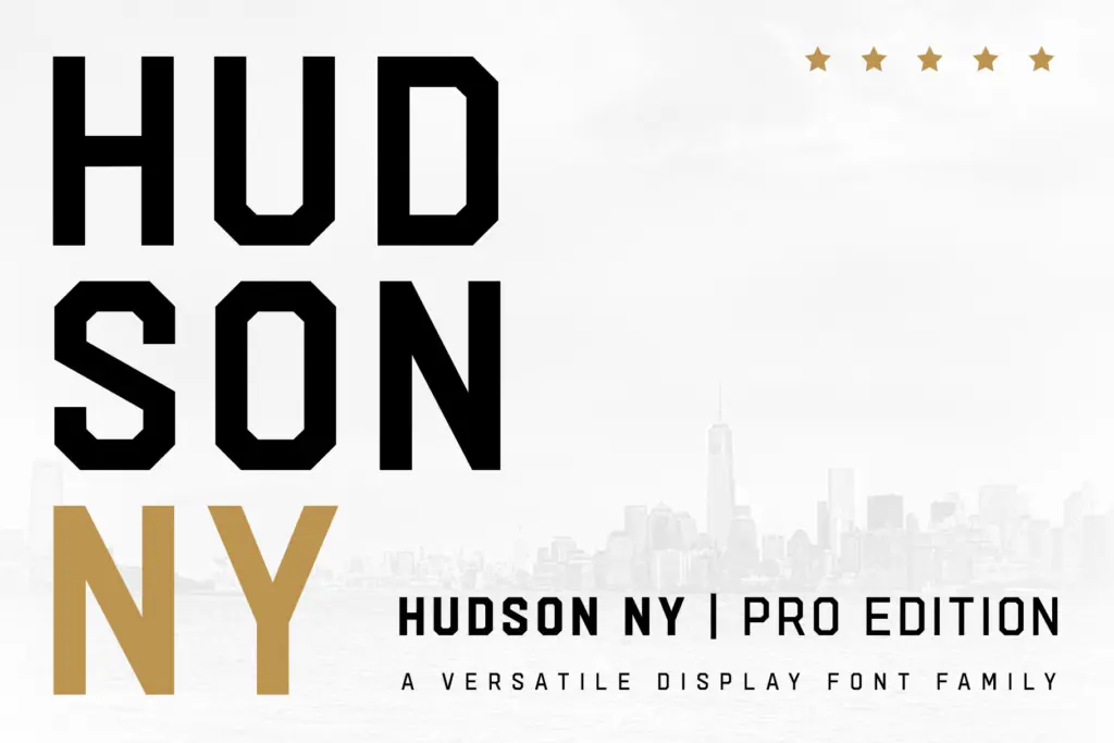
The Pro Edition’s real upgrade is depth rather than novelty. Six weights across each of the three styles, plus italics for all of them, gives a working range that the original Hudson NY didn’t have — you can now build a hierarchy within a single sub-family instead of reaching for a different typeface for body copy or captions. Small caps, stylistic sets and alternate glyphs round this out, letting a headline avoid the repetition that condensed display faces are prone to when a word repeats a letterform twice in six characters.
Dropping the press styles from the original family is a sensible edit. Distressed or textured display fonts tend to be used once for a hero moment and then abandoned because they don’t flex to smaller applications; cutting them in favour of six clean weights per style is a trade worth making if what you want is a family you’ll actually reach for more than once. The glyphs have been redrawn rather than patched, which shows in the italics — they carry genuine slant and construction rather than a mechanically obliqued clone of the roman.
Use cases
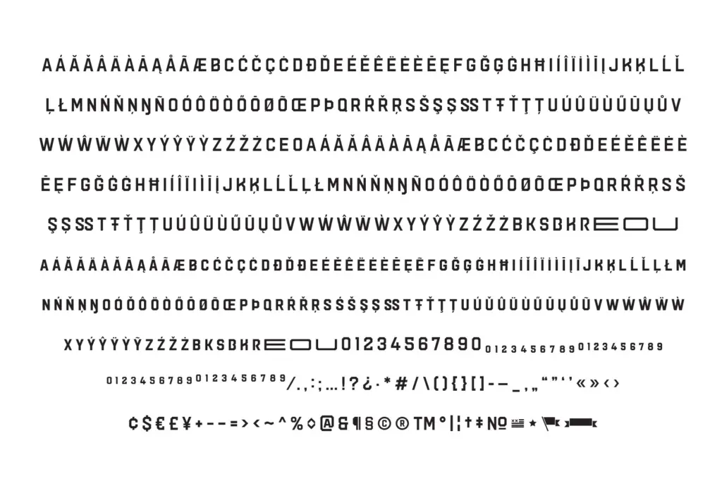
This is a logo and packaging typeface first. The condensed proportions and weight range suit beer and beverage labels, sports team branding, and any headline context where you need density and punch in a tight horizontal space — a can label, a jersey number, a magazine masthead. The slab cut works well for anything that wants a retro-athletic feel without going full varsity cliché, and the serif cut softens that same skeleton for editorial or menu use.
It is less suited to long-form text or anything that needs to breathe — the tight spacing and heavy contrast start to fight the reader past a headline or a short block of caption copy. Treat it as a display and branding tool, pair it with a plainer text face for body copy, and it earns its keep. Used at small sizes in body settings, though, the contrast and tight fit will work against legibility rather than for it.
What we liked, and what we didn’t
Strengths
- Regular, Serif and Slab styles share one skeleton, so they mix cleanly in a single brand system
- Six weights plus italics per style give real hierarchy options that the original family lacked
- Alternates and stylistic sets help break up letter repetition in short condensed headlines
Trade-offs
- Tight spacing and heavy contrast make it unsuited to body text or long captions
- Dropping the press styles removes the textured option some buyers of the original may have wanted
Hudson NY Pro is a focused upgrade that trades novelty for usability, giving three coordinated display styles real weight range and alternates instead of gimmicks. It's built for headlines and labels, not paragraphs, and knows exactly what job it's for. Anyone doing sports or beverage branding will get more mileage from this edition than the original.
Verdict

Tantype reviews typefaces in depth — every font is tested in real branding, editorial and screen layouts before a word gets written. 555+ fonts reviewed and counting.