
Blackletter Fonts: 10 Best Blackletter Fonts, from Textura to Fraktur
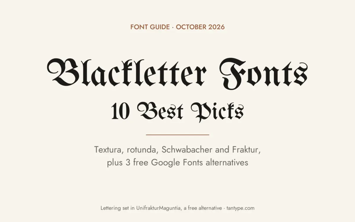
A blackletter font is a typeface based on the Gothic book hands of medieval Europe: narrow, dark letters built from broken, angular pen strokes. Most people call the style “Old English” or “Gothic”, and it has four main families: textura, rotunda, Schwabacher and Fraktur.
Our top three picks are 1456 GLC Gutenberg B42 PRO for an accurate textura modelled on Gutenberg’s Bible type, Cathdra for the classic Old English look, and ED Celandine for a pared-back modern blackletter that stays readable on logos and shirts. Every font in the main list is a commercial font sold on Creative Market; three free Google Fonts come further down.
Browse blackletter fonts on Creative Market Commercial fonts: our picks cost $12 to $34 for a desktop licence (October 2026)
What is a blackletter font?
Wikipedia describes blackletter (also “black letter”) as a medieval book hand of the Gothic family, later turned into typefaces. It was used across Western Europe from about the late 12th century until the 17th, and in German until 1941. The name contrasts these heavy letters with the lighter “white letter” humanist scripts of the time. Gutenberg printed his 42-line Bible in a textura type in the 1450s, so European printing began in blackletter.
The four main blackletter families
- Textura: the earliest and most formal style, with tall, narrow letters and diamond-shaped feet. The name comes from the Latin texo, to weave, after the page’s woven look. This is the style most people picture as Gothic.
- Rotunda: a rounder blackletter used mainly in Italy, with open bowls and fewer breaks in the curves. Its most common form was the littera bononiensis of 13th-century Bologna.
- Schwabacher: a rounded, lively German style. Wikipedia dates the oldest surviving Schwabacher printing to 1472; the Nuremberg Chronicle (1493), Dürer’s Apocalypse (1498) and Luther’s Bibles used it. Look for the crossed top of the lowercase g and an H that resembles an h.
- Fraktur: the German blackletter that replaced Schwabacher by the mid-16th century. In a Fraktur o, only the left side is broken, and the capitals are built from curly C- and S-shaped strokes. It stayed in everyday German use until the Nazi government banned it in 1941.
A fifth group, bastarda, mixes blackletter with cursive handwriting. Many modern fonts mix families freely.
Why blackletter is called “Old English”
“Old English” is a font name, not a historical style. According to MyFonts, Monotype’s Old English is a digital font made around 1990 and based on Caslon Black, cast by William Caslon’s foundry in England around 1760. Wikipedia notes that blackletter is sometimes called Old English lettering but has nothing to do with the Old English language, which predates it by centuries.
Today you’ll see blackletter on newspaper nameplates (Wikipedia lists The New York Times and the Los Angeles Times), diplomas, beer labels, metal album covers, streetwear and tattoos.
The best blackletter fonts at a glance
- 1456 GLC Gutenberg B42 PRO: the most faithful textura, with Latin abbreviations.
- Cathdra: classic Old English capitals over a heavy textura lowercase.
- CS Ruslan Drawn: ornamental Old English with a hand-drawn edge and an italic.
- 1483 Rotunda Lyon: a historical rotunda with long s and old ligatures.
- Ronna: a readable hand-drawn rotunda, and the cheapest pick.
- 1538 Schwabacher: a Reformation-era Schwabacher made for print.
- Fraktur Blackletter Gothic Font: a calligraphic Fraktur with long flourishes.
- Disarm TM: an eroded Fraktur with alternate capitals.
- Doomer TM: a photocopied-looking blackletter for posters and merch.
- ED Celandine: a minimal modern blackletter for logos and apparel.
Best blackletter fonts on Creative Market
Prices are for a one-seat desktop licence as listed on Creative Market on October 16, 2026; sales and price changes are common, so check the listing. Package details come from each designer’s listing.
1. 1456 GLC Gutenberg B42 PRO
Gilles Le Corre of GLC Foundry based this textura on the “B42” type of Gutenberg’s Latin Bibles. It is the most historical font here: dense, upright letters with diamond-shaped feet, a long s, the twisted x of the originals, and a large set of original ligatures and Latin abbreviations. W and J didn’t exist in Gutenberg’s type, so the designer drew them. The listing says it covers Western (including Celtic), Central and Eastern European, Baltic and Turkish languages. Choose it for book covers, certificates, period film titles and anything that should look like an early printed page. It costs $34.
See 1456 GLC Gutenberg B42 PRO on Creative Market
2. Cathdra
Cathdra, by Indotype Foundry (December 2025), is what most people mean by an Old English font: capitals with hairline curls and spurs over a heavy textura lowercase with pointed feet. Indotype calls it “a powerful and atmospheric Gothic Blackletter typeface,” and the cover image lists 204 glyphs, so expect a display font with basic accents rather than a historical character set. Use it for nameplates, labels, posters and certificates where you want the traditional look without the rough texture of the hand-drawn picks below. It costs $22.
See Cathdra on Creative Market
3. CS Ruslan Drawn
Craft Supply Co. calls CS Ruslan Drawn an “Ornamental Old English Display Font.” Its heavy capitals carry spurs and split strokes, and the outlines have a slightly uneven, inked edge, so words look lettered by hand. It comes in Regular and Italic, which is rare in blackletter, with upper and lower case, numerals, punctuation and accented letters. Its PUA-encoded extras can be pasted into apps without OpenType support. Use it for book and game titles, band posters and labels. It costs $20.
See CS Ruslan Drawn on Creative Market · Read our CS Ruslan Drawn review
4. 1483 Rotunda Lyon
A second GLC font, and the easiest way to get a real rotunda. The listing explains that a Lyon printer used a Venetian rotunda type in 1483 for a French translation of the Aeneid, and this font follows it “with historical forms and ligatures enriched with accented letters.” Compared with the Gutenberg textura, the bowls are rounder and the letters wider, so text looks lighter and reads more easily. The glyph chart shows a long s, ligatures such as ſt and ff, and accented capitals. Use it for menus, wine labels and short passages with an Italian or medieval feel. It costs $20.
See 1483 Rotunda Lyon on Creative Market
5. Ronna
Evgeniy Berd of ZenLettering describes Ronna as a “handmade Rotunda” that stays easy to read while keeping “that dark Blackletter feel.” The previews show broad, round lowercase letters, closer to a heavy pen-written hand than to a printed textura. It is a single font, and the listing doesn’t mention alternates or ligatures. The designer suggests tattoo sketches, logos, street signs and book covers. At $12 it is the cheapest pick, and a safe choice when your text runs longer than a few words.
6. 1538 Schwabacher
GLC’s Schwabacher follows a type used in Wittenberg in 1538 to print a German pamphlet by Johannes Kymeus. The designer kept the long s and the special German letters, added missing and accented characters, and the previews show historical alternates and ligatures. Le Corre says it stays “clear and easy to read from 8 or 9 points” and was designed for print, which is unusual for a blackletter. Choose it for German text, beer labels, Reformation-themed material and short paragraphs. It costs $22.
See 1538 Schwabacher on Creative Market
7. Fraktur Blackletter Gothic Font
Roman Korolev of kaer_shop based this Fraktur on a 1695 copybook by Trautner of Nuremberg. It is the most calligraphic font here: tall, sharply broken lowercase with long ascenders, and capitals that end in hairline loops and swirls. The listing includes upper and lower case, numerals, punctuation, ligatures and multilingual characters. The capitals make fine initials on their own, but in a row they turn into ornament, so set words in upper and lower case. Use it for wedding and certificate headings, labels and bookplates. It costs $24.
See Fraktur Blackletter Gothic Font on Creative Market
8. Disarm TM
Leo Karhunen of Type Mania describes Disarm as “a Fraktur with irregular rhythm and distressed details,” and one preview admits it is closer to an 18th-century Fraktur than a medieval hand. The edges look eroded and the letters bounce slightly, like old print. Stylistic Set 2 swaps in alternate capitals, and files come in OTF, TTF and WOFF2. The designer warns of “limited languages”: the listing names only Basic Latin and Euro, so check your accents first. Use it for folk-horror posters, craft beer and zines. It costs $19.
See Disarm TM on Creative Market
9. Doomer TM
Doomer, also from Type Mania (December 2025), is “a blackletter font with soft edges and multi-xerored character”: the strokes look photocopied several times over. Two stylistic sets alternate automatically when contextual alternates are on, so repeated letters don’t look identical. It supports Basic Latin, Western and Central European and Pan-African Latin, in OTF, TTF and WOFF2. The skull-and-bones previews show where it fits: metal and punk flyers, band merch and skate graphics. It costs $29.
See Doomer TM on Creative Market · Read our Doomer TM review
10. ED Celandine
Eko Setiawan of Emyself Design drew ED Celandine (2020) as a modern, minimal blackletter. It has full, rounded bowls, wedge-shaped stroke ends, a generous x-height and plain, compact capitals, which makes it one of the easiest blackletters to read on a logo or shirt. You get Regular and Outline in OTF, TTF and WOFF. Our review counted 364 glyphs in the Regular, with ligatures, stylistic alternates and 16 PUA-encoded extras for Canva and Cricut. The designer suggests posters, branding, logos, apparel, cards and tattoos. It costs $15.
See ED Celandine on Creative Market · Read our ED Celandine review
How to choose a blackletter font
- Match the family to the mood: textura (Gutenberg B42, Cathdra) looks formal and churchly; rotunda (Rotunda Lyon, Ronna) softer and Mediterranean; Schwabacher German and folksy; Fraktur literary and ornate.
- Never set it in all caps: blackletter capitals were drawn to start a word, not to stand in a row. Use upper and lower case for anything people need to read, and save a lone capital for a drop cap or monogram.
- Keep it short: headlines, names and short phrases. For anything longer than a sentence, choose 1538 Schwabacher, Ronna or ED Celandine.
- Logos and shirts: heavy, simple forms such as ED Celandine, Cathdra and Doomer hold up in embroidery, screen printing and vinyl. Hairline flourishes fill in or break up at small sizes.
- Historical features: the long s and ligatures in the GLC fonts need OpenType-aware software such as InDesign or Illustrator.
Old English capitals are also at the heart of Chicano tattoo and cholo lettering; see our roundup of the best Chicano fonts for that style. For hybrids, see our reviews of Dark Reborn (blackletter and serif), Runholdy (blackletter and sans) and Baroness Beatrice, a softened “neogothic” display face.
Free blackletter fonts
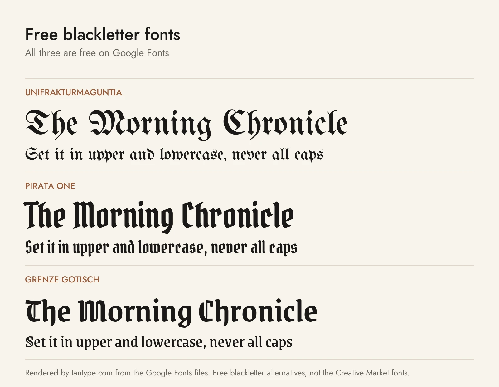
These three Google Fonts use the SIL Open Font License, which allows personal and commercial use, including logos and products you sell.
- UnifrakturMaguntia: a traditional Fraktur based on Peter Wiegel’s Berthold Mainzer Fraktur, which follows a 1901 typeface by Carl Albert Fahrenwaldt. It has German ligatures such as ch, ck and tz, and is the closest free match to the Fraktur Blackletter Gothic Font, without the long flourishes.
- Pirata One: a simplified, condensed textura by Rodrigo Fuenzalida and Nicolas Massi, made to work on screens. It is far less ornate than Cathdra or Gutenberg B42 and handles headings and short paragraphs.
- Grenze Gotisch: a blackletter version of Omnibus-Type’s Grenze, with weights from Thin to Black. Its lowercase is close to an ordinary roman, so it reads more like ED Celandine than a historical font.
Most “free blackletter font” downloads on other sites are personal-use demos or files uploaded without the designer’s permission. Neither covers a logo or a product you sell.
Licensing: personal vs commercial use
Creative Market’s Desktop licence lets a font appear in “unlimited commercial and personal projects,” including physical products, social media, packaging and paid ads.
- Seats: buy one seat per person who uses the font.
- Websites and apps: the Desktop licence allows the font online only as an image. Live web text needs a Webfont licence; apps and ebooks need App or E-pub licences.
- Print on demand: only the licence holder may use the font to make the finished product, so customers can’t type their own text in it on your store.
- Logos: Creative Market allows a font in a logo if it is modified and isn’t the dominant element, and you must disclaim it when you register a trademark.
This is a summary, not legal advice. Read the licence on each product page before you buy.
Blackletter font FAQ
Is it “blackletter” or “black letter”?
Both. Wikipedia gives blackletter, black letter and black-letter as accepted spellings, and “Old English font” and “Gothic font” describe the same style.
What does the blackletter font alphabet look like?
The lowercase is narrow and built from straight, broken strokes, so m, n, u and i are made of near-identical vertical strokes. Historical fonts add a long s (ſ), an r rotunda that looks like a 2, and ligatures such as ch, ck and tz. In many older Fraktur fonts, capital I and J share one shape. For these features, choose 1456 GLC Gutenberg B42 PRO, 1538 Schwabacher or UnifrakturMaguntia.
Why are blackletter capitals so hard to read?
Blackletter capitals are decorative shapes made of loops and curls, and several look alike to modern readers. All caps are slower to read in any typeface because, as typographer Ilene Strizver explains, “word shapes are lost.” Blackletter makes that worse. Linguist Daniel Bunčić notes that old Fraktur Bibles didn’t set even sacred words in all caps, because “all-caps Fraktur words are basically illegible”; they capitalised the first two letters instead. Write “Brewing Co.”, not “BREWING CO.”
What is the best blackletter font?
For historical accuracy, 1456 GLC Gutenberg B42 PRO. For the classic Old English look, Cathdra. For a logo or shirt that must be read quickly, ED Celandine.
Is there a free blackletter font for commercial use?
Yes. UnifrakturMaguntia, Pirata One and Grenze Gotisch are free on Google Fonts under the SIL Open Font License, which allows commercial use.
