
Outline Fonts: 10 Best Outline, Inline and Layered Fonts for Signs, Posters and Cricut
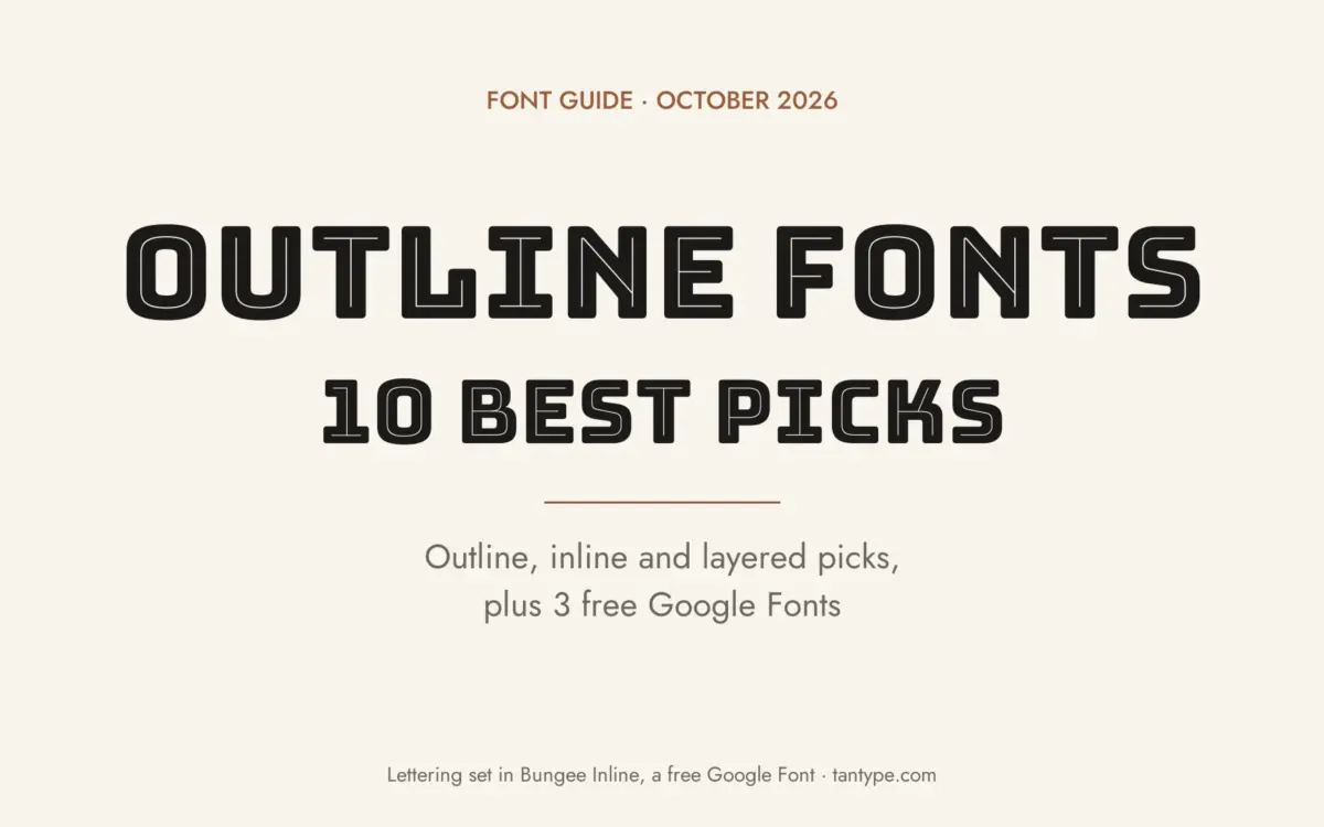
An outline font draws each letter as a contour with the inside left open, so the paper, a photo or a second colour shows through. Close relatives are inline letters, with a thin line cut through the stroke, and layered fonts, where fill, outline and shadow files stack into one multicolour word.
Our top three picks are Ontario, a four-layer all-caps set from Jen Wagner Co; Singolare, a large geometric family from Latinotype with three outline cuts and an inline; and Howdy Handsome, a Western duo with dozens of stackable layers. Every font on the main list is a commercial font sold on Creative Market. Three free Google Fonts options are further down.
See Creative Market’s outline font guide Commercial fonts: regular desktop prices below were checked on October 16, 2026
What is an outline font?
In design, an outline font is a typeface whose letters are drawn as hollow shapes: a line traces the edge of each character and the middle stays empty. Designers group it with a few close relatives:
- Outline (hollow): only the contour is printed.
- Inline: the letter stays solid, with a thin light line cut through the middle of each stroke.
- Open-face: an older foundry term for letters with a white line cut into them, often set to one side so the letter looks engraved or lit from one direction.
- Multiline: several parallel lines build each letter, the look of neon tubing and 1930s shop signs.
- Layered (chromatic): matching files, such as fill, outline, inline and shadow, that line up exactly and are stacked in different colours.
The styles are old. Wikipedia’s article on display typefaces shows a 1796 poster with an inline initial and an 1818 Welsh poster set in an inline “fat face”. Wood type for 19th-century posters pushed the idea further. According to Wood Type Research, chromatic types, designed to print one letter in two or more colours, were first made in wood by Edwin Allen and shown in George Nesbitt’s 1841 Fourth Specimen of Machinery Cut Wood Type. William H. Page showed chromatic designs in 1859, and his firm’s 1874 Specimens of Chromatic Wood Type, Borders, Etc. remains the best-known catalogue of the genre.
The style returned between the wars. Wikipedia notes that inline sans serifs “were also very popular in lettering of the inter-war period.” Sol Hess drew Broadway Engraved, an inline cut of Broadway, for Lanston Monotype in 1928. A. M. Cassandre’s Bifur for Deberny & Peignot (1928 or 1929, sources differ) came in a line-shade style and a solid two-colour version, and Rudolf Koch’s multiline Prisma followed in 1931. That is why several fonts in our best Art Deco fonts roundup have outline styles.
Outline fonts vs adding a stroke in software
You can fake an outline by giving any font a stroke and no fill. A stroke is usually centred on the letter’s edge, so half of it eats into the letter: counters in a, e and B fill in, corners turn round or spiky, and letters crowd because the spacing was set for the solid font. A drawn outline font has an even line, clean joins and spacing that allows for the line, and it stays editable text.
Layered and chromatic fonts
Layered fonts are the digital version of chromatic wood type. You type the same word in each file, stack the text boxes exactly and give each layer its own colour: a shadow behind, a fill, then an outline or inline on top. Google’s free Bungee family works the same way; its designer documents layer fonts for multicolour typesetting in apps that don’t support colour fonts.
The best outline fonts at a glance
- Ontario — four stackable all-caps layers, including an offset outline.
- Singolare — five weights with three outline styles and an inline.
- Howdy Handsome — Western script and sans with 26 layering options between them.
- Republiko — clean all-caps sans with three different outline styles.
- Signature Creation — sign-painter display with inline, outline, shadow and extrude.
- Helight — crafted sans in regular, inline and outline, plus a script.
- Vintage — retro serif with matching outline and extrude layers.
- Songster — 19th-century song-sheet capitals with a Line Shade layer.
- Naïve Inline — hand-drawn layered serif with five interior patterns.
- Clodice 3D — bubble letters with outline and two extrude directions.
Best outline fonts on Creative Market
Prices are the regular one-seat Desktop licence shown on Creative Market on October 16, 2026; prices change, so check the listing.
1. Ontario
Jen Wagner’s Ontario is the clearest example of a modern layered font: a playful, narrow all-caps sans split into four files, Regular (solid), Outline, Outline Offset and Inline, plus a Numbers and Punctuation file. Outline Offset is an outline shifted to one side, so it reads as a drop shadow. Each layer is its own font, so you control every colour; the cover stacks Outline Offset, Regular, Inline and Outline. Use it for logos, shop headers and social graphics with two or three colours. Desktop licence: $17.
See Ontario on Creative Market
2. Singolare
Singolare, by Luciano Vergara of Latinotype, is a geometric sans serif with angular terminals and a very large x-height, and it is the most complete system here. It comes in five weights from Ultralight to Black, each with a stencil version and expressive cuts, plus four decorative styles: three outline versions and one inline. Latinotype says these work alone or layered over the Black in different colours. With a lowercase and real weights, it can carry a whole identity, not only a headline. It is the most expensive pick. Desktop licence: $129.
See Singolare on Creative Market
3. Howdy Handsome
Nicky Laatz’s Howdy Handsome Layered Font Duo pairs a rope-style Western script with 17 layering and style options and an all-caps Western sans with nine, including a slanted version. The script adds alternates, ligatures and cowboy swashes, and the bonus “Ranchy Extras” are Western vector graphics in AI, EPS, PSD, PNG and SVG. The listing says the alternates need OpenType-capable software such as Photoshop or Illustrator CC 2018 or later, and there is no Canva reference sheet. Desktop licence: $40.
See Howdy Handsome on Creative Market · Read our Howdy Handsome review
4. Republiko
Republiko from VP Fonts is a bold, clean all-caps sans with four styles: Regular plus Outline One, Outline Two and Outline Three. Creative Market’s own guide describes the three outlines as double, overlapping and solid, so you get more than one hollow look from a single purchase. The listing claims multilingual support. It is plain enough for packaging, homeware and magazine headers, and the overlapping outline looks lively without extra layers. It is the cheapest pick. Desktop licence: $15.
See Republiko on Creative Market
5. Signature Creation
Signature Creation, from Ahmad Ramzi Fahruddin’s Arterfak Project, is a display font based on vintage sign painting. It has five layered styles: Regular, Inline, Shadow, Outline and Extrude. Stack them and you get the highlight, shadow and depth a sign painter would add by hand. You also get swashes and stylistic alternates in TTF, OTF and WOFF. It suits barbershop and diner signs, merch and labels that should look hand-lettered. Desktop licence: $18.
See Signature Creation on Creative Market
6. Helight
Helight from Edignwn Type is a crafted display pack with three parts: an all-caps sans in regular, inline and outline versions, a script with lowercase and ligatures, and a dingbat font with 13 hand-drawn illustrations. Creative Market’s guide singles out its thick, solid outline, which holds up better at small sizes than a hairline contour. Both fonts are multilingual and PUA-encoded. Think badges, apparel, coffee packaging and outdoor brands. Desktop licence: $25.
See Helight on Creative Market
7. Vintage
Sensatype’s Vintage is a moderate-contrast retro serif built around stacking. It ships as Vintage, Vintage Outline and Vintage Extrude, drawn to align exactly, so the extrude sits behind the solid letter and the outline frames it. As our review notes, the base serif is fairly plain on its own; the layers do the work. It has upper and lowercase, Western European accents and some alternates in OTF, TTF and WOFF. Use it for badges, labels and packaging headers at large sizes, since the outline layer can look muddy when set small. Desktop licence: $19.
See Vintage on Creative Market · Read our Vintage review
8. Songster
Ilham Herry’s Songster is the most historical pick. It is a thick-and-thin all-caps serif based on a 19th-century song-sheet cover, with a Regular and a Line Shade style. Line Shade carries a fine internal line, the effect old printers got from open-face and shaded types; set it over the Regular in a second colour for a two-tone, letterpress look. A Pair font, an ornament Extras file and OpenType alternates complete the kit. There is no lowercase. It fits posters, labels and signage with a period feel. Desktop licence: $35.
See Songster on Creative Market · Read our Songster review
9. Naïve Inline
Naïve Inline, by Paris designers Fanny Coulez and Julien Saurin of S&C Type, is a layered hand-drawn serif with irregular lines. The collection has 11 fonts: Light, Medium and Bold, a shadow version of each, and five interior patterns called Dia, Half, Full, Demi and Dot. Lay a weight over one or more patterns and colour each layer for a softer, more handmade result than the geometric picks. Good for children’s books, café menus and stationery. Desktop licence: $25.
See Naïve Inline on Creative Market
10. Clodice 3D
Craft Supply Co.’s Clodice 3D is a round, cheerful bubble font with four styles: Regular, Outline, Extrude Right and Extrude Left. Stack an extrude with the Regular and Outline for a puffy, sticker-like word; the listing doesn’t give the stacking order, so test one word first. It has upper and lowercase, multilingual accents and PUA encoding, and the listing says it needs no special software. The soft shapes forgive loose alignment when you cut layers on a vinyl cutter. Use it for kids’ parties, toy packaging and playful posters. Desktop licence: $25.
See Clodice 3D on Creative Market · Read our Clodice 3D review
How to choose an outline font
- Size first. Hollow letters lose weight at a distance. On signs, choose a thick outline (Helight, Republiko) or stack the outline over a fill so the word reads from across the street.
- Cricut and vinyl layering. Layered fonts suit cutters because each file becomes one colour of vinyl. Cricut Design Space’s Offset tool “creates a proportionally larger or smaller layer of your design”, which is useful for a backing layer, but a drawn outline gives cleaner corners than an offset. Very thin outlines tear when you weed them.
- Posters. Outline type lets an image show through the letters. For more condensed and wood-type options, see our best poster fonts.
- Embroidery. A hollow outline is close to how an embroidery digitiser already thinks, as a path for a running or satin stitch rather than a filled area. Thin, tight outlines may not stitch cleanly at small sizes, so ask your digitiser before you commit to a font.
- Check the software. Layering works in any app with stackable text, but OpenType alternates need Illustrator, InDesign, Photoshop, Affinity or Figma. Canva and Cricut Design Space usually show only the basic letters.
Free outline fonts
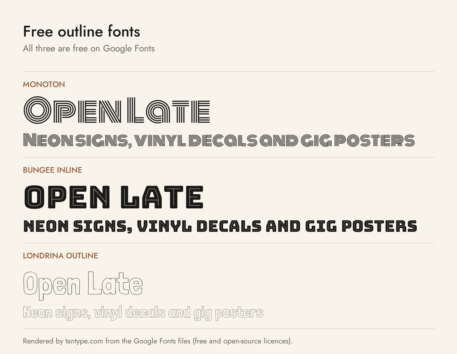
These three are on Google Fonts under the SIL Open Font License, so they are free for personal and commercial work. Each is a single display style, without the alternates or extras of the paid picks, though Bungee and Londrina have sister styles you can stack.
- Monoton by Vernon Adams is a multiline display font that Google Fonts calls “a contemporary take on metalpress fonts like, for example, ‘Prisma'”, Rudolf Koch’s 1931 design. It gives you the neon-tube look in one file but is meant for sizes above 30 points.
- Bungee Inline by David Jonathan Ross is the inline member of a family based on stacked urban signs. Google Fonts also has Bungee Outline and Bungee Shade, and the designer’s release adds layer fonts, so it is the closest free match to Ontario.
- Londrina Outline by Marcelo Magalhães is a hand-drawn hollow font from São Paulo street lettering, with a lowercase. Its designer says you can combine it with Londrina Solid for layered effects, a casual counterpart to Naïve Inline.
Licensing: personal vs commercial use
Creative Market sells fonts under four licences, explained on its font licence page:
- Desktop: unlimited personal and commercial projects, including products, packaging, social media and paid ads. On websites, apps and games the font may only appear as images. One seat per user.
- Webfont: embedding on websites you own or control, within a pageview limit chosen at checkout.
- App: embedding in one app or game, as long as the font can’t be extracted.
- E-pub: embedding in one e-book or electronic publication.
Print-on-demand tools where your customer types their own text aren’t allowed. For a logo you plan to trademark, the licence page says the font must be modified and not the dominant element. You can’t share the files. This is a summary, not legal advice; check the terms on each listing.
Outline font FAQ
What is an outline font?
In graphic design, it is a typeface with hollow letters: only the edge of each character is drawn. In computing the term also means a vector font, one stored as lines and curves that scale to any size, as Wikipedia explains. TrueType and OpenType fonts are outline fonts in that technical sense even when the letters are solid.
Are there free outline fonts for commercial use?
Yes. Monoton, Bungee Inline, Bungee Outline and Londrina Outline are free on Google Fonts under the Open Font License, which allows commercial use. Fonts marked “free for personal use” elsewhere usually need a paid licence for business work.
How do I turn any font into an outline font?
In Illustrator or Photoshop, set the fill to none and add a stroke. Expect thicker letters and filled-in counters, because the stroke spreads into the letter. For clean results, use a font drawn as an outline.
Which outline fonts work best on a Cricut?
Choose layered sets with separate files, such as Ontario, Vintage or Clodice 3D, and avoid hairline outlines. Cut each layer in its own colour of vinyl, weed it, and stack the layers with transfer tape.
