
Juno: a hand-painted condensed headliner for loud, textured statements
Design style
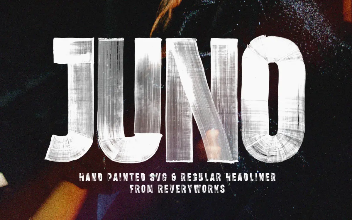
Juno is a bold condensed display face built around a hand-painted texture rather than a clean vector outline. The letterforms are narrow and stacked tight, with visible drag marks where the brush ran dry or caught the paper’s tooth. It reads as physical rather than digital — closer to a poster stencilled in a hurry than anything drawn with a pen tool from the start. The condensed proportions push the letters upright and blocky, so the texture becomes the main event rather than a finish applied on top of a more restrained shape.
There’s an obvious rawness to the drawing. Strokes vary in weight from letter to letter, and some terminals are ragged where the brush lifted off unevenly. That’s clearly intentional — a smooth version of this letterform would lose the point of the font entirely — but it does mean Juno commits fully to one register. It’s not trying to be subtle, and it doesn’t have a quiet mode.
Character set and features
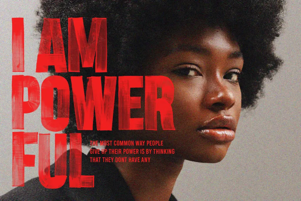
The package includes both an SVG version, which keeps the full painted texture and colour variation per glyph, and a plain OTF Regular for wider software compatibility. The SVG format is the better representation of the design’s intent, but it’s genuinely limited to newer Photoshop and Illustrator builds — the Regular OTF is what most people will actually type with day to day, and it flattens the texture into a single consistent stroke rather than the layered brush effect.
Diacritic coverage extends to a solid range of accented Latin characters, so the font can serve French, German, Nordic and a handful of other European-language needs without falling back to unaccented substitutes. There’s also a set of high-resolution PNG characters supplied separately, useful for compositing individual letters into artwork at a size where the paint texture holds up under scrutiny. As a hand-textured face, don’t expect a large glyph set of ligatures, alternates or small caps — Juno is built for headline words, not typesetting.
Use cases
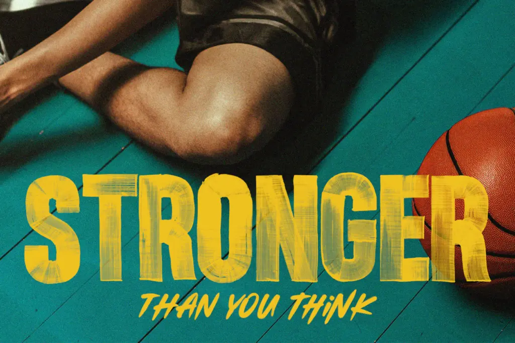
This is a font for short, loud words: a gig poster headline, a single word on a T-shirt, a sports team name, a badge or sticker design. The condensed width means it packs a lot of letters into a narrow horizontal space, which suits vertical formats like phone wallpapers or narrow banner ads. The painted texture also reads well at large scale — printed big, on fabric, or roughed up further in a design programme — where the drag marks and inconsistent edges add character instead of just looking noisy.
It’s the wrong choice for body copy, small captions, or anything that needs to stay legible below a fairly generous size, since the texture and tight spacing both work against fine detail. It also isn’t a face for brands wanting a settled, repeatable mark — the roughness that gives it personality also makes it a poor fit for anything needing polish or restraint. Used for what it’s built for — a single punchy line of type — it does its job with some real conviction.

What we liked, and what we didn’t
Strengths
- Painted texture with visible drag marks gives it real physical character
- Condensed proportions pack a lot into narrow vertical spaces like posters or phone formats
- Solid diacritic coverage for several European languages
Trade-offs
- SVG version, which carries the full texture, only works in newer Photoshop or Illustrator builds
- Roughness that makes it distinctive also limits it to display sizes, not body text or small captions
Juno is a committed, single-purpose display font — a condensed, hand-painted headliner built for one loud word at a time. It works well at large scale for posters, apparel and badges, but the texture and tight spacing rule it out for anything needing fine legibility or a settled brand look.
Verdict

Tantype reviews typefaces in depth — every font is tested in real branding, editorial and screen layouts before a word gets written. 555+ fonts reviewed and counting.