
Folk Fest: a hand-stitched display face for craft and folk branding
Design style
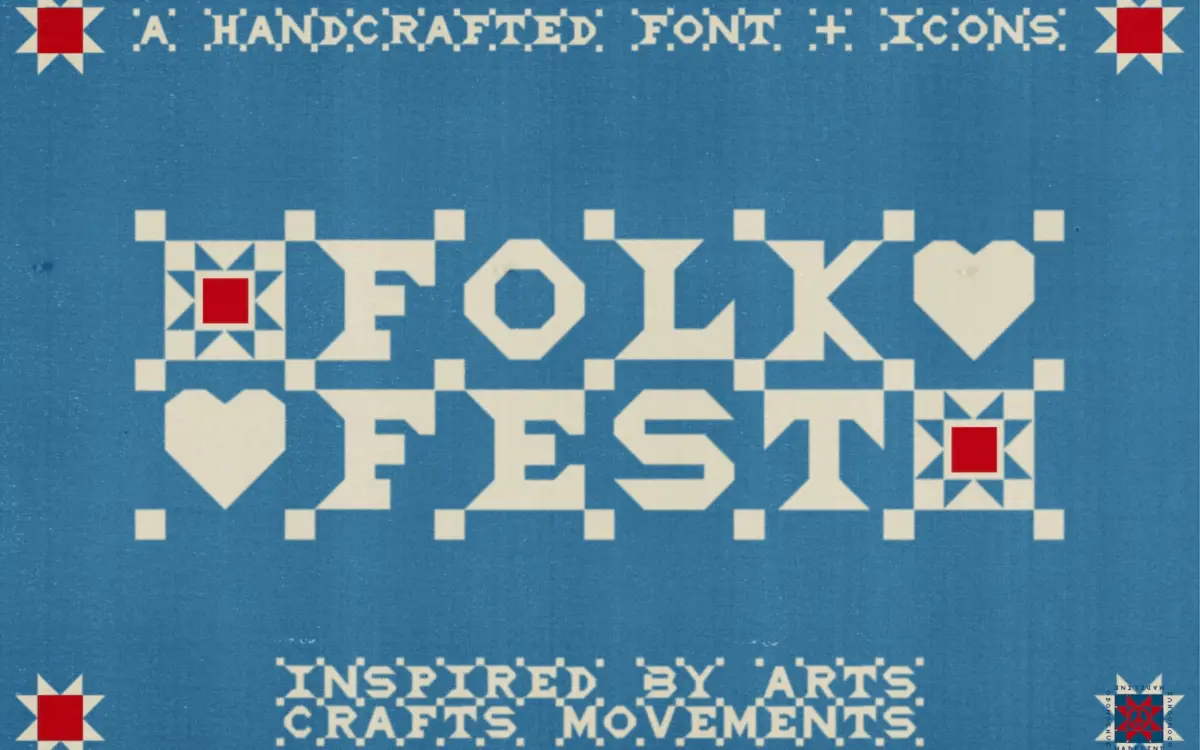
Folk Fest is an all-caps display font built around the idea of quilting rather than typesetting. The letterforms are irregular, thick-stroked, and slightly wobbly in a way that reads as sewn rather than drawn. Every uppercase letter comes in two states: a clean version and a stitched version, the latter carrying a running dashed line through the stroke that mimics a needle’s path. That stitched line is the whole personality of the font — it turns a fairly blunt, boxy letterform into something with texture and history behind it.
The proportions lean wide and square, closer to a stamped or appliquéd letter than a drawn one. There’s no attempt at contrast or calligraphic flow here; the strokes are near-monoline and the imperfections are structural rather than incidental, which keeps it from feeling like a distressed version of a normal sans. It’s a font that commits to a craft object metaphor and doesn’t hedge with subtlety.
Character set and features
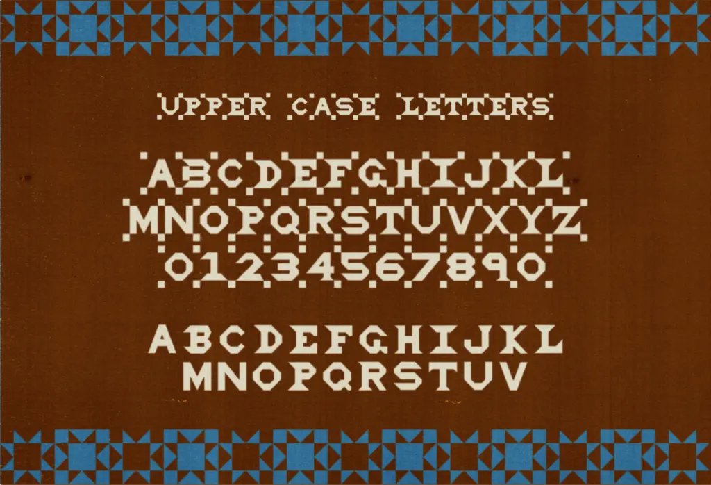
The uppercase A–Z and numerals 0–9 each ship in stitched and clean alternates, so you can pair a plain heading with a stitched accent word, or run the whole thing stitched for a more textile feel. Basic punctuation is included in the stitched version only, which is a small but real limitation if you need matching clean punctuation.
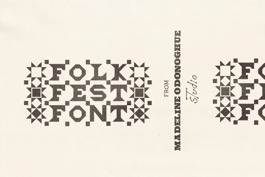
The more distinctive part of the set is the lowercase. Instead of a lowercase alphabet, a–z map to quilt-motif icons — doves, hearts, stars, patchwork blocks — meant to function as borders, standalone marks, or spot illustrations rather than as text. This is a smart use of the lowercase slot for a font that was never going to need true lowercase letters anyway, and it gives buyers a small icon library bundled into the same file. It does mean the font is entirely uppercase for actual reading text, so anyone expecting sentence case will be disappointed.
Use cases
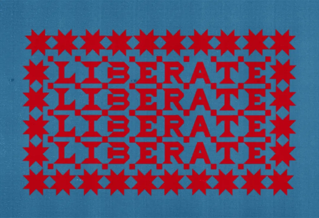
This is a font for short bursts of text, not paragraphs: gig posters, album titles, market stall signage, quilt or textile branding, farmers’ market and craft fair collateral, packaging for handmade goods. The stitched line detail reads well at poster and headline sizes but will clog up fast if set small — this is not a font for body copy or fine print, and the brief doesn’t suggest it was built for that job.
The doubled alternates give some working flexibility: a logo could use the clean version for legibility and the stitched version for texture in a secondary lockup, or mix both within one word for a handmade, uneven rhythm. Combined with the icon set, it’s realistic to build a small poster or product label using nothing but this one file — heading, stitched accents, and quilt-motif graphics all from the same font.
Where it won’t help is anywhere a brand needs neutrality or a wide size range. It’s a strong, single-note display face aimed squarely at folk, craft, and Americana-adjacent identities, and it does that one job with conviction rather than trying to cover more ground than it should.
What we liked, and what we didn’t
Strengths
- The stitched-line detail gives an otherwise blunt letterform genuine textile character
- Clean and stitched alternates for every uppercase letter and numeral add real working flexibility
- Lowercase slot is repurposed as a usable quilt-motif icon set rather than wasted
Trade-offs
- All-caps only, so it can't handle sentence-case body text
- Punctuation only exists in the stitched version, limiting the clean alternate's usefulness
Folk Fest commits fully to its quilting and craft-fair concept, and the stitched detailing gives it real personality at display sizes. It's a narrow tool by design — all caps, best in short bursts — so it suits folk, textile, and handmade branding far better than general-purpose work.
Verdict

Tantype reviews typefaces in depth — every font is tested in real branding, editorial and screen layouts before a word gets written. 555+ fonts reviewed and counting.