
Vintage Varsity: a collegiate slab for letterman-jacket branding
Design style
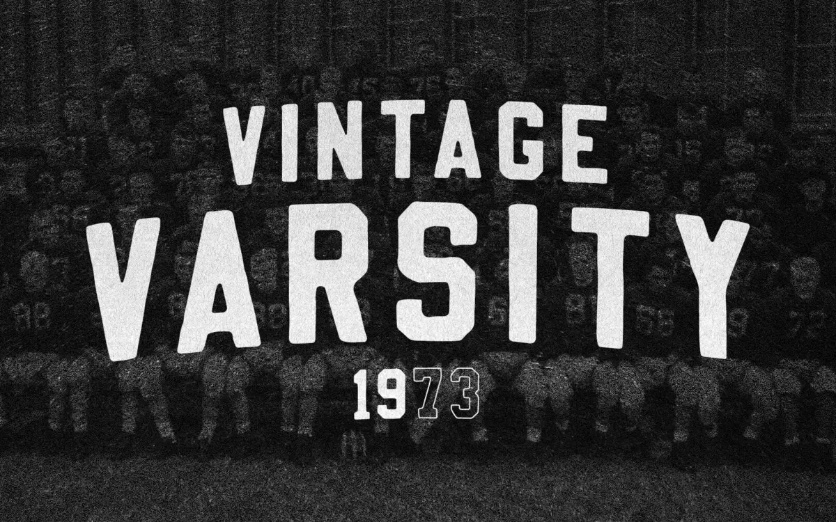
Vintage Varsity is a chunky collegiate slab built around the block letterforms you’d find felt-appliquéd onto a letterman jacket. The strokes are heavy and even, corners are squared off rather than rounded, and the serifs read more as slab feet than as refined bracketing. It doesn’t pretend to be anything other than a display letter drawn for patches, chenille, and screen print. The proportions are wide and confident, closer to a numeral font used on sports jerseys than to a text slab like Rockwell or Courier.
There’s a slight roughness to the edges in places, enough to suggest hand-cut felt rather than a vector ruler, but it’s restrained compared to fully distressed vintage fonts. That’s a smart choice: too much texture and it stops working at small sizes, too little and it loses the handmade feel entirely. Vintage Varsity sits in the middle, which makes it more usable but also means it doesn’t commit fully to either a clean geometric slab or a rough hand-lettered look.
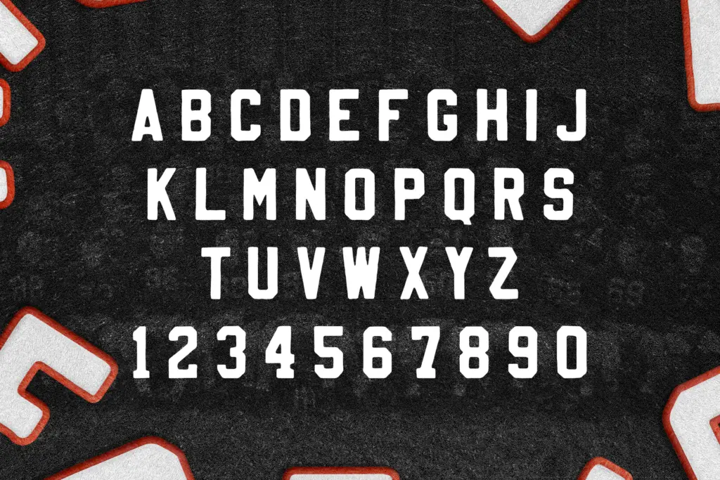
Character set and features
The letterforms are built for uppercase-first design — this is a font that wants to shout a word or two, not set a paragraph. Numerals carry the same block weight as the letters, which matters if you’re using it for jersey numbers or team years. Because the strokes are so uniform in width, kerning between wide letters like W and M needs a careful eye; left on autopilot, some pairs will look loose next to tighter combinations like IL or IT.
There isn’t much room here for delicate detail — no alternates for swash flourishes, no small caps, no italic companion mentioned. That’s consistent with what the font is trying to do. It’s a one-note instrument, and the note is loud and blocky. Anyone expecting a full family with light and bold weights, or a lowercase built for body copy, will be disappointed; this is an all-caps display face through and through.
Use cases
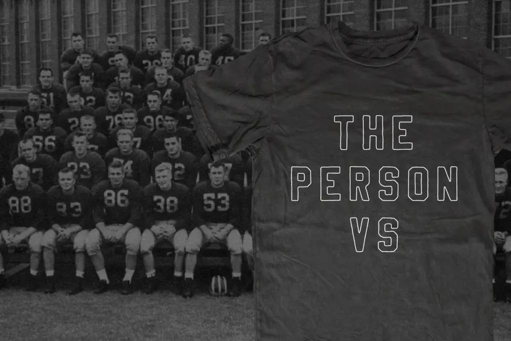
The obvious home for Vintage Varsity is exactly where the name points: team names, mascot logos, varsity jacket lettering, and retro slogan tees. Strip the fill and apply a stroke, as the seller suggests, and you get a decent outline treatment for screen printing or embroidery mockups where a solid block would clog detail. It also does reasonable work on badge-style logos, beer labels, and packaging that wants a nostalgic, Americana feel without going full grunge.
Where it struggles is anywhere that needs nuance or long-form reading. Don’t reach for it in body text, in anything multilingual, or in contexts where a subtler retro reference is wanted — its weight and squared geometry read loud from across a room, which is the point, but it can overpower smaller layouts like business cards or invitations. Treat it as a headline and lockup tool, not a full typographic system, and it earns its keep.

What we liked, and what we didn’t
Strengths
- Convincing collegiate block-letter feel without excessive distressing
- Works well stroked-and-outlined for screen print or embroidery mockups
- Uniform stroke weight makes it read clearly even at moderate distances
Trade-offs
- No lowercase or additional weights, so it's limited to short all-caps headlines
- Even stroke width means some letter pairs need manual kerning adjustment
Vintage Varsity does one job well: loud, blocky collegiate lettering for logos, tees, and badge designs. It's not built for anything beyond short display use, and the single all-caps weight limits how far it stretches, but for its intended niche it delivers a convincing letterman-jacket feel.
Verdict

Tantype reviews typefaces in depth — every font is tested in real branding, editorial and screen layouts before a word gets written. 555+ fonts reviewed and counting.