
Thistails Font Duo: a monoline script paired with a companion sans
Design style
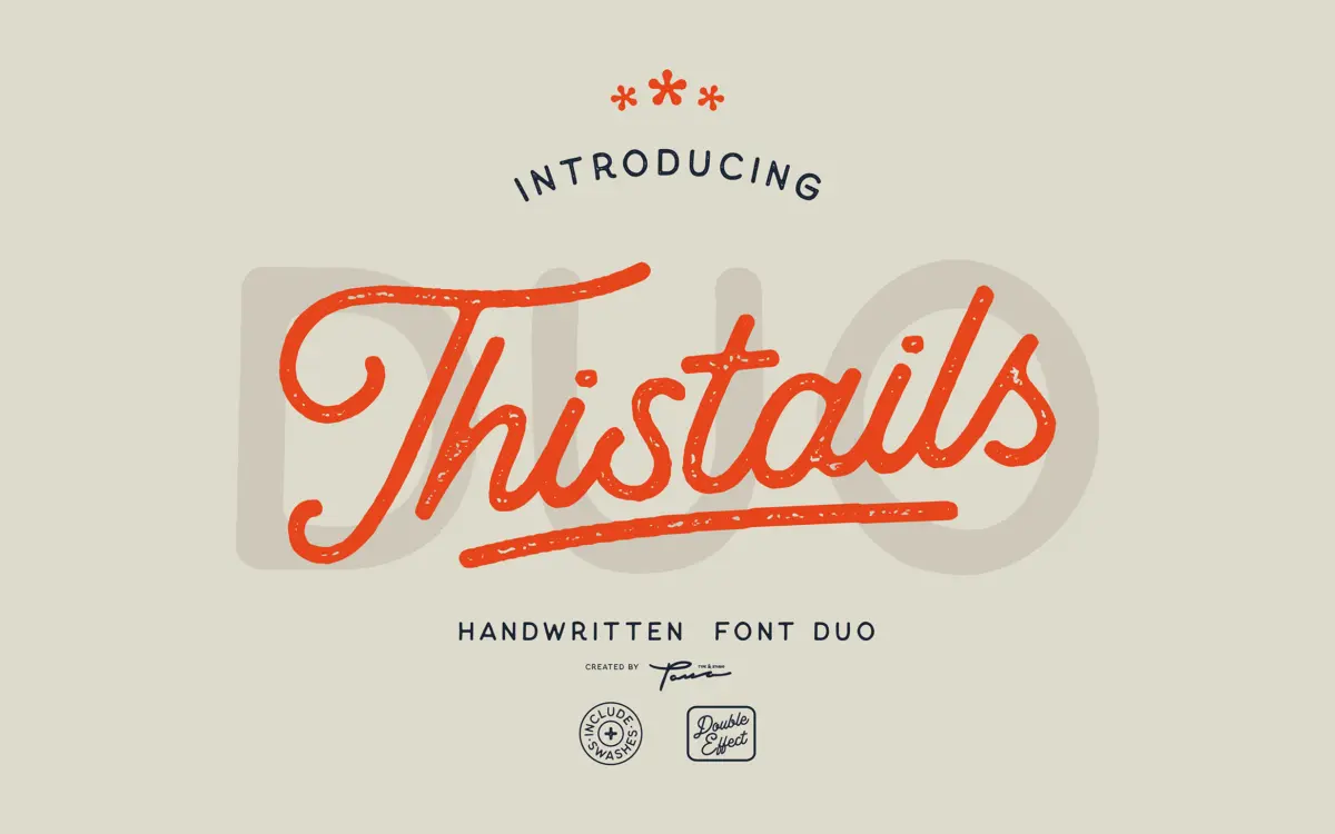
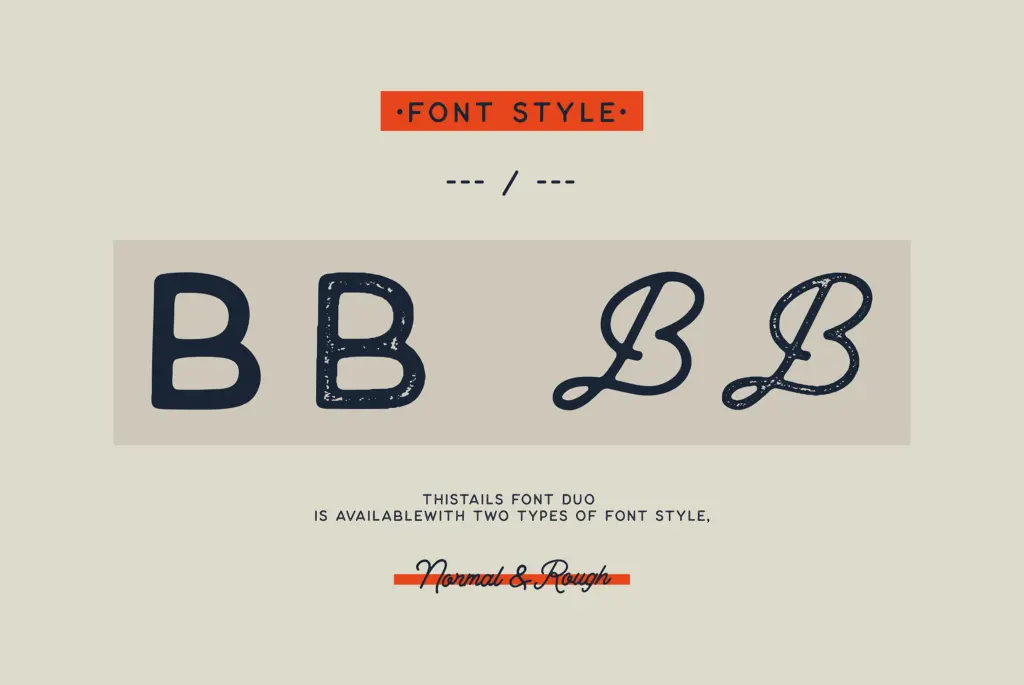
Thistails pairs a monoline script with a matching sans, each offered in a clean cut and a rougher, textured cut. The script leans casual rather than formal — it has the loose, slightly uneven baseline of hand lettering rather than the tight geometric control of a calligraphic script. Strokes stay a single weight throughout, so the character comes from letter shape and connection rather than contrast between thick and thin.
The companion sans is the more useful half of the pairing on its own terms. It is plain, slightly condensed in feel, and reads as a support face rather than a statement — which is exactly the job it is built for. The rough versions of both add a grain, a broken edge to strokes that suggests a brush or worn stamp. It is a modest effect, not a heavy distress treatment, so it stays legible at small sizes where a lot of textured display scripts fall apart.
Nothing here pushes into unfamiliar territory. It sits comfortably alongside the current wave of “hand-painted, modern vintage” script duos aimed at small studios and product sellers — competent, likeable, not trying to be a signature piece.
Character set and features
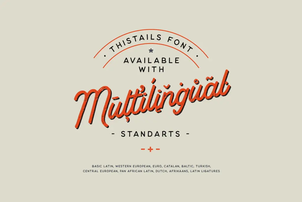
The set covers standard Latin plus an extended range of Western European languages — Nordic, Baltic, Central European and a scattering of others — so accented setting in most European markets is covered without hunting for a fallback font. Swashes are included, mostly for cap entries and word-final flourishes, and there are ligatures and a stylistic set to vary repeated letter shapes, which helps break up the monotony that monoline scripts are prone to over longer lines.
The rough and regular cuts of each face share metrics, so you can swap between them without a lot of re-kerning, which is a small but genuinely practical touch when a client wants a cleaner or grittier version of the same layout. The script’s spacing is generous rather than tight; it is built to be read letter by letter, not as a flowing connected hand, and lowercase joins are more implied than physically linked in places.
Use cases
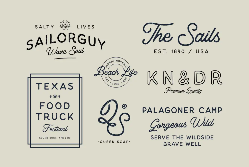
This is a duo built for product-adjacent branding: packaging labels, small-batch goods, quote graphics, t-shirt prints, business cards. The script does well as a short accent line — a product name, a signature phrase — set above or below the sans for body information. Because the rough cut stays legible at modest sizes, it holds up on physical packaging where ink spread and texture matter more than on a screen.
It is less suited to long-form setting or anything that needs a script to carry paragraphs of text; the looseness that makes it feel handmade in a headline becomes fatiguing over multiple lines. For wedding stationery or invitation work it will read as more rustic-craft than formal-elegant, so it fits a farmhouse or artisanal brief better than a black-tie one. Logo work is a reasonable use if the mark stays short — a word or two — since swash flourishes need room to breathe and get cramped in tight lockups.
What we liked, and what we didn’t
Strengths
- Rough and regular cuts share metrics so swapping between them keeps layouts stable
- Broad European language coverage for a script of this type
- Companion sans is genuinely useful as a plain support face, not an afterthought
Trade-offs
- The script's looseness becomes fatiguing set across multiple lines or paragraphs
- Design territory is crowded — nothing here distinguishes it strongly from similar hand-painted duos
Thistails is a competent, unpretentious script-and-sans duo built for rustic product branding rather than formal elegance. It does its intended job well but doesn't try to be more than that.
Verdict

Tantype reviews typefaces in depth — every font is tested in real branding, editorial and screen layouts before a word gets written. 555+ fonts reviewed and counting.