Serif
3.9
Hangoe: An Eight-Style Serif for Editorial and Branding Work
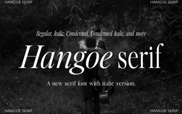
Design style Hangoe sits in the old-style serif tradition, with the kind of restraint that reads as confident rather than…
 Tantype

Design style Hangoe sits in the old-style serif tradition, with the kind of restraint that reads as confident rather than…
Tantype
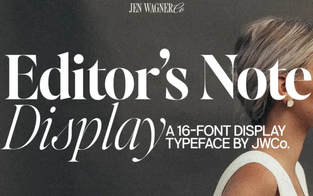
Design style Editor’s Note Display is a companion to a text-oriented family, and it reads that way: the letter skeletons…
Tantype
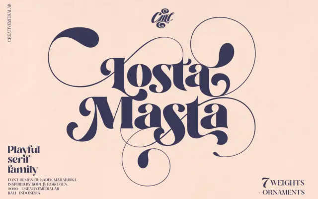
Design style Losta Masta is a display serif that leans hard into curl and bounce rather than the usual retro-serif…
Tantype
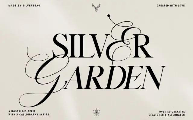
Design style Silver Garden is a single serif family sold as four styles — regular, italic, bold, bold italic —…
Tantype
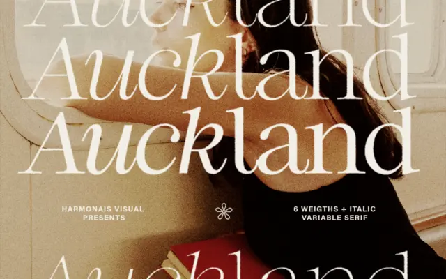
Design style Auckland sits in the modern-serif camp: moderate contrast between thick and thin strokes, bracketed serifs that are trimmed…
Tantype
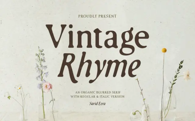
Design style Vintage Rhyme is a serif that trades crisp edges for a worn, printed-twice look. The strokes carry an…
Tantype
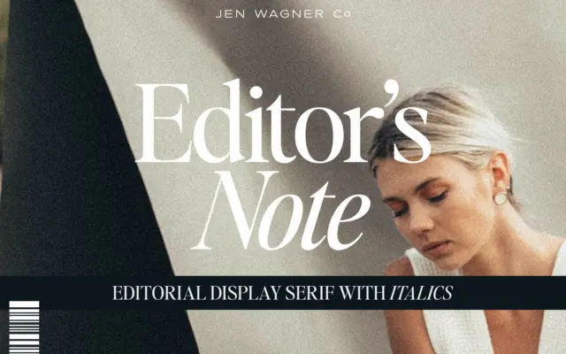
Design style Editor’s Note belongs to the current wave of pared-back editorial serifs — the kind built for masthead headers…
Tantype
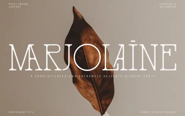
Design style Marjolaine works a narrow seam between two references that don’t usually meet: the delicate slab serif and the…
Tantype
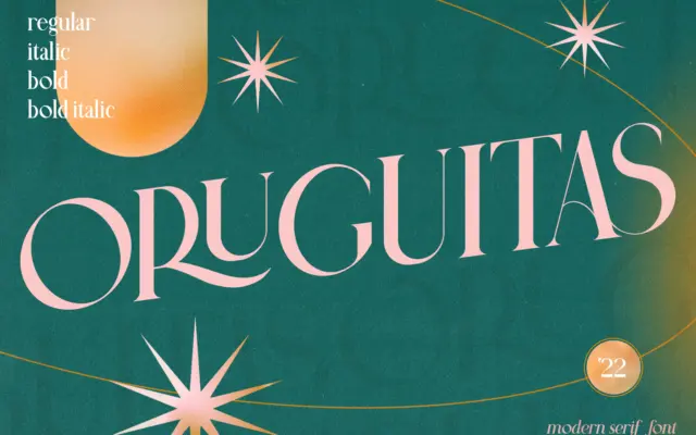
Design style Oruguitas sits in that familiar territory of contemporary serifs that pair high-contrast strokes with a slightly formal bearing.…
Tantype