
Silver Garden: a nostalgic serif duo for fashion-adjacent branding
Design style
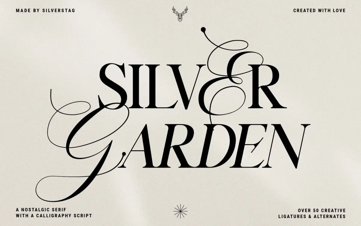
Silver Garden is a single serif family sold as four styles — regular, italic, bold, bold italic — pitched as a duo because the regular/italic pairing reads clean and fashion-forward while the bold weights pick up extra curl in the terminals and serifs, pushing them toward a more vintage, hand-inked feel. That’s a reasonable trick for getting two moods out of one skeleton, and it mostly works: the regular weight has a tightened, slightly compressed structure with sharp, thin serifs that gives it a magazine-mast feel, while the bold weight rounds out the joints and adds swash-like flourishes that soften it into something closer to a letterpress label.
The italic doesn’t stray far from a slanted roman, which keeps it legible but also means it doesn’t add much personality on its own — it reads as a companion, not a second voice. The bold italic is where the vintage character is most pronounced, combining the slant with the extra curvature for the most decorative option in the set. There’s a coherent logic to the family, but the four styles feel more like a tonal dial than four distinct tools.

Character set and features
Each style ships with more than 25 lowercase ligatures and a full set of uppercase script alternates, which is the real substance of this release. The ligatures target common letter pairs and are clearly built to soften the joins that would otherwise look mechanical in a serif this narrow — useful, though as with any large ligature set, overusing them in body copy can start to look fussy rather than considered. The uppercase alternates lean script, giving each capital a more calligraphic option for headline or monogram use, which is where this typeface is clearly meant to live.
The seller notes full language support, standard punctuation and numerals, and instructions for accessing alternates in common design apps including Canva — worth checking against your own workflow if you rely on OpenType features inside a specific app, since support varies. There’s no mention of small caps, tabular figures, or extended weight range, so treat this as a family built for expressive headline work rather than a flexible text system.
Use cases
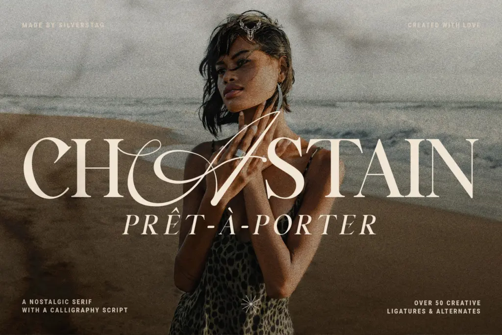
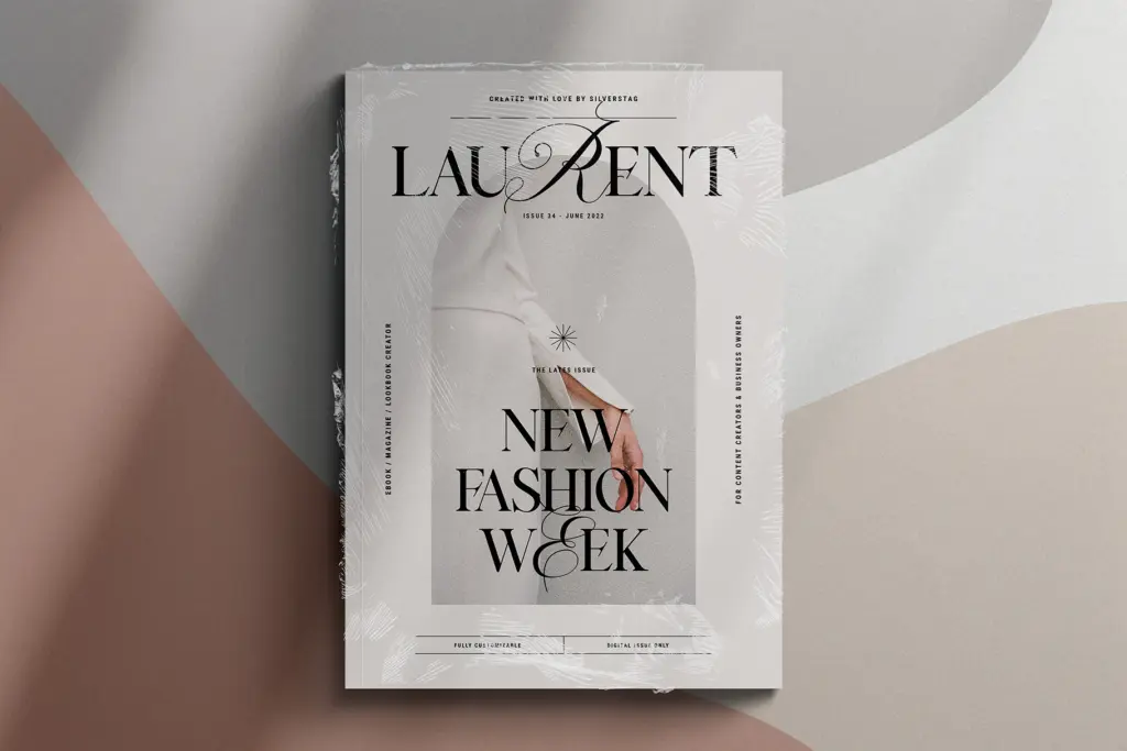
This is a font for short-form, high-visibility text: logotypes, product labels, magazine mastheads, wedding stationery headers, packaging call-outs, Instagram graphics. The regular and italic styles suit anything wanting a chic, fashion-editorial tone — a boutique logo, a perfume label, a lookbook cover line. The bold and bold italic styles push into nostalgic territory better suited to vintage-inspired branding, retro packaging, or a heritage-brand wordmark.
It’s not built for paragraphs of text. The serifs are fine enough and the ligatures frequent enough that it loses clarity below headline size, and there’s no indication of a text-optimized companion sans or matching body font in the release. Pair it with a plain, quiet sans for supporting copy and let Silver Garden do the talking in titles, initials, and short lockups.
What we liked, and what we didn’t
Strengths
- Bold weights add genuine vintage curl without losing the serif's basic legibility
- Large ligature set and script capital alternates give real headline variety
- Clear, single-minded use case makes it easy to know when to reach for it
Trade-offs
- Italic style stays close to a simple slant and adds little personality on its own
- Not built for body text — no indication of a companion text face or extended weights
Silver Garden does one job well: short, expressive headline type with a nostalgic edge, especially in its bolder weights. It's not a text face and the italic feels underdeveloped compared to the rest of the family, but for logos, labels, and short lockups it delivers a distinct, usable character.
Verdict

Tantype reviews typefaces in depth — every font is tested in real branding, editorial and screen layouts before a word gets written. 555+ fonts reviewed and counting.