
Oruguitas: A Modern Serif With Ligature Flourishes for Branding
Design style
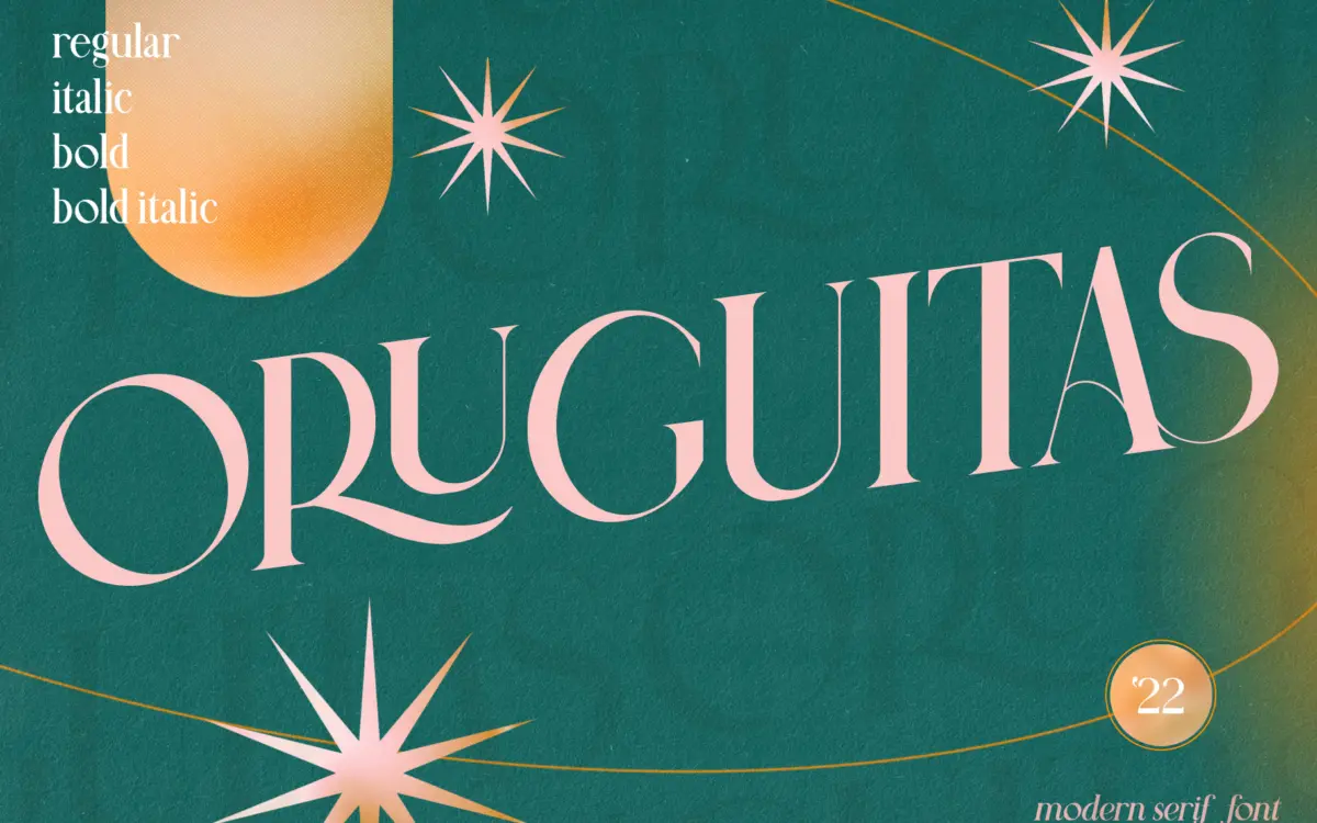
Oruguitas sits in that familiar territory of contemporary serifs that pair high-contrast strokes with a slightly formal bearing. The brief for it describes a mix of bold and super-thin lines, and that’s the first thing you notice: hairline serifs and connecting strokes set against much heavier stems. It’s a common recipe right now for wedding and editorial serifs, and Oruguitas executes it competently rather than daringly. The regular and italic are drawn to work together, with the italic carrying more of the calligraphic energy while the upright holds the structure.
The contrast is the main personality trait here. At larger sizes it reads as polished and a little formal, the kind of serif that wants to sit on a menu or a perfume label rather than a paragraph of body text. The thin strokes are thin enough that you’ll want to keep an eye on how they render at small sizes or in print reproduction, since fine hairlines are the first thing to disappear on cheap stock or low-resolution screens.
Character set and features
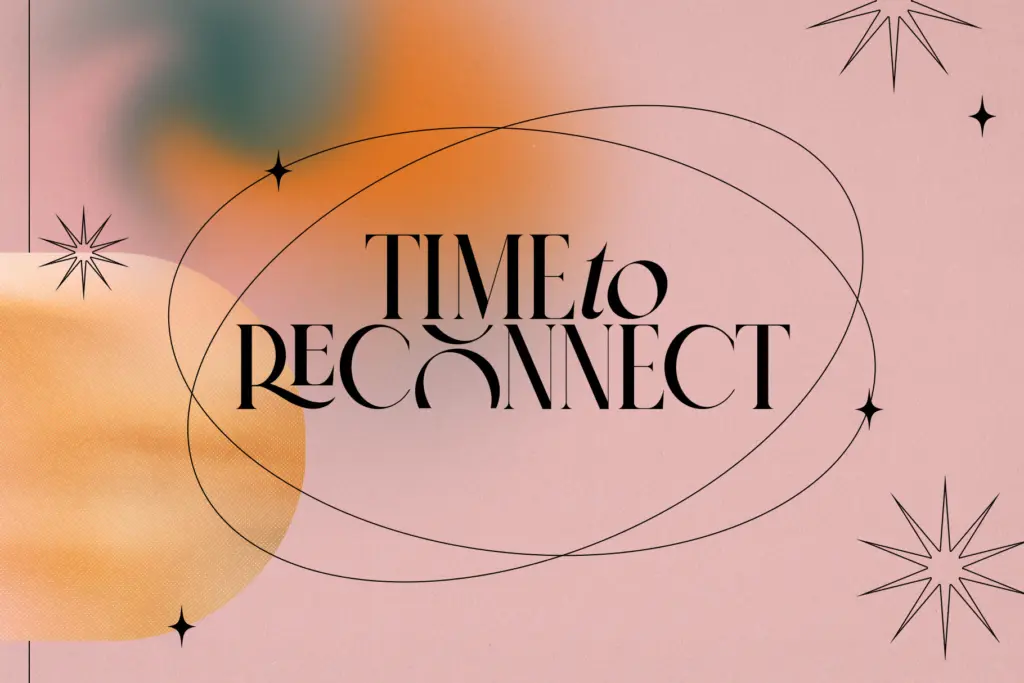
The headline feature is a set of twenty uppercase ligatures — combinations like RA, LE, TS, ZO and others listed in the specimen. These aren’t the usual lowercase connecting ligatures you’d see in a script face; they’re stylistic pairs built for capital letter combinations, which is a slightly unusual choice and tells you where this font expects to be used: short lines of set text, names, monograms, headers, rather than long-form setting.
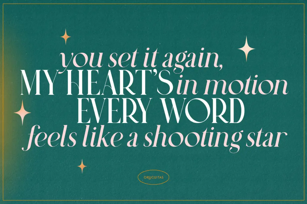
Used well, that ligature set can give a logotype or an invitation line a bespoke, hand-finished look without anyone having to draw custom letterforms. Used carelessly, twenty ligatures scattered through a paragraph will look busy and inconsistent, so they need to be applied selectively rather than left to auto-trigger across a whole layout. The regular and italic pairing gives you a legitimate way to add emphasis within a line — italic for a name, regular for supporting text — which is more useful in practice than most decorative serifs offer.
Use cases
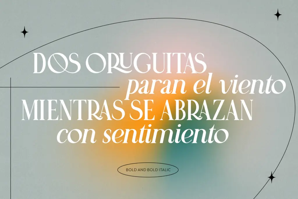
Oruguitas is built for short-format, high-visibility text: logotypes, wordmarks, wedding stationery, packaging labels, and editorial headers where a handful of words carry the whole visual weight. The uppercase ligature set is best deployed in exactly those contexts — a monogram, a brand name, a title line — where you can control which pairs fire and check that the thin strokes hold up in the final material.
It’s not a font for body copy or dense paragraphs; the contrast and the ligature-driven design work against it there, and legibility would suffer well before a reader noticed the craftsmanship. Designers working on luxury branding, invitation suites, or packaging where a serif needs to feel considered rather than generic will get the most out of it. Anyone needing a workhorse text face for long documents should look elsewhere.
What we liked, and what we didn’t
Strengths
- Twenty uppercase ligatures give logotypes and monograms a custom, hand-finished feel without custom lettering
- Regular and italic pairing offers a legitimate way to build emphasis within a single line
- High contrast gives it a formal, editorial presence at display sizes
Trade-offs
- Hairline strokes risk disappearing at small sizes or on lower-quality print stock
- Not suited to body text or long-form setting, where the contrast undermines readability
Oruguitas is a competent high-contrast serif with a genuinely useful set of uppercase ligatures for short-format branding work. It's not reinventing the modern serif genre, and the thin strokes need care in production, but for logotypes and invitation lines it does its job cleanly.
Verdict

Tantype reviews typefaces in depth — every font is tested in real branding, editorial and screen layouts before a word gets written. 555+ fonts reviewed and counting.