
The Silver Editorial: a 9-weight high-contrast serif for magazine-style branding
Design style
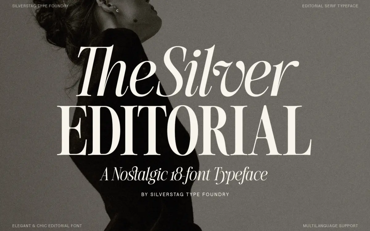
The Silver Editorial sits in the high-contrast editorial serif tradition — thick vertical stems, hairline-thin horizontals, and bracketed serifs that thin out toward their tips. The brief points to 1980s fashion-magazine typography as the reference, and that shows up most clearly in the heavier weights, where the stroke contrast gets dramatic enough to read as pure display work rather than text setting. There’s a self-conscious coolness to the letterforms: slightly narrowed counters, a vertical stress, and terminals that stay crisp rather than rounding off.
What’s less common is the range. Nine weights plus italics is a genuine system, not a headline face with a couple of alternates bolted on. That means the same underlying skeleton has to work whether it’s drawn as a hairline or as a near-black, and the family mostly holds that line — the DNA of the letterforms stays recognisable across the weight spread, which is harder to pull off than it sounds when contrast is this pronounced.
Character set and features
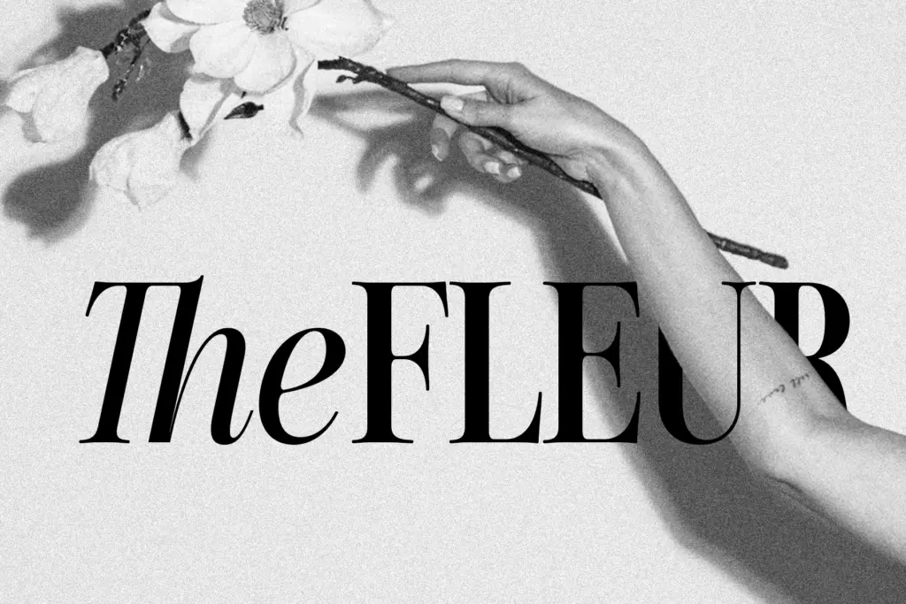
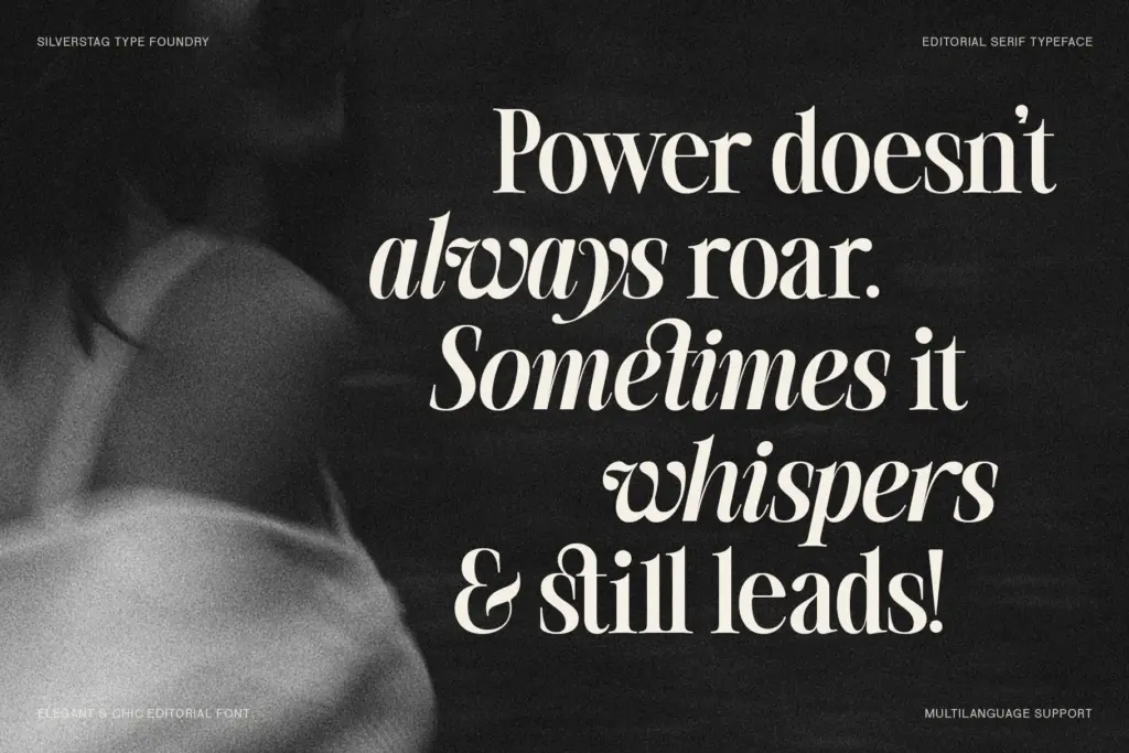
Each of the nine weights comes with a matching italic, giving eighteen fonts total and a reasonable amount of room to build hierarchy without reaching for a second family. The seller notes multilingual support and custom ligatures, though the specifics of language coverage aren’t detailed, so treat that as a starting point to verify against your own text rather than a guarantee. The italics are worth checking individually — in faces built around high contrast, italics can either add warmth or feel like an afterthought, and that’s the kind of thing you want to see in your own PDF proof before committing a layout to it.
At the lightest weights, the hairlines get thin enough that they’ll disappear at small sizes on screen or on uncoated stock — this is a family built for the eye of a magazine spread, not for a paragraph of body copy at 9pt. The heaviest weights, conversely, are unapologetically display: don’t expect them to set a full page of running text comfortably.
Use cases
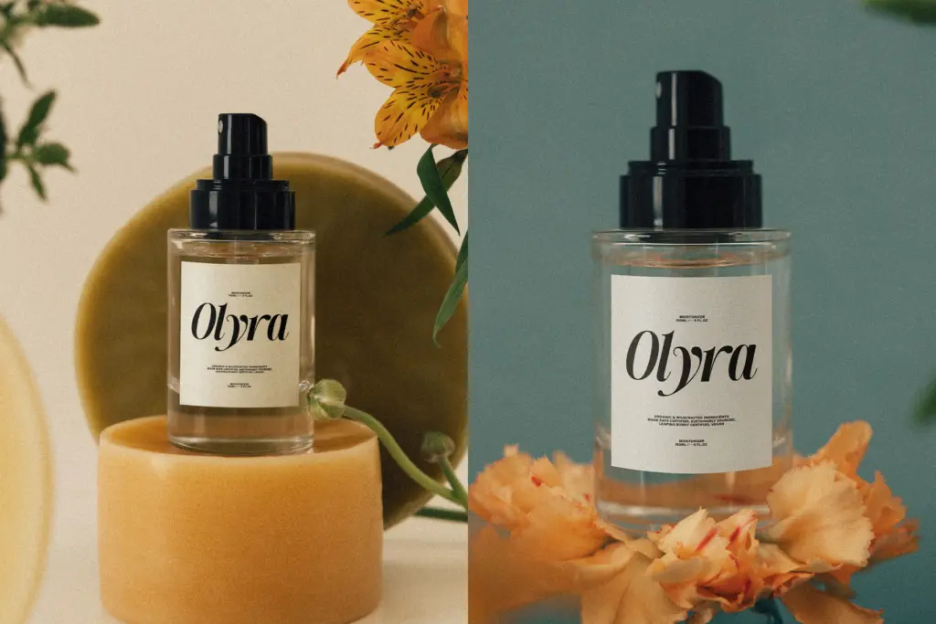
This is a headline and identity typeface first. It reads naturally in magazine mastheads, fashion branding, packaging typography, and editorial layouts where a single striking word or line carries the composition. The lighter-to-medium weights can handle subheads and short pull quotes; the italics add a secondary voice for captions or bylines without needing a companion typeface.
Where it’s less suited is dense text setting — the contrast that gives it personality at large sizes works against legibility once you’re below body-copy thresholds. It’s also not a neutral, get-out-of-the-way workhorse; it has a period-specific attitude that will read as retro-modern in almost any context, which is a feature for fashion and lifestyle branding but a liability if you need something quieter. Designers building an editorial system — magazine, fashion catalogue, boutique packaging — will get the most out of the full weight range; those needing a single flexible font for mixed use may find the family’s specialization limiting.
What we liked, and what we didn’t
Strengths
- Nine matched weights plus italics give real hierarchy without a second family
- High contrast strokes give headlines and mastheads a distinct fashion-editorial voice
- Consistent letterform DNA holds up from the lightest to the heaviest weight
Trade-offs
- Hairline weights lose legibility at small sizes or on uncoated stock
- The strong retro-editorial character limits its use as a neutral, general-purpose serif
The Silver Editorial delivers a genuinely built-out weight system with a confident 1980s-editorial attitude, and it earns its keep in headline and branding work. It's not a text face and doesn't pretend to be — save it for the moments where its contrast can show off, not the paragraphs underneath.
Verdict

Tantype reviews typefaces in depth — every font is tested in real branding, editorial and screen layouts before a word gets written. 555+ fonts reviewed and counting.