
Netsera: a calligraphic serif for editorial and fashion branding
Design style
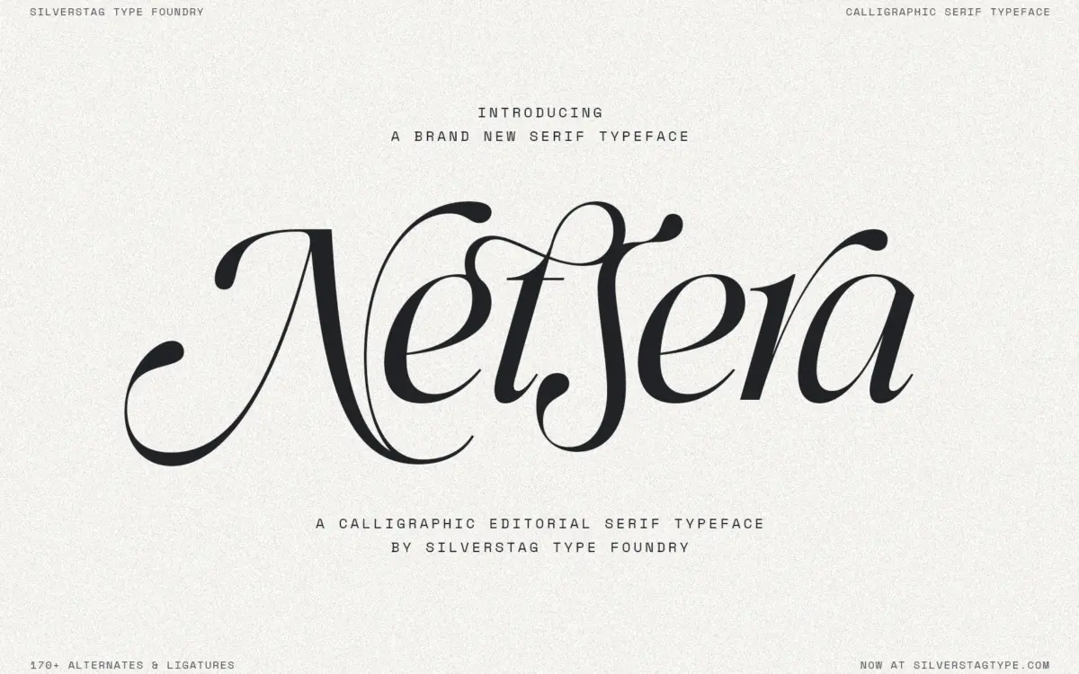
Netsera sits at the point where a serif structure meets a calligraphic hand. The uprights have the weight distribution and axis you’d expect from a serif text face, but the curves swing with the entry and exit strokes of pen lettering — the sort of thing you see in a lot of current fashion-adjacent serifs. Contrast is high: thin hairlines pull against thicker stems, and terminals often flick or taper rather than sit square. It gives the face a sense of movement without tipping fully into script territory.
The Italic is the more calligraphic of the two, with longer swashes and a looser rhythm, while the Regular keeps enough vertical discipline to still read as a serif at heart. Together they read as a matched pair rather than two unrelated designs, which matters if you plan to mix them in the same layout.
Character set and features
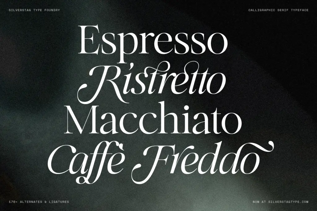
The character count here is genuinely large — over 900 glyphs, with more than 170 ligatures and alternates split across both weights. That’s the real substance of the release: it’s not just an A–Z with a few extra swashes bolted on. Expect contextual alternates for common letter pairs, discretionary ligatures, and swash caps that can replace the default versions at the start or end of a word. Multilingual coverage extends the Latin set well beyond English-language use, and standard punctuation and figures are present alongside the decorative extras.
The trade-off with a set this dense is that it needs an OpenType-aware layout tool to show its range. Drop it into an app without ligature and alternate support and you’ll get a competent but noticeably plainer serif — the swashes and contextual swaps won’t fire on their own. Anyone buying this for the alternates specifically should confirm their software applies OpenType features before committing a layout to it.
Use cases
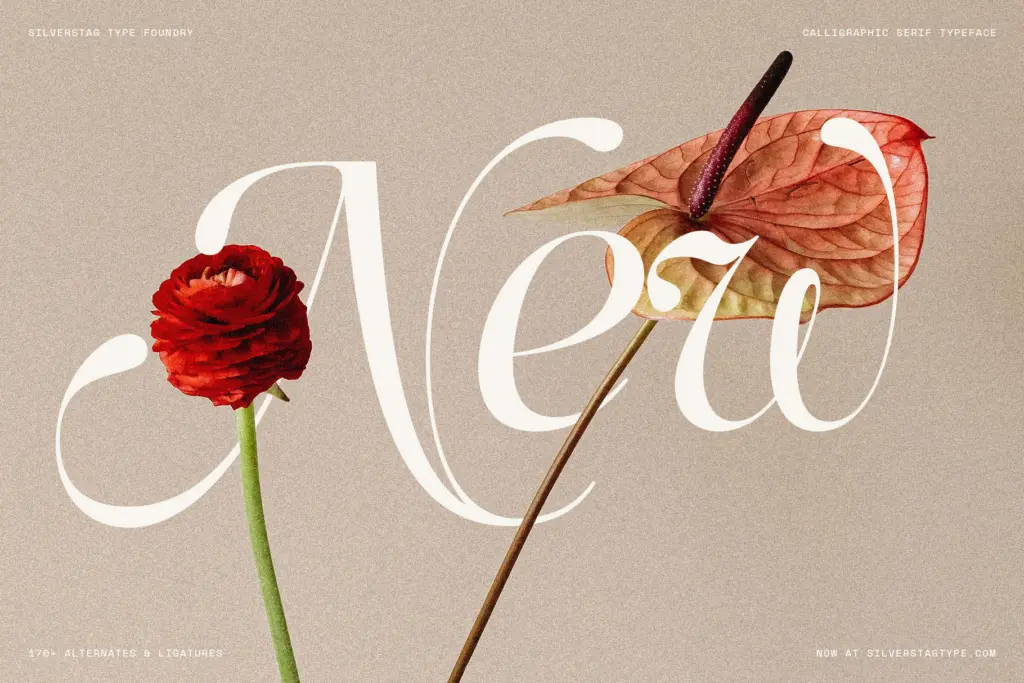
Netsera’s natural home is short-form, display-scale text: a masthead, a product name on packaging, a wedding invitation, a logotype that wants some warmth without going full script. The high contrast and calligraphic detailing hold up well at large sizes, where the thin strokes stay crisp and the swashes have room to breathe. At body-copy sizes, the contrast starts working against it — thin hairlines can disappear at small point sizes, particularly in print on absorbent stock or in low-resolution screen rendering. This is a headline and lockup font, not a paragraph font, and it’s worth treating it that way from the brief stage rather than discovering it at proof stage.
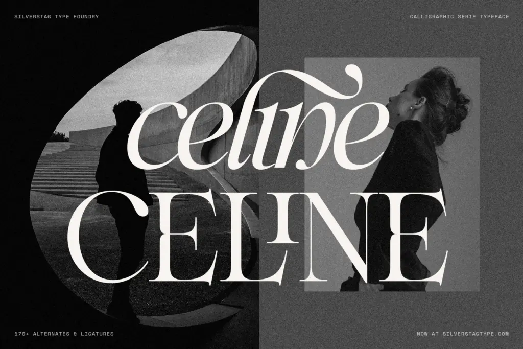
For branding work — boutique labels, fashion lines, editorial titles, invitation suites — it delivers a recognisable, slightly romantic tone that’s distinct from the plainer geometric serifs currently everywhere. Pair it with a quieter sans or a restrained serif for supporting text, and let Netsera carry the names and headlines where its personality actually earns its keep.
What we liked, and what we didn’t
Strengths
- Large, thoughtfully built ligature and alternate set with over 170 variants
- Regular and Italic feel like a genuinely matched pair, not an afterthought
- High contrast gives headlines and logotypes a distinct, romantic character
Trade-offs
- Thin hairlines lose crispness at small sizes and on low-quality print stock
- Full character depends on OpenType feature support, which not every app provides
Netsera is a well-drawn calligraphic serif with a genuinely deep alternate set, best suited to headlines, logotypes and short display text rather than body copy. It needs OpenType-capable software to show its full range, and its high contrast makes it fragile at small sizes. For fashion and editorial branding work, though, it has real personality.
Verdict

Tantype reviews typefaces in depth — every font is tested in real branding, editorial and screen layouts before a word gets written. 555+ fonts reviewed and counting.