
Palmore: A Condensed Rounded Serif for Vintage-Leaning Headlines
Design style
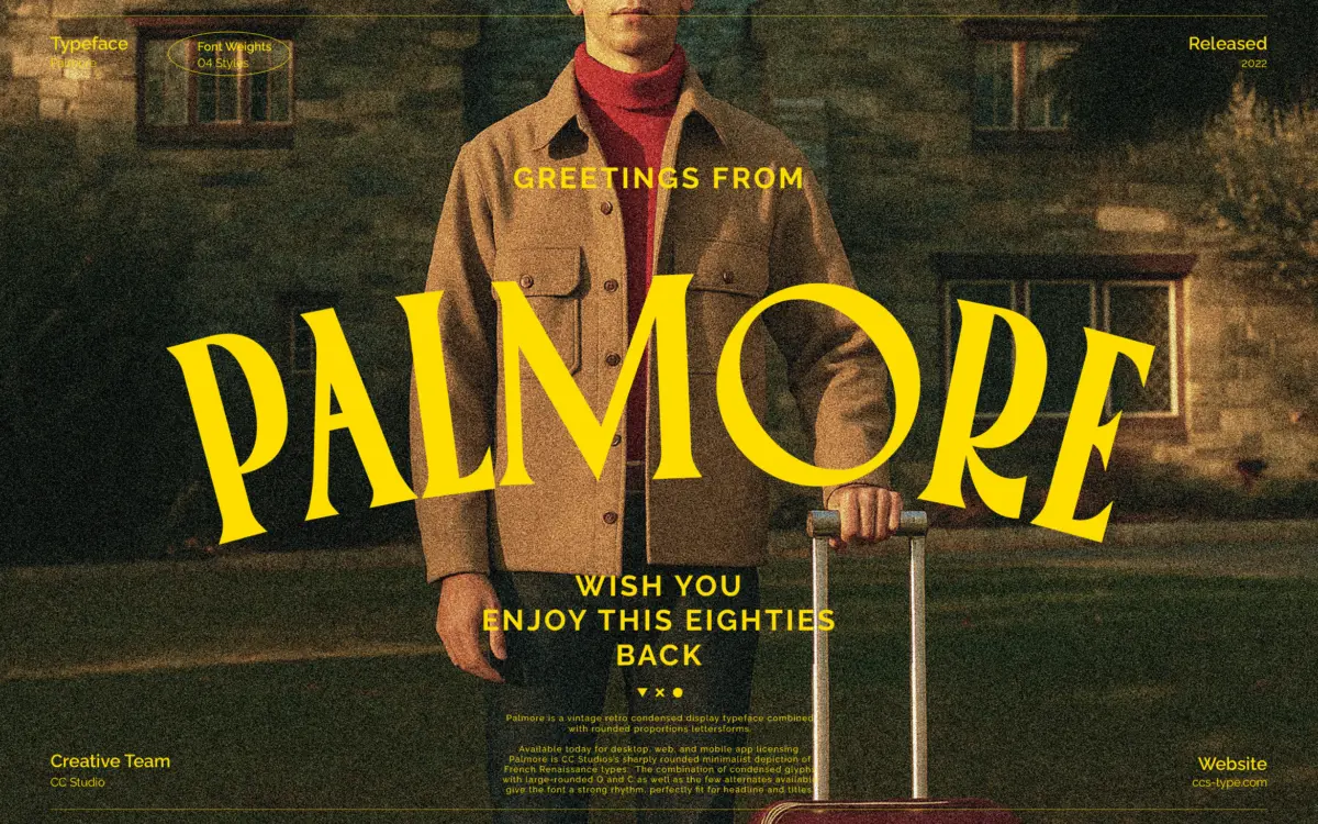
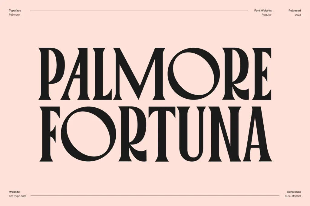
Palmore sits in that well-worn but still useful lane of condensed display serifs built for headlines rather than paragraphs. The letterforms are narrow and tightly fitted, but the designer has softened the whole thing with rounded bowls and generous curves on characters like O and C. That combination is really the point of the typeface: the condensed structure gives it a compressed, march-in-a-line rhythm, while the rounding keeps individual letters from feeling stiff or overly formal.
The vintage reference is legible without being a costume. There’s a slight retro warmth to the serifs and the way the counters open up, recalling the kind of lettering you’d find on a mid-century magazine masthead or a hand-painted shop sign, but nothing here is so ornamental that it reads as pastiche. Across the four weights, that rhythm holds steady — the lighter cuts read as clean and slightly playful, the heavier ones lean into that vintage-advert density.
Character set and features
Palmore ships with a large glyph set, reportedly over 300 characters, covering multilingual support alongside stylistic alternates and ligatures. The alternates matter here more than in most display faces, because a handful of swapped letters — particularly around the rounded caps — noticeably change the texture of a headline without breaking the family resemblance. It’s a small tool but a useful one for anyone setting several words and wanting to avoid obvious repetition in letterforms.
Four weights give you some room to work within a single project, though this is not a workhorse text family — the condensed proportions and rounded detailing are tuned for short bursts of type, not long-form reading. At small sizes the tight spacing between strokes can start to close up, so it rewards being used exactly where it’s strong: big, short, and confident.
Use cases
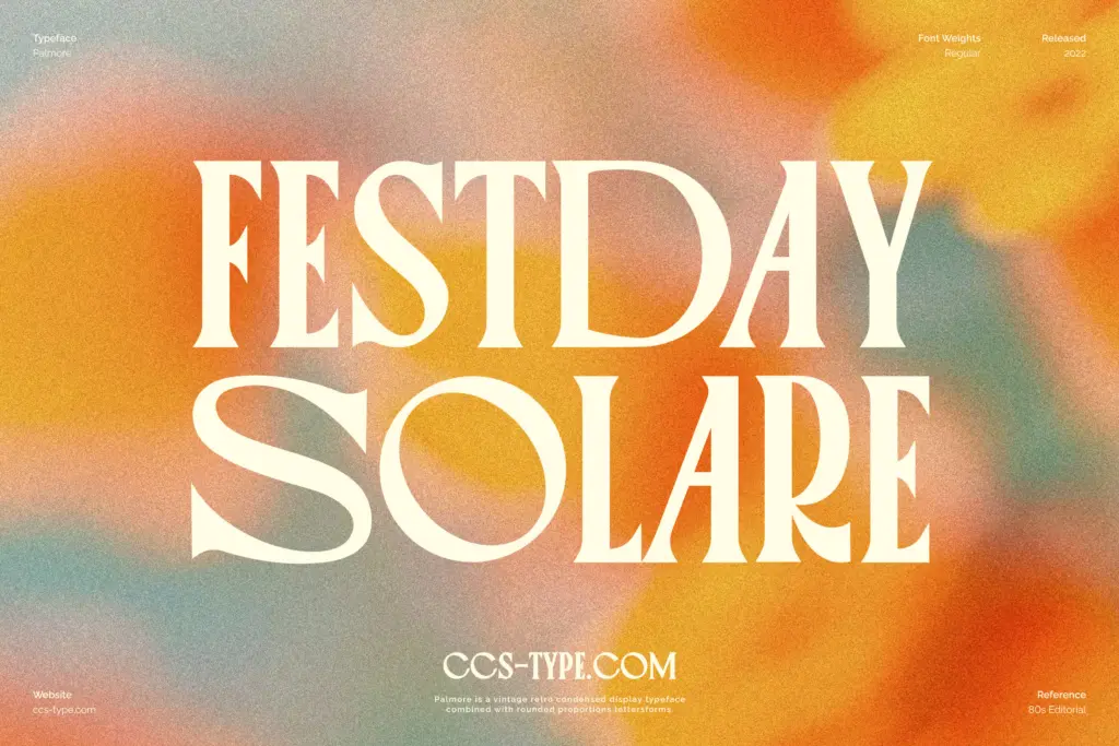
This is a headline typeface first. It suits editorial mastheads, feature titles, and pull quotes where you want something with a bit of retro character but not full-blown script or ornamental serif drama. The condensed width also makes it a reasonable fit for packaging or label work where horizontal space is tight and you need a few words to carry visual weight — think product names, badge lettering, or short taglines on posters.
Branding applications work well too, particularly for businesses leaning into a 70s or 80s print aesthetic: cafés, record labels, boutique retail, anything wanting warmth without looking overly polished or corporate. Social graphics and Instagram headline treatments are another natural home, since the letterforms read clearly even when cropped tight.
What it won’t do is body copy — don’t reach for Palmore past a sentence or two. And because the vintage-rounded-condensed combination is fairly specific, it works best as a supporting display element paired with a plainer serif or sans for any surrounding text, rather than trying to build an entire visual system out of it alone.

What we liked, and what we didn’t
Strengths
- Rounded bowls on O and C give a tight condensed structure real warmth and personality
- Stylistic alternates meaningfully vary texture across headline-length settings
- Four weights offer flexibility within a single vintage-leaning project
Trade-offs
- Condensed spacing tightens up uncomfortably at small sizes, limiting it to display use
- The specific vintage-rounded-condensed look narrows how many contexts it fits naturally
Palmore is a well-drawn condensed display serif that earns its vintage label honestly, thanks to rounded bowls that soften an otherwise tight, march-like rhythm. It's built for headlines and short branding moments, not body text, and works best paired with a plainer face for supporting copy. A solid, characterful choice for anyone chasing a specific retro-editorial mood rather than an all-purpose family.
Verdict

Tantype reviews typefaces in depth — every font is tested in real branding, editorial and screen layouts before a word gets written. 555+ fonts reviewed and counting.