
Recoleta: a rounded serif built for warm, confident headlines
Design style
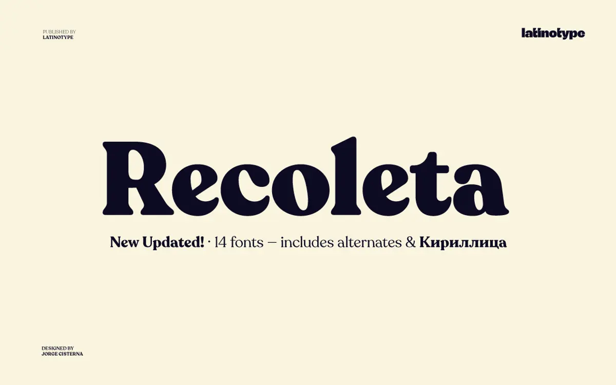
Recoleta belongs to the family of soft slab serifs that took cues from 1970s display faces like Cooper and Windsor, but it isn’t a straight revival. The bracketed serifs are chunky and slightly rounded rather than sharp, and the strokes swell and taper with a fluidity that gives the letters a friendly, almost hand-finished feel. There’s a low contrast between thick and thin strokes, which keeps the overall texture even without going flat.
What sets Recoleta apart from a generic retro slab is how consistently that roundedness is applied. Bowls are full, terminals curl gently rather than cutting off square, and the italics lean into the same soft geometry instead of switching to a script-like posture. It reads as considered rather than nostalgic pastiche — the 70s reference is a starting point, not a costume.
Character set and features
The family spans a broad weight range, from light to black, so you can pull a delicate weight for setting a few lines of body copy and jump to something much heavier for a headline without leaving the family. That range is the practical backbone of the design: the lighter cuts read fairly straightforwardly, the heavier ones lean hard into personality, with thicker terminals and more pronounced curves.
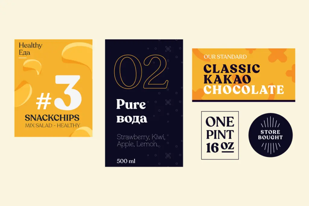
Stylistic alternates are where Recoleta earns its keep for branding work. Several lowercase letters — g, a, and others — come with alternate forms that swap the default shape for something more distinctive, letting you dial a wordmark up or down without changing typefaces. OpenType features handle the swaps, so alternates can be applied selectively rather than as a wholesale style change. The typeface also supports Cyrillic, extending its use into markets that a lot of display serifs simply don’t reach.

Use cases
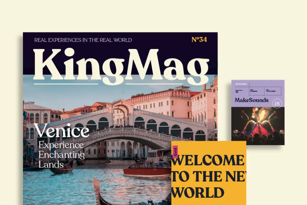
Recoleta is most at home in headline and identity work: logotypes, packaging lockups, editorial mastheads, cookbook and lifestyle branding where a bit of warmth is wanted without tipping into whimsy. The heavier weights carry real presence at large sizes and hold their shape well when scaled up for signage or packaging.
It’s less suited to long-form body text. Even the lighter weights have a rounded density that starts to feel heavy in paragraphs of more than a few lines, and the soft, similar-shaped letterforms can blur together at small sizes — legibility drops faster than with a more conventional text serif. Treat it as a display and short-copy family: headlines, subheads, pull quotes, short packaging copy, and let something plainer carry the reading text. Used that way, across its weight range, it gives a brand a consistent, slightly retro warmth without requiring multiple unrelated typefaces to cover headline and subhead duties.
What we liked, and what we didn’t
Strengths
- Wide weight range lets one family cover both delicate headlines and heavy display work
- Stylistic alternates give logotypes and wordmarks a distinctive, non-default look
- Cyrillic support extends its use beyond Latin-only branding projects
Trade-offs
- Rounded, similar letterforms reduce legibility at small sizes or in long text
- Its retro warmth is a strong flavour that won't suit neutral or technical brands
Recoleta is a well-drawn, distinctive display serif that does headline and branding work with real personality. It isn't built for body copy, and its softness can blur at small sizes, but as a family for logos, packaging and editorial headlines it earns its popularity.
Verdict

Tantype reviews typefaces in depth — every font is tested in real branding, editorial and screen layouts before a word gets written. 555+ fonts reviewed and counting.