
Ten Pounds: a hand-drawn serif with a deep OpenType toolkit for playful branding
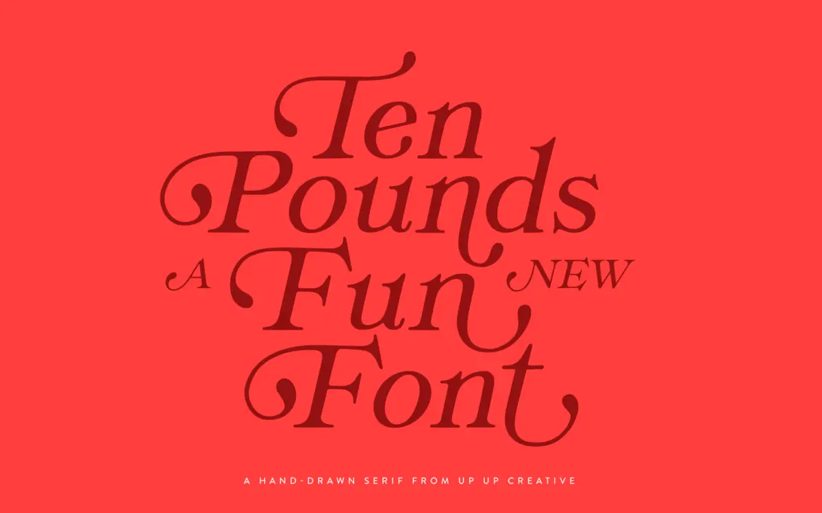
Design style
Ten Pounds is a hand-drawn serif with a loose, sketchy construction rather than a polished, formal one. The strokes wobble slightly, the serifs are stubby and irregular, and the overall feel is closer to a marker or brush-pen sketch than to a traditionally cut serif. It doesn’t try to disguise its handmade origin, and that’s the point: the imperfections are the personality. Letters lean and lift unevenly, giving the face a bouncy, informal rhythm rather than a steady one. This is not a serif built for gravitas or restraint. It reads as friendly, a little chaotic, and unmistakably illustrative — the kind of face that looks drawn by hand because it is.
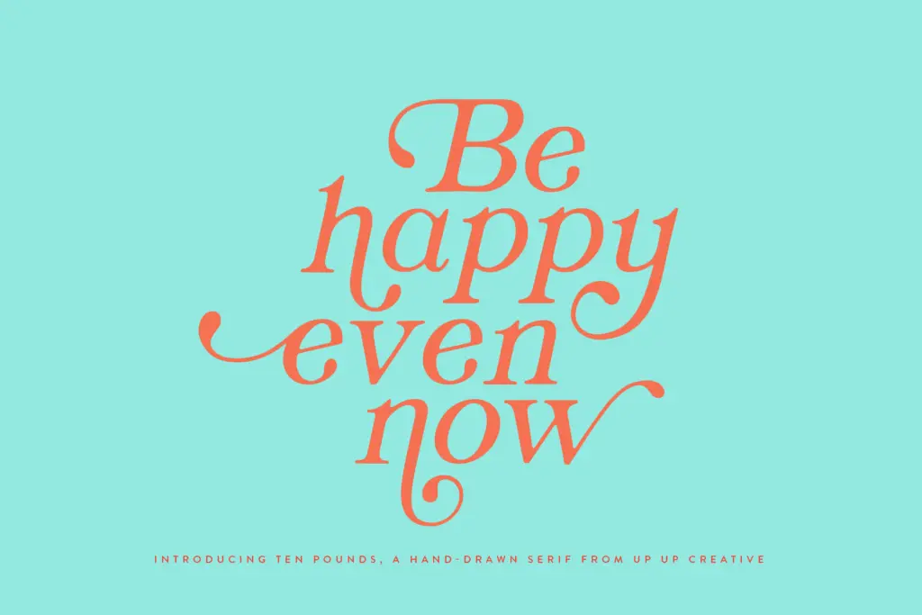
Character set and features
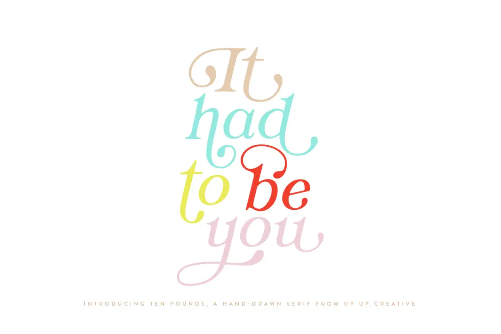
The glyph count here is unusually large for a display face — more than 1,300 characters, with over 100 ligatures included. That’s a lot of raw material, and it shows in how the font is meant to be used: not by typing a word and calling it done, but by building it, swapping alternates, and letting the OpenType features do the work of variation. Stylistic sets, character variants, and initial/final contextual forms all suggest the designer wanted each occurrence of a letter to look slightly different from the last, mimicking genuine handwriting rather than a repeating stamp. Multilingual support and multiple currency symbols round things out for practical use beyond English-language projects. The catch is accessibility: these features only reveal themselves in OpenType-aware software like Illustrator or InDesign. In Word, you’re digging into the advanced font menu, and many casual buyers simply won’t bother — meaning a chunk of what makes this font interesting will go unused by anyone who doesn’t already know their way around glyph panels.
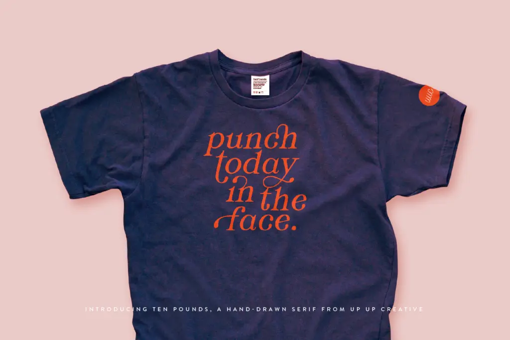
Use cases
Ten Pounds fits short, expressive text: logotypes, poster headlines, packaging call-outs, invitation lettering, t-shirt graphics, and anything aimed at children’s or craft-adjacent branding. Its wobble and warmth work in favour of anything trying to feel handmade, small-batch, or playful — a bakery, a kids’ product line, a zine cover, a wedding invitation with a casual rather than formal tone. It is not suited to body copy or long-form editorial text; the irregularity that makes it charming at large sizes becomes fatiguing and hard to track in paragraph form. It also won’t do well in contexts asking for corporate polish or minimalism — the whole design argument runs opposite to that. Treat it as a display and accent typeface rather than a working text face, pair it with something quieter for supporting copy, and lean on the alternates and ligatures if you’re using it for anything longer than a headline or a short line of lettering. Used sparingly and with attention to the OpenType features, it earns its keep as a characterful, slightly unpredictable display serif.
What we liked, and what we didn’t
Strengths
- Large glyph set with over 100 ligatures gives real variation across repeated letters
- Contextual alternates and stylistic sets let the handmade feel look genuinely varied, not repetitive
- Multilingual and currency symbol support extends its use beyond English-only projects
Trade-offs
- Its full feature set is hard to access outside OpenType-aware apps like Illustrator or InDesign
- The irregular, wobbly forms tire the eye quickly at body-text sizes
Ten Pounds is a characterful, sketchy display serif with a genuinely deep glyph set behind it. It's built for short bursts of expressive lettering, not paragraphs, and its best features are locked behind OpenType-savvy software most casual users won't touch. Good for branding and invitation work that wants a handmade, playful tone.
Verdict

Tantype reviews typefaces in depth — every font is tested in real branding, editorial and screen layouts before a word gets written. 555+ fonts reviewed and counting.