
Midruns Font Duo: A Bold Script and Sans Pairing for Retro Branding
Design style
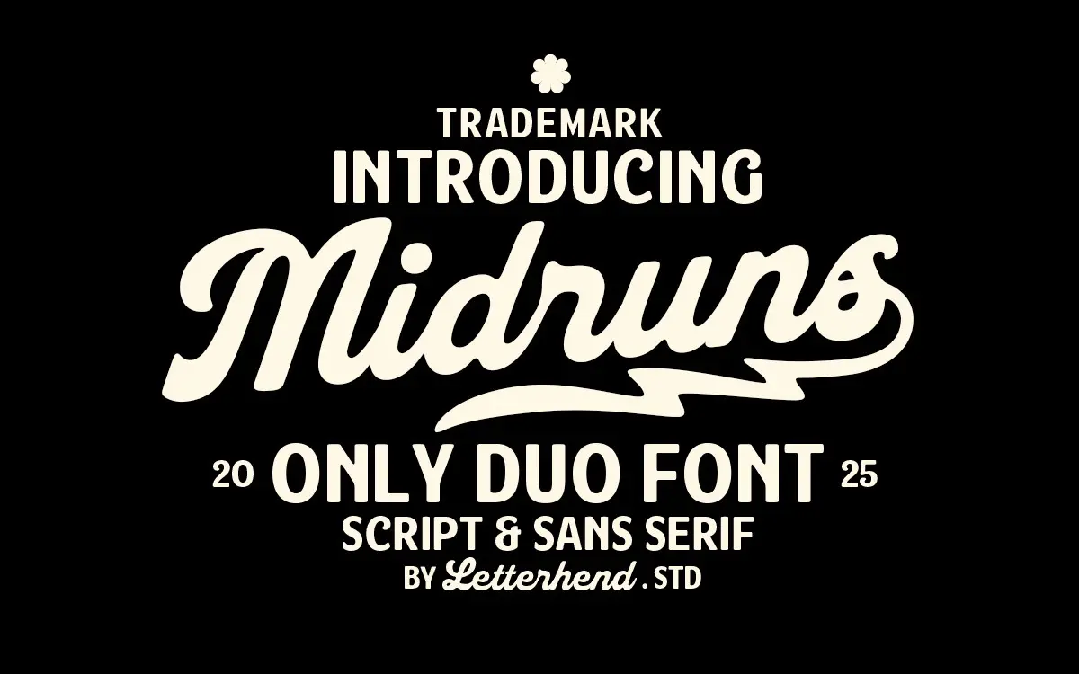
Midruns pairs a heavyweight brush script with a companion sans, both built around the same retro-signage instinct. The script carries thick, confident strokes with rounded terminals rather than sharp brush points, which gives it a blunter, more graphic feel than most script fonts aiming for elegance. It reads as hand-lettered rather than calligraphic — closer to a painted shop sign than a wedding invitation. The letters lean into their weight, with joins that bulge slightly at connection points, and a baseline that dips and rises in a controlled, deliberate way rather than a chaotic scrawl.
The sans partner is drawn plainly, with even strokes and a slightly condensed skeleton that keeps it compact next to the script’s width. It doesn’t try to compete for attention. Where the script is expressive, the sans is quiet — a support act, not a co-star. That contrast is really the whole design premise: one face for noise, one for information.
Character set and features
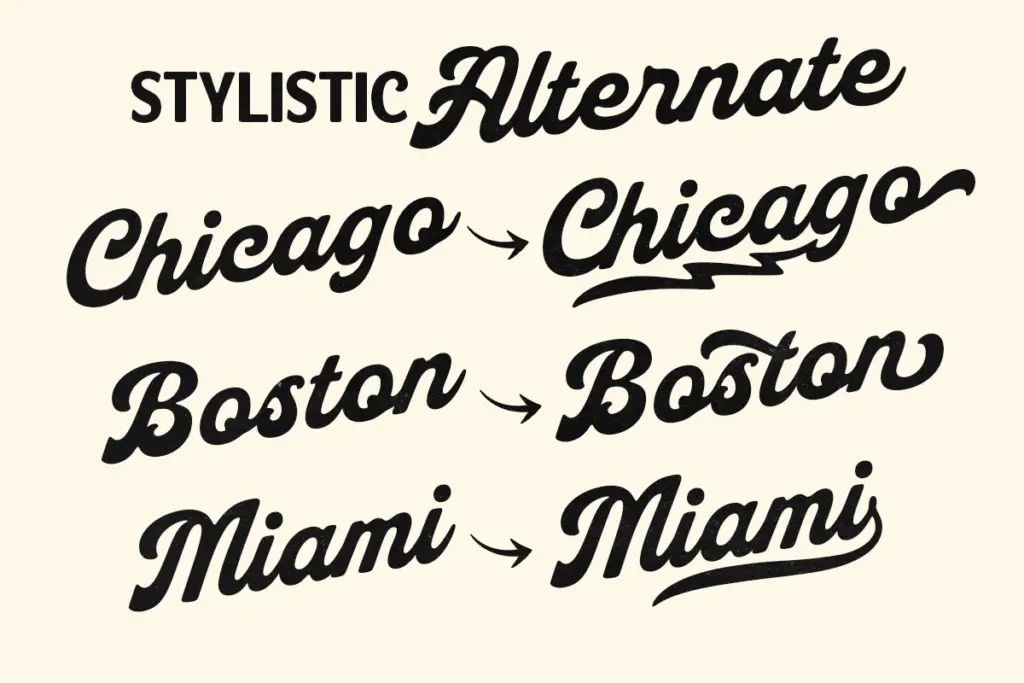
Both fonts cover uppercase, lowercase, numerals and punctuation, with the script including alternates and ligatures to break up repeated letters — useful given how heavy and distinctive each script letterform is on its own. Without swaps, a word with doubled letters can start to look clumped, so the alternates aren’t decorative extras here, they’re doing real legibility work. PUA encoding is used to access them, so anyone new to glyph panels will want to spend a few minutes in a proper OpenType-aware app rather than assuming they’ll appear automatically.
Multilingual support is included, though the brief doesn’t specify which languages, so anyone working outside basic Latin should check character coverage before committing a layout to it. There’s no indication of a weight range beyond the single bold script and its sans companion — this is a duo, not a family, and should be judged on that basis rather than expecting the flexibility of a multi-weight system.
Use cases
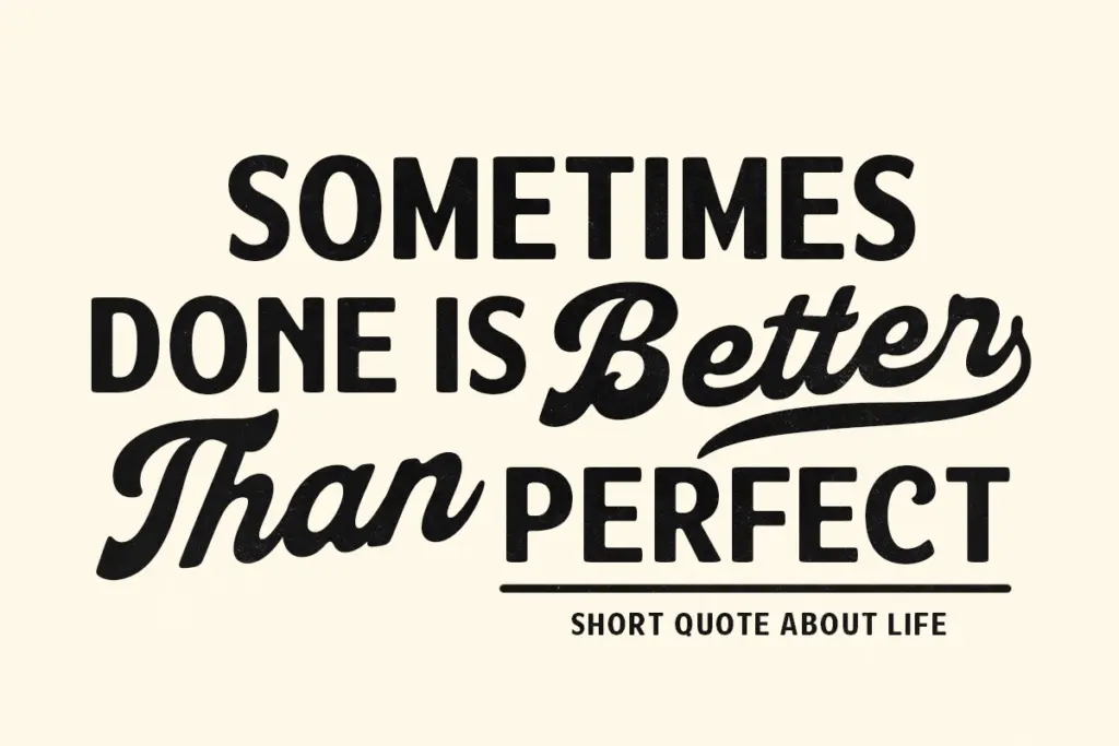
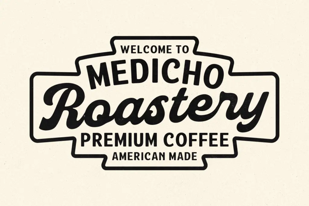
Midruns is built for branding work that wants a retro-modern voice without going fully vintage-kitsch: logotypes, packaging fronts, apparel graphics, signage, and social posts where a short burst of script text needs to carry personality. The script’s weight means it holds up fine at small sizes for a script font — thin hairline strokes are the usual failure point for scripts at small scale, and Midruns mostly avoids that by staying chunky throughout.
It’s less suited to anything needing restraint or long-form use. The script is not a font for setting a sentence, let alone a paragraph — it’s a name-plate or headline tool, two or three words at most before the personality becomes fatigue. The sans is the more flexible half and could reasonably do secondary work — taglines, addresses, ingredient lists — on its own, separate from the script. Buyers should think of this as a fixed-role pair: one for the shout, one for the fine print, with limited room to improvise beyond that.
What we liked, and what we didn’t
Strengths
- Bold, chunky script strokes hold up better at small sizes than typical thin-brush scripts
- Alternates and ligatures address the repeated-letter clumping that heavy scripts often suffer from
- Sans companion is plain and legible enough to work independently for secondary text
Trade-offs
- The script is only practical for short words or phrases, not sentences or paragraphs
- It's a fixed two-style duo rather than a multi-weight family, limiting flexibility across a full brand system
Midruns is a competent retro-branding duo with a heavyweight script that reads well at small sizes and a plain sans that keeps things legible. It's a specialist pairing for short bursts of branding text, not a flexible system for long-form work.
Verdict

Tantype reviews typefaces in depth — every font is tested in real branding, editorial and screen layouts before a word gets written. 555+ fonts reviewed and counting.