
Birdie: a distressed hand-lettered font with real vintage-print grit
Design style
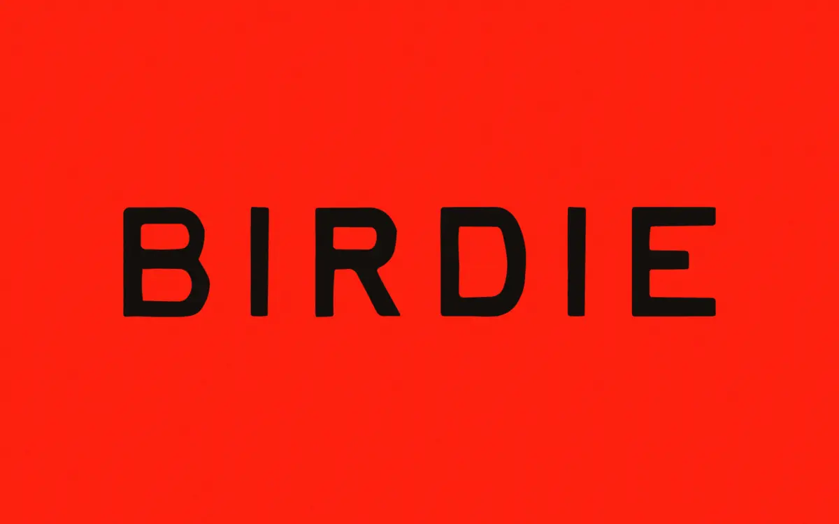
Birdie sits in the well-worn territory of vintage-print lettering: uneven baselines, ink-heavy strokes, and edges that look like they came off a rubber stamp rather than a pen plotter. It’s not polished calligraphy dressed up with a texture filter — the roughness is baked into the letter construction itself, so the wobble reads as handmade rather than applied. Strokes vary in weight within a single letter, terminals fray slightly, and there’s enough inconsistency between repeated letterforms that the eye doesn’t immediately register a pattern, which is the point of this style.
The overall tone leans warm and a little worn, closer to a hand-stamped market sign or an old feed-sack label than a modern lettering flourish. It won’t suit anyone chasing a clean, contemporary hand-lettered look — this is deliberately imperfect, and that imperfection is the whole appeal.
Character set and features
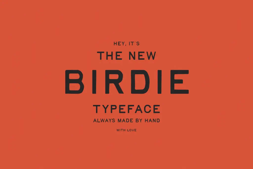
The font includes contextual alternates for both upper and lowercase letters as well as digits, which helps break up repetition in longer words — useful given how distinctive some of the rougher characters are. Without alternates, a word with doubled letters could look mechanically repeated in a way that undercuts the handmade illusion; with them, consecutive same letters shift shape and keep the texture believable.
Language support extends across Western European characters, including accented forms needed for Icelandic and Welsh, so it’s usable well beyond English-only projects — a genuine plus for a display face this stylised, since diacritics are often an afterthought in hand-lettered fonts and end up looking bolted on. Here they appear to follow the same rough-edged logic as the base letters, though as with any heavily textured display font, it’s worth setting a proof at your intended size before committing, since fine ink-splatter detail can either sing or turn to mush depending on output.

Use cases
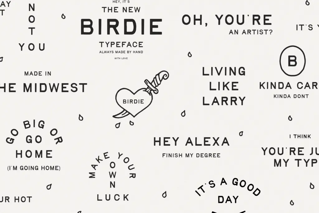
Birdie is built for short bursts of text rather than paragraphs: headlines, logotypes, product labels, packaging call-outs, badge lockups. The vintage-print character makes it a natural fit for anything trying to evoke Americana, farmers-market branding, craft goods, or retro packaging — the kind of project where you want type that looks like it’s been through a printing press a few times rather than fresh off a screen. It also has obvious appeal for greeting cards, seasonal merchandise, and hand-lettered-style social graphics where a bit of grit reads as personality rather than sloppiness.
It’s less suited to body copy or anything requiring sustained reading — the deliberate irregularity that makes it charming in a headline becomes fatiguing across sentences. Pair it with a plain, quiet sans or serif for supporting text rather than asking Birdie to do double duty; it wants to be the loud element in a layout, not the whole voice.
What we liked, and what we didn’t
Strengths
- Contextual alternates for upper/lowercase and digits keep repeated letters visually varied
- Roughness feels built into the letterforms rather than added as a texture effect
- Broad Western European language support including Icelandic and Welsh diacritics
Trade-offs
- Not legible enough for extended body copy or fine print
- The heavy distressed texture may lose detail at very small sizes or low-resolution print
Birdie delivers a convincing vintage-print texture with contextual alternates that keep repeated letters from looking mechanical. It's a strong pick for short, punchy branding and packaging work, but it's not built for body text or clean modern layouts.
Verdict

Tantype reviews typefaces in depth — every font is tested in real branding, editorial and screen layouts before a word gets written. 555+ fonts reviewed and counting.