
Fander Font: a minimalist sans built for logotype and wordmark work
Design style
Fander sits in the geometric-leaning end of minimalist sans design, the kind of letterform you reach for when a brand wants to look stripped-back rather than warm. Strokes are even, counters are open, and there’s little in the way of flourish — this is a face built around restraint rather than character. The skeleton reads as grotesque-adjacent: straightforward terminals, minimal stroke contrast, no humanist quirks pulling attention to individual letters.
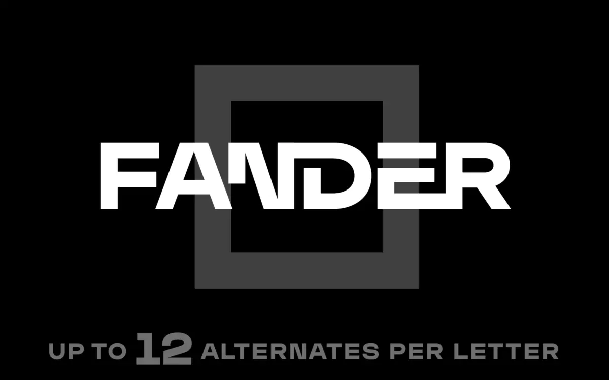
What separates Fander from a generic minimalist sans is the alternate system layered on top of that skeleton. With up to twelve variants per letter, the designer has clearly built this as a kit of parts rather than a fixed alphabet. Some alternates lean more angular, others more rounded or truncated — the kind of swaps that let a wordmark pick up a slightly unexpected notch in a G or a cut corner in an R without breaking the overall geometric logic. On its own, in default form, Fander reads clean but unremarkable. The alternates are where the design decisions actually live, and where the font earns its keep.
Character set and features
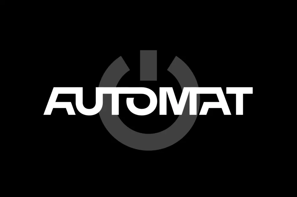
The set covers Latin letters with their alternates, basic multilingual characters also carrying alternates, numerals, punctuation, and a set of extra characters. That’s a reasonably deep character set for a logotype-focused face, and the fact that the alternate treatment extends beyond the core Latin alphabet into multilingual support is worth noting — many display faces stop their alternate systems at the 26 basic letters and leave accented characters to default forms that don’t match the rest of the design.
Access to the alternates is manual, through the Glyphs panel in whatever software you’re using — Illustrator’s Window > Type > Glyphs, for instance. There’s no OpenType feature automation mentioned, no stylistic sets triggering swaps contextually. That means building a wordmark with Fander is a hands-on process: you pick each letterform individually, which is exactly right for logotype work where you want full control, and exactly wrong if you were hoping to set a paragraph and have the alternates do something interesting automatically. This is not a text face pretending to have display features bolted on — it’s a display and lettering tool through and through.

Use cases
Fander’s natural home is logotypes, wordmarks, and short-form branding marks — taglines, headline treatments, title cards, packaging lockups where a handful of characters carry the whole visual weight. The alternate system rewards exactly this kind of use: pull two or three letters, test variants against each other, lock in a combination that feels specific to the brand rather than off-the-shelf.
It’s less suited to anything requiring sustained reading. There’s no indication of a text-weight companion or an extended family built for body copy, and the minimalist geometric construction isn’t the kind of thing you want to read in long paragraphs anyway — it tends to flatten at smaller sizes where the alternates’ subtle differences disappear. Treat it as a mark-making tool, not a system typeface, and it performs well within that narrow brief.
What we liked, and what we didn’t
Strengths
- Up to 12 alternates per letter gives real room to customise a wordmark without leaving the typeface family
- Alternate coverage extends into multilingual characters, not just the basic Latin set
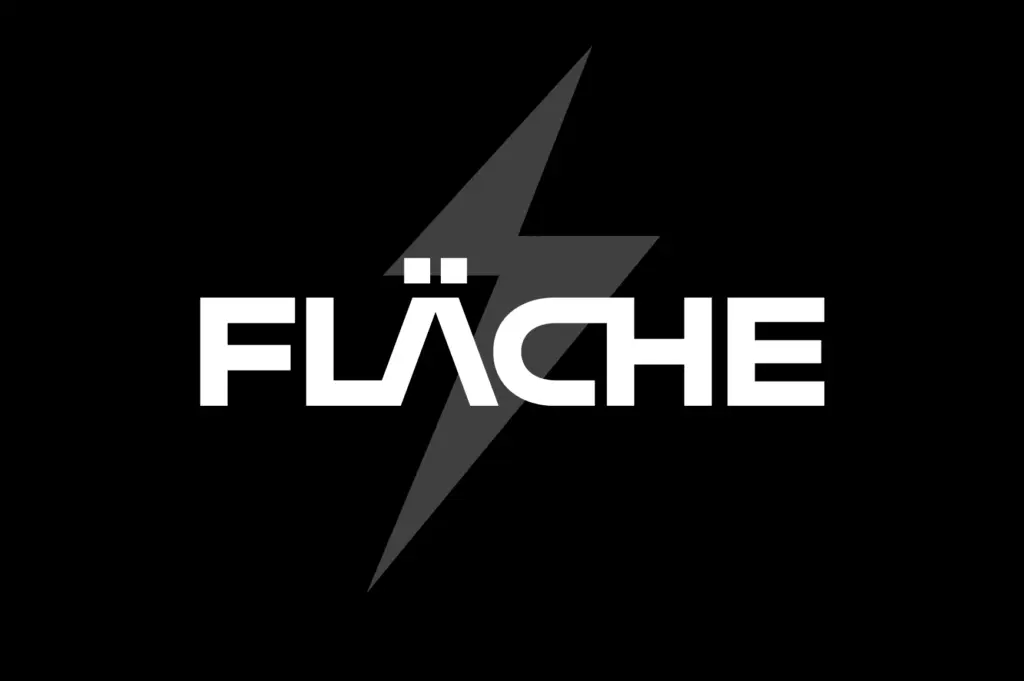
- Open, even construction keeps marks legible at logo scale
Trade-offs
- No automated OpenType feature access — alternates require manual selection via the Glyphs panel
- Default letterforms alone are fairly generic and depend on alternate swaps to feel distinct
Fander is a minimalist sans built specifically for logotype construction, with a deep alternate system that lets you customise individual letters rather than committing to a fixed alphabet. It won't do much for you outside branding and headline work, but within that narrow lane the alternates genuinely add value.
Verdict

Tantype reviews typefaces in depth — every font is tested in real branding, editorial and screen layouts before a word gets written. 555+ fonts reviewed and counting.