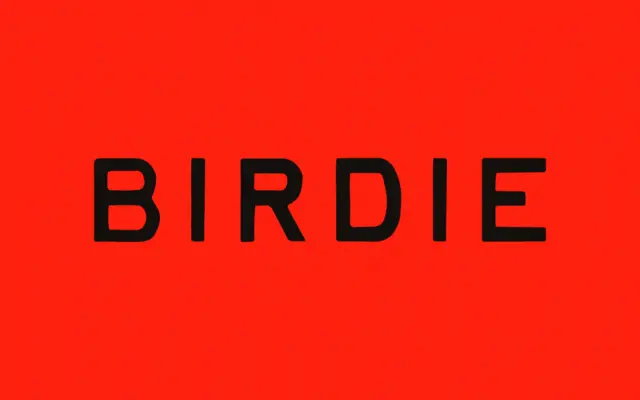
Birdie: a distressed hand-lettered font with real vintage-print grit
Design style Birdie sits in the well-worn territory of vintage-print lettering: uneven baselines, ink-heavy strokes, and edges that look like…
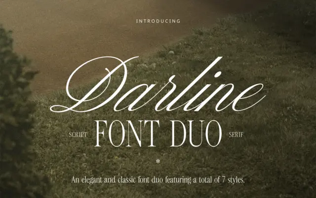
Design style Darline is built on a familiar but reliable premise: a restrained serif carrying the weight of the work,…
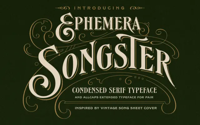
Design style Songster pulls from the lettering found on 19th-century song sheet covers, and it shows in the details rather…
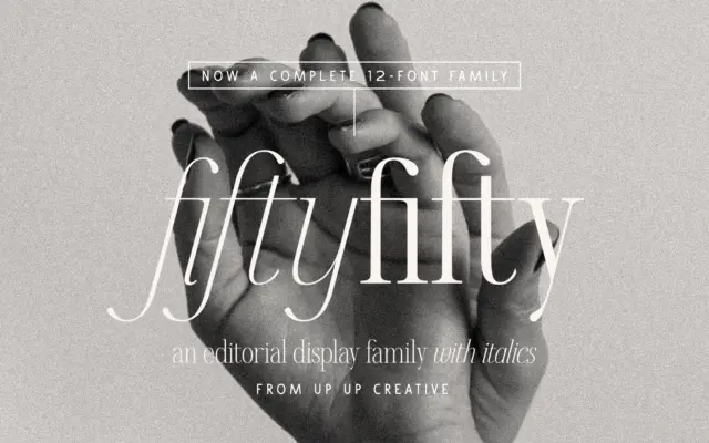
Design style Fifty Fifty sits in the editorial serif category, which usually means one of two things: a workhorse text…
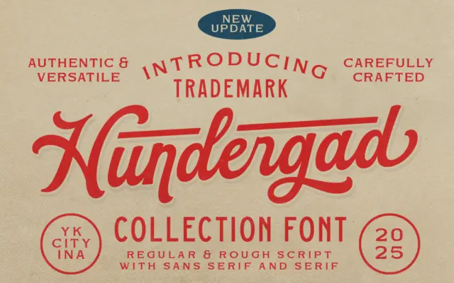
Design style Hundergad started life as a single bold script and has been expanded into a small family: the original…
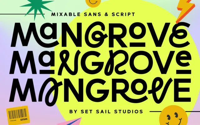
Design style Mangrove is built around a simple idea: a rounded, slightly quirky sans sitting next to a loose, swash-heavy…
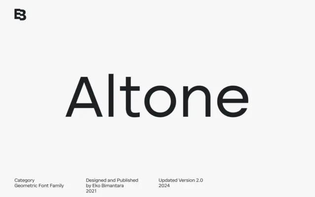
Design style Altone sits closer to grotesque territory than to the geometric-purist camp its category label suggests. The seller draws…
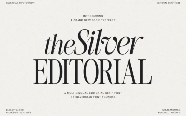
Design style The Silver Editorial is a high-contrast serif built for attention rather than for reading paragraphs. Its debt to…
Design style Ratch sits in familiar geometric grotesk territory but doesn’t stay quietly there. The circular bowls, near-monolinear strokes, and…