
Darline Font Duo: a serif-and-script pairing for quiet-luxury branding
Design style
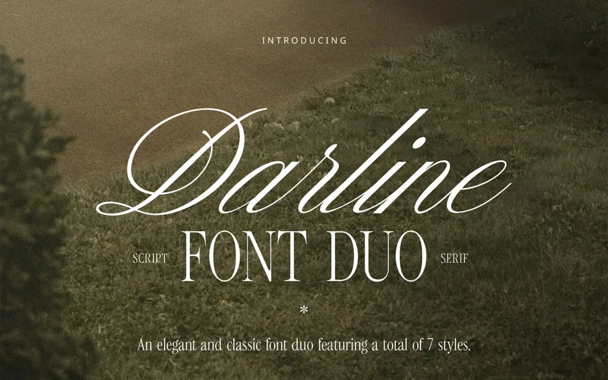
Darline is built on a familiar but reliable premise: a restrained serif carrying the weight of the work, and a script riding alongside it for accent and personality. The serif side leans on modest contrast and closed, slightly narrow apertures — nothing showy, but drawn with enough care in the joinery that it reads as a considered text face rather than a placeholder. The script is the more expressive half, with a moderate slant, connected lowercase, and a looseness to the baseline that keeps it from feeling stiff. Two of the script variants are labelled “Aged,” which rough up the strokes with worn edges and broken terminals, giving the duo a second register between crisp and lived-in.
Together they land somewhere in the “quiet luxury” territory the seller is chasing — pale, understated, more department-store perfume box than nightclub flyer. That’s a specific look, and Darline commits to it rather than hedging toward something louder. The trade-off is that neither half is particularly distinctive on its own; the serif especially could be swapped for any number of similar light serifs without much visual loss. The script carries more of the identity here.
Character set and features
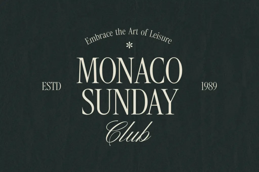
Three serif weights — Light, Regular, Bold — give the family enough range to build a small hierarchy: a light weight for body copy or subheads, a bold for anchoring a wordmark or headline. The script comes in four cuts: Regular, Regular Slanted, Aged, and Aged Slanted, which is generous for what’s usually treated as an accent face. Full punctuation, numerals, and special characters are included, and language support extends across several Western European languages, so accented characters in French, German, Portuguese and the Scandinavian languages are accounted for rather than bolted on as an afterthought.
The Aged variants are the most useful differentiator in the set. Rather than relying on a single script style and hoping it fits every mood, the duo gives you a clean connected script for polished work and a distressed version for anything that wants a handmade or heritage feel — a label, a stamp, a market stall sign. That flexibility is worth more in practice than the sheer number of files suggests.
Use cases
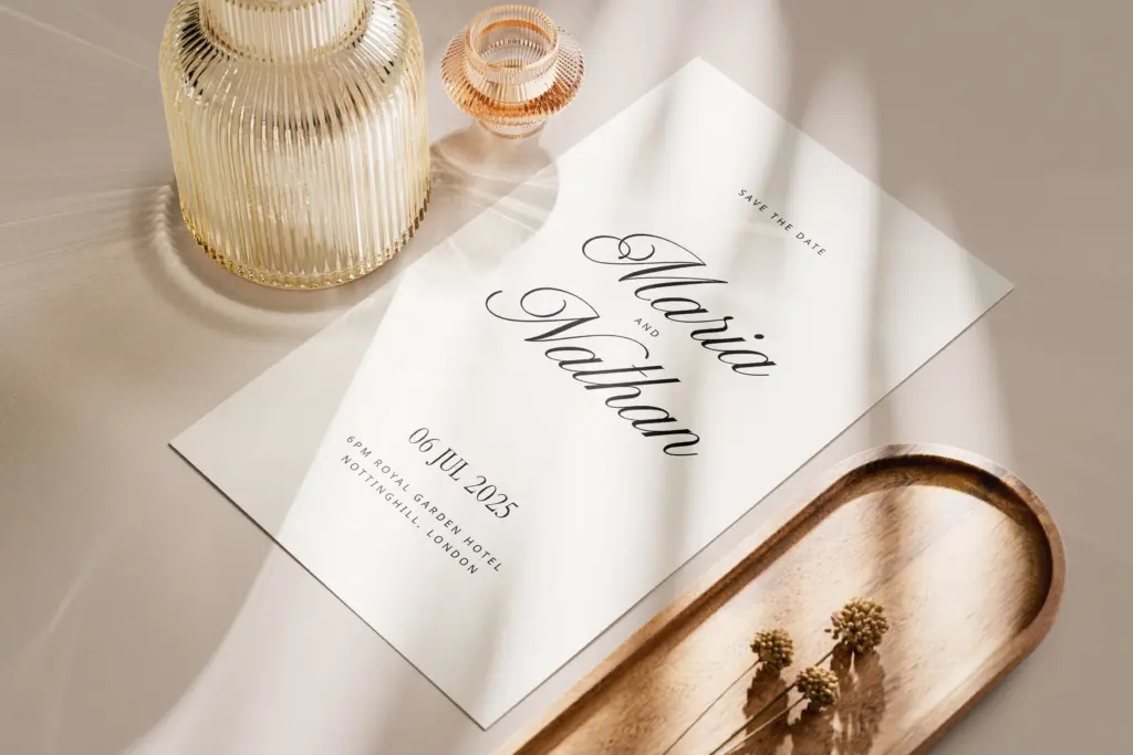
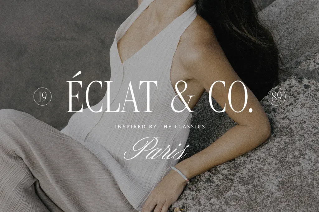
This is a branding kit more than a display face for headline-scale impact. The serif does the reading work — packaging copy, invitation body text, a logotype’s supporting line — while the script supplies a signature or monogram flourish above it. Wedding stationery is an obvious fit, particularly where the brief calls for something soft rather than romantic-cursive. Beauty, skincare, and boutique retail branding are the other natural homes: the palette of forms reads as considered rather than decorative, which suits packaging and social media graphics that need to feel premium without shouting.
It’s less suited to anything that needs a strong, memorable mark at a glance — a sports logo, an app icon, a poster meant to work from across a room. The forms are too quiet for that kind of job. Used at the scale it’s designed for — cards, labels, small-format branding — the pairing does exactly what it promises, cleanly and without fuss.
What we liked, and what we didn’t
Strengths
- The Aged script variants give the duo a second, more textured register without buying a separate font.
- Three serif weights allow a small type hierarchy for branding layouts.
- Broad accented-character support makes it usable across several European languages out of the box.
Trade-offs
- The serif half is fairly generic and could be substituted with many similar light serifs.
- The overall look is too understated for logos or display work that needs strong visual presence at a glance.
Darline Font Duo is a competent, quietly styled serif-and-script pairing that suits soft branding, wedding stationery, and packaging rather than bold display work. The Aged script variants add real practical range, even if the serif half is the less memorable of the two. It's a dependable choice for a specific mood, not a distinctive one.
Verdict

Tantype reviews typefaces in depth — every font is tested in real branding, editorial and screen layouts before a word gets written. 555+ fonts reviewed and counting.