
Mangrove Font Duo: a playful sans and script pairing for branding work
Design style
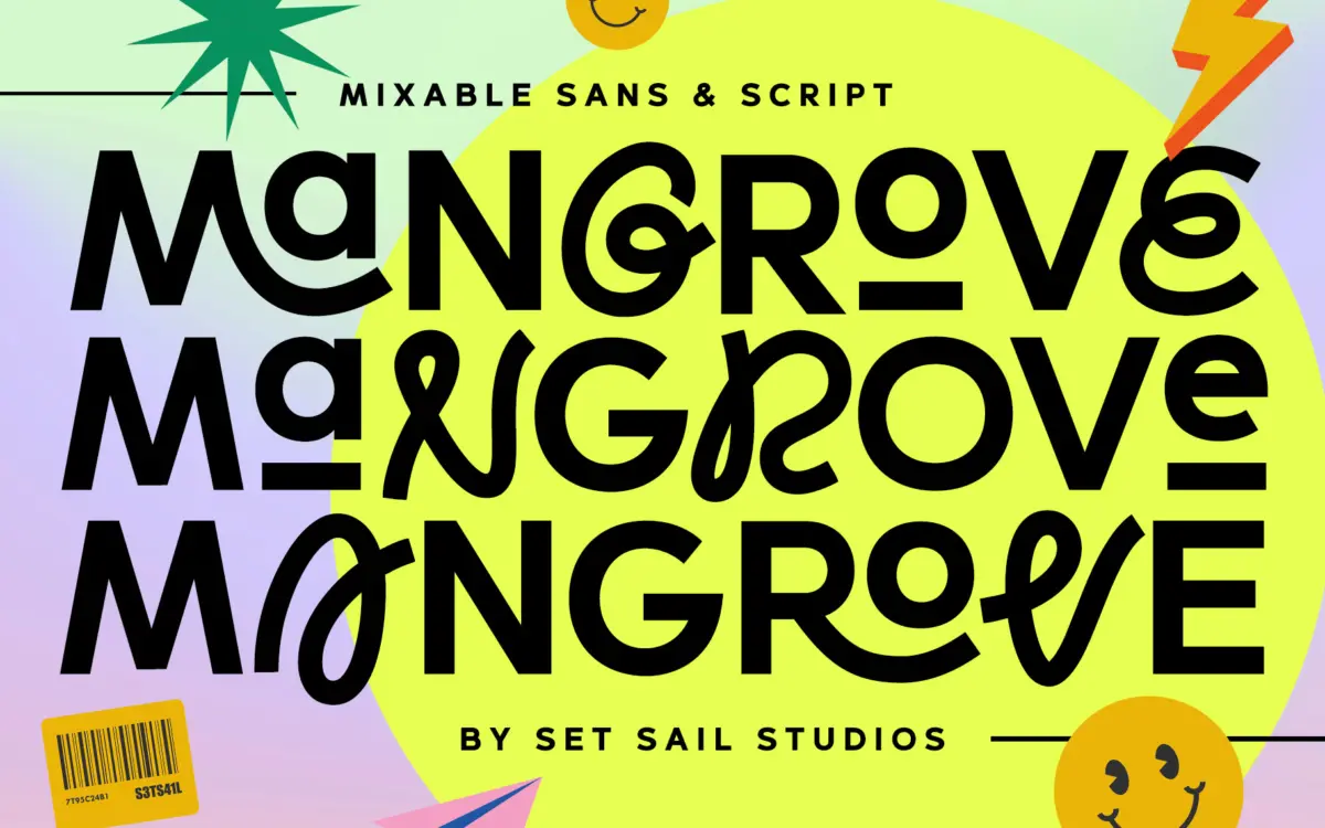
Mangrove is built around a simple idea: a rounded, slightly quirky sans sitting next to a loose, swash-heavy script, both drawn to share the same casual energy. The sans has soft terminals, a bit of bounce in the baseline, and letterforms that avoid strict geometry in favour of something friendlier and hand-adjusted. The script leans into looping ascenders and descenders with visible variation from letter to letter, giving it a sketched, unforced quality rather than the tight, calligraphic precision you get in more formal script faces.
What holds the duo together is restraint. Neither face pushes its personality so hard that it fights the other. The sans is quirky without becoming a novelty font, and the script is expressive without slipping into illegibility. That balance is the actual achievement here — pairing a sans and script is common, but making them read as siblings rather than a forced marriage takes some care in how the proportions and stroke weights line up.
Character set and features
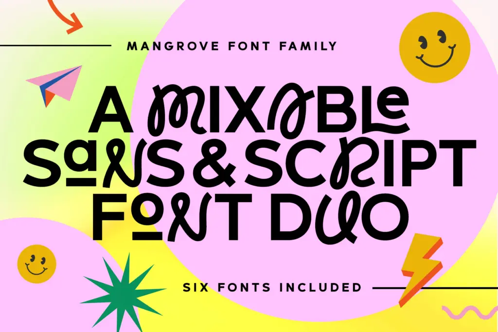
Each face comes in three weights, so between the sans and script you have six fonts to work with, plus upper and lowercase in both. The script includes swash and ligature alternates, and the sans carries small caps, which the seller pitches as a way to mix registers within a single word or line — dropping a script capital into a sans word, for instance. This kind of in-word mixing is a specific technique, and it works here because the x-heights and weights were clearly checked against each other rather than left to chance.
Language support is broad, covering most major Western and Central European languages along with Turkish and the Nordic set, so diacritics are accounted for rather than bolted on as an afterthought. There’s no mention of numerals, currency symbols, or extended ligature sets beyond what’s described, so treat anything not explicitly stated as unconfirmed.
Use cases
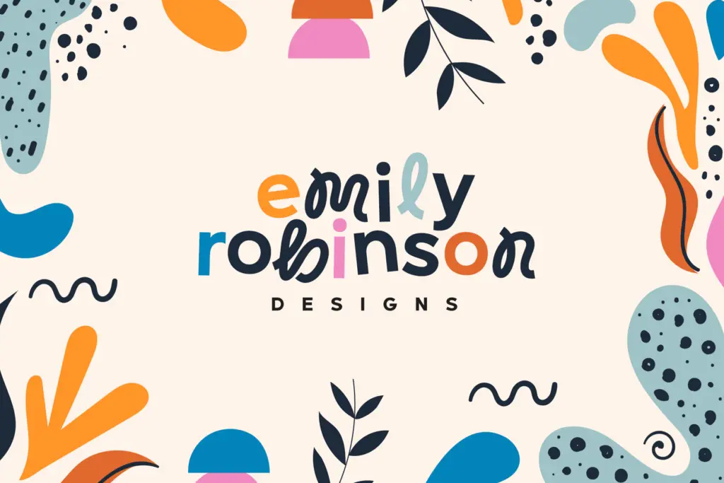
This is a branding and packaging typeface first. The combination suits logotypes, product labels, and short editorial headlines where a brand wants warmth without going fully handwritten. The sans alone is legible enough to carry body copy in short bursts — a paragraph on a package, a subhead on a poster — but it’s not built for long-form reading; the personality that makes it appealing at display sizes will tire the eye in a page of text.
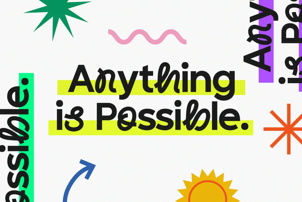
The script is best kept to short phrases, names, or accents rather than full sentences, which is true of most scripts with this much swash activity. Where the duo earns its keep is in the mixing: a wordmark set mostly in the sans with one script flourish, or small caps used as a secondary label style. Designers doing food and beverage branding, small-batch product packaging, or playful editorial titling will get the most mileage. It’s less suited to corporate or technical work, where the casual, uneven rhythm of both faces would read as off-brand rather than characterful.
What we liked, and what we didn’t
Strengths
- Sans and script are genuinely balanced in weight and proportion, so they mix without a fight.
- Small caps and swash alternates give real flexibility for in-word mixing techniques.
- Broad European language support makes it usable beyond English-only branding work.
Trade-offs
- The script's looping swashes limit it to short phrases rather than sentences.
- The sans's casual bounce makes it tire the eye in longer text passages.
Mangrove is a well-matched sans and script pairing that does the specific job it sets out to do: casual, characterful branding type. It's not built for long copy or formal work, but for logotypes and packaging accents it holds together better than most duo releases.
Verdict

Tantype reviews typefaces in depth — every font is tested in real branding, editorial and screen layouts before a word gets written. 555+ fonts reviewed and counting.