Display
3.7
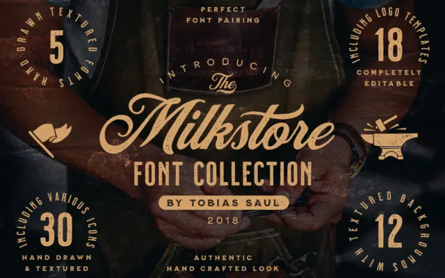
Milkstore: a hand-painted brick-wall face set for vintage badges and packaging
Design style Milkstore reads as a sign-painter’s alphabet run through a wall of old brick. The five styles inside the…
 Tantype

Design style Milkstore reads as a sign-painter’s alphabet run through a wall of old brick. The five styles inside the…
Tantype
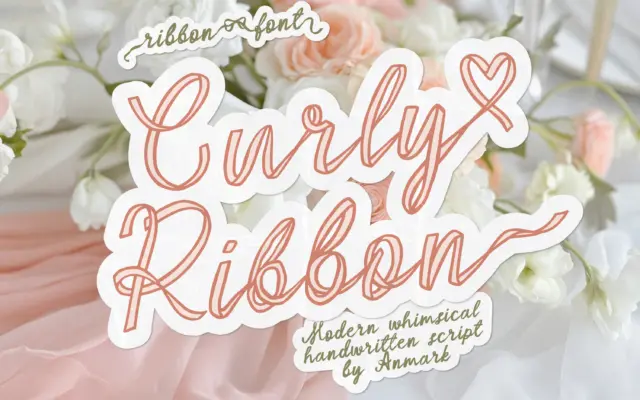
Design style Curly Ribbon builds each letter as if it were a strip of ribbon folded and looped into a…
Tantype
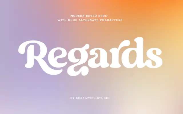
Design style Regards sits in that well-populated corner of type design where a serif skeleton gets bent toward something warmer…
Tantype
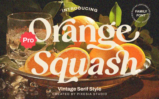
Design style Orange Squash Pro leans into the chunky, slightly retro serif look that’s become shorthand for 70s-inflected branding —…
Tantype
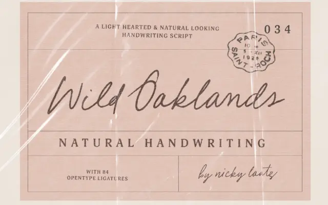
Design style Wild Oaklands sits in the loose, monoline end of handwriting scripts: it wants to read as a note…
Tantype
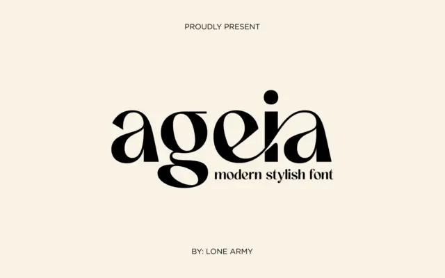
Design style Ageia sits in the geometric-sans family that’s become the default vocabulary for modern branding, but it doesn’t try…
Tantype
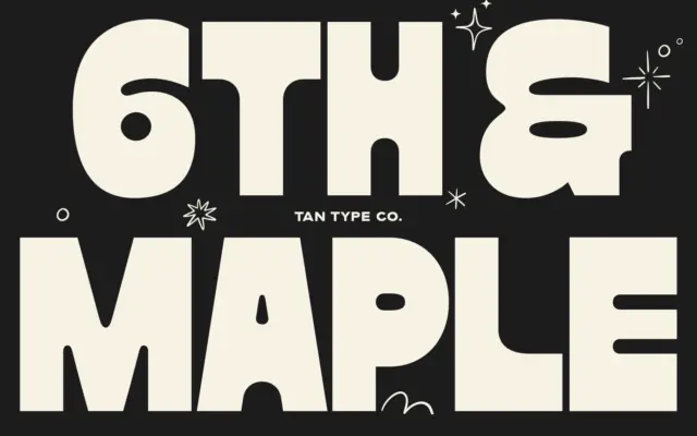
Design style Maple is a fat display face built around thick, blocky strokes with almost no contrast between thick and…
Tantype
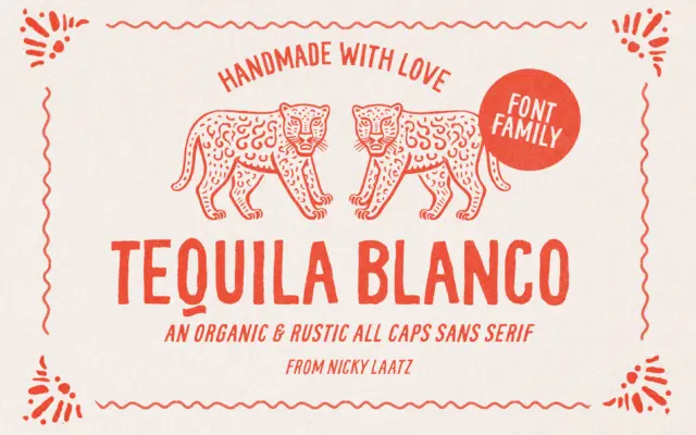
Design style Tequila Blanco is an all-caps display face built around a single idea: worn, hand-drawn marks that look like…
Tantype
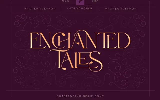
Design style Enchanted Tales sits in the decorative end of the serif family — closer to vintage lettering and storybook…
Tantype