
TAN Maple: A Chunky Heavyweight Display Font for Loud Headlines
Design style
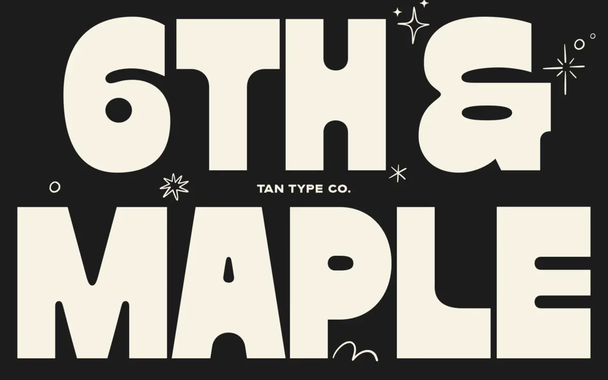
Maple is a fat display face built around thick, blocky strokes with almost no contrast between thick and thin. The letterforms sit heavy on the baseline, with rounded corners softening what would otherwise read as pure block lettering. That rounding is doing most of the work here — it keeps the weight from tipping into brutal or industrial territory, and gives the face a slightly bouncy, informal quality instead. There’s a loose, drawn feel to some of the curves, as if the letters were built by hand and then cleaned up rather than constructed purely on a grid. It’s not a geometric fat face, and it’s not trying to be a precise slab either. It lands somewhere between casual lettering and a poster typeface, and that in-between quality is its main design decision.
Character set and features
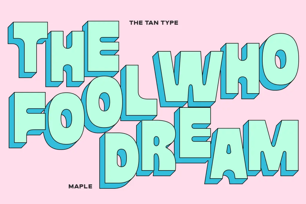
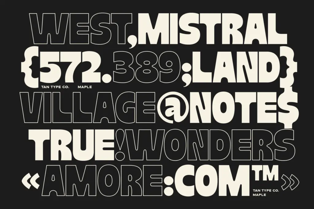
The weight is consistent across the alphabet, which matters more than it sounds like it should in a face this heavy — spacing has to be handled carefully so counters don’t clog and words don’t turn into a solid black bar. Maple manages that reasonably well at display sizes, though tight-set headlines will need manual kerning attention in a few pairs, as is typical of any single-weight fat font. Multilingual character support is included, which extends the font’s reach beyond a strictly English-language brief. There’s no mention of a companion italic or a range of weights, so this is a one-note instrument: you get the fat cut and nothing lighter to pair against it within the family itself. That’s fine if the job calls for one loud voice, less so if you need a hierarchy built from a single typeface.
Use cases
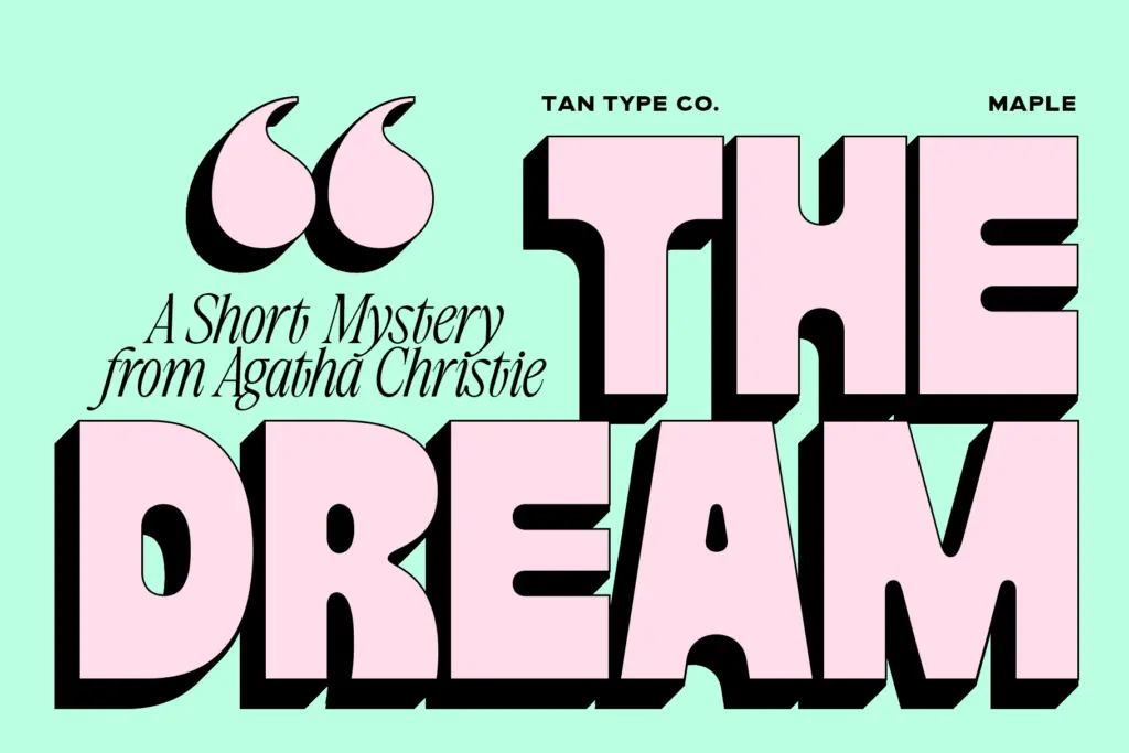
This is a headline font, not a text font, and it knows it. At large sizes — posters, packaging call-outs, app icons, social graphics, merch — the chunkiness reads as confidence rather than clutter. It has enough personality to carry a single word or a short phrase on its own, which is really the job a font like this is hired to do. Fashion-adjacent and streetwear branding, gig posters, and anything wanting a bit of attitude without going full grunge or grunge-slab territory will find a use for it. Where it struggles is anywhere near body copy or small labels: the stroke weight and tight apertures aren’t built for that, and legibility drops off fast below display sizes. It’s also worth being deliberate about how much of it you use — a whole paragraph set in Maple will fight itself for attention. Used sparingly, as a single dominant word on a page or screen, it does exactly what a fat display face should: it stops the scroll.
What we liked, and what we didn’t
Strengths
- Rounded corners keep the heavy weight from feeling stiff or purely geometric
- Multilingual character support extends its use beyond English-only briefs
- Strong presence at large sizes for single words or short phrases
Trade-offs
- No companion weights or italic, so it can't build hierarchy on its own
- Legibility drops quickly below display size due to tight counters and heavy strokes
Maple is a confident, single-purpose fat display font that does one job well: making a short word or phrase loud. It's not built for hierarchy or body text, and buyers should know that going in. For posters, packaging call-outs and branding moments that need one heavy word, it delivers.
Verdict

Tantype reviews typefaces in depth — every font is tested in real branding, editorial and screen layouts before a word gets written. 555+ fonts reviewed and counting.