Serif
3.9
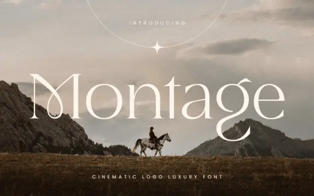
Montage: a cinematic serif for luxury logos and high-end branding
Design style Montage sits in the high-contrast display serif tradition, the kind of letterform built for a marquee rather than…
 Tantype

Design style Montage sits in the high-contrast display serif tradition, the kind of letterform built for a marquee rather than…
Tantype
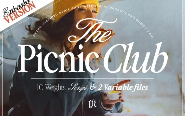
Design style The Picnic Club reads as a display serif with its roots firmly in late-1970s and 1980s lettering: slightly…
Tantype
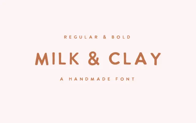
Design style Milk & Clay sits in the loose, hand-drawn sans category that’s become a staple of small-brand branding: unjoined…
Tantype
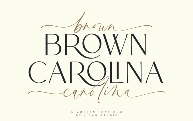
Design style Brown Carolina pairs a plain, all-caps sans with a connecting script, the pairing sold as a single duo…
Tantype
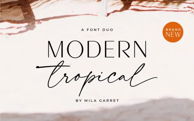
Design style This is a two-piece kit built around a simple pairing logic: a plain-spoken sans serif to carry information,…
Tantype
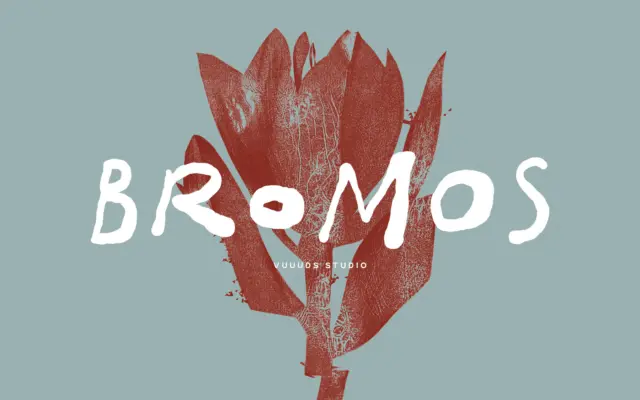
Design style Bromos sits in the brush-grunge corner of handwritten lettering: strokes look pulled quickly with a dry brush, edges…
Tantype
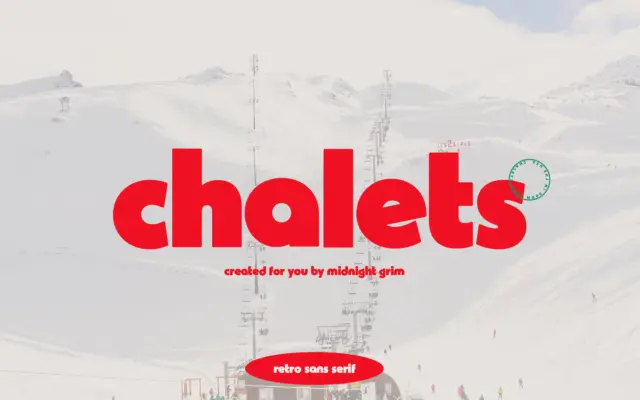
Design style Chalets pulls from mid-century ski resort signage — the kind of lettering you’d find painted on a lodge…
Tantype
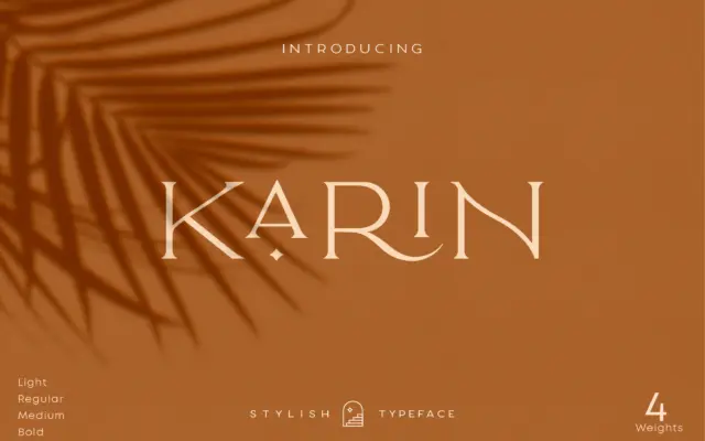
Design style Elegant Karin is an all-caps serif built around a narrow, upright skeleton. The contrast is moderate rather than…
Tantype
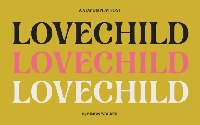
Design style Lovechild reads as a hand-lettered script, the kind built from actual brush or pen strokes rather than a…
Tantype