
Curly Ribbon: a novelty ribbon-lettering script for playful invites and branding
Design style
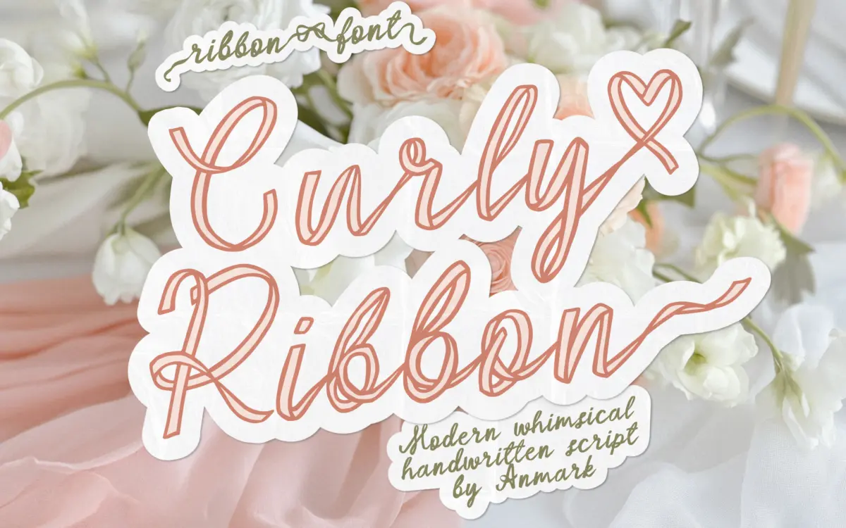
Curly Ribbon builds each letter as if it were a strip of ribbon folded and looped into a word. The strokes have a consistent outlined channel running through them, and where letters connect the ribbon appears to bend, twist, and occasionally cross over itself. It’s a novelty construction more than a calligraphic one — the model here isn’t a pen or brush, it’s a physical material with give and shine implied through the outline treatment.
The regular weight is drawn as an outline, which keeps the ribbon illusion legible: you can see the twist because the line describing it stays thin and continuous. The bold weight thickens that same skeleton into a filled shape, and while it reads more like a conventional script at a glance, it loses some of the ribbon effect in the process — the twists become harder to distinguish from ordinary loop overlaps. Ligatures tie letter pairs together with extra swash work, and small bow and heart flourishes appear as connective tissue rather than as separate dingbats. The overall tone sits closer to craft-fair signage than fine calligraphy, which is exactly the niche it’s aiming for.
Character set and features
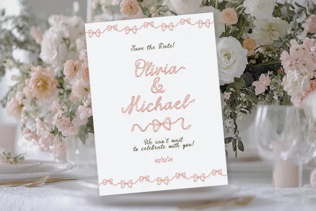
The two styles cover the same letterforms from different angles: Regular as an outlined ribbon script, Bold as a solid script that keeps the curl pattern but drops the outline conceit. Lowercase alternates are the more useful feature here — swap in a second or third version of a letter to avoid two identical loop shapes sitting next to each other, which is a real problem in ribbon-style scripts where repetition reads as a mistake rather than a rhythm. Ligatures handle awkward letter combinations by merging them into a single ribbon path rather than letting two separate strokes collide.
Because the letters are built from a continuous ribbon idea, spacing needs manual attention. Ribbon scripts like this one are drawn to imply a single unbroken strip, so kerning pairs that look fine in isolation can create visual knots when set as a full word — expect to nudge individual glyphs in a layout program rather than trusting the font to set itself correctly at paragraph length. This isn’t a fault unique to Curly Ribbon; it’s the nature of the genre, but buyers should know it going in.
Use cases
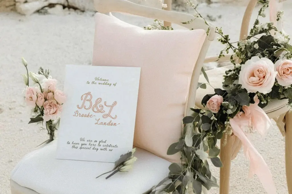
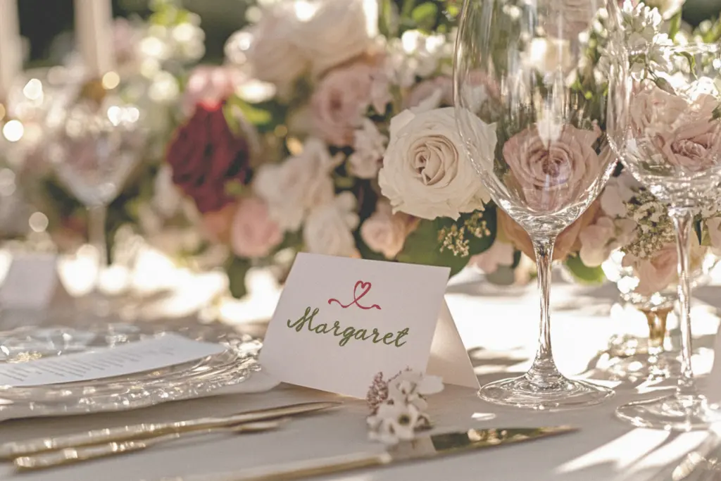
This is a display font for short bursts of text: a couple’s names on an invitation, a logotype, a greeting card headline, a social media graphic. It is not built for body copy, captions, or anything that needs to be read quickly or at small sizes — the outline in particular disappears below a certain point size and the bold weight starts to look like a generic script rather than a ribbon.
Where it earns its keep is in wedding and event stationery, packaging that wants a handmade, gift-wrapped feel, and branding for businesses selling something tactile — bakeries, florists, boutique gift shops. The bow and heart ligatures make it an easy fit for anything already leaning feminine or celebratory in tone. Designers working on anything more restrained or corporate should look elsewhere; the ribbon conceit is specific and doesn’t flex into neutral registers.
What we liked, and what we didn’t
Strengths
- Alternates for lowercase letters break up repetitive loop shapes effectively.
- Ligatures merge awkward letter pairs into a single continuous ribbon path.
- The outlined regular weight sells the ribbon illusion convincingly at display sizes.
Trade-offs
- The bold weight loses much of the ribbon effect and reads as a generic script.
- Requires manual kerning attention for anything beyond a short word or two.
Curly Ribbon is a competent novelty script that commits fully to its ribbon-folding conceit, which makes it charming in short, decorative bursts and unusable anywhere text needs to move fast. The alternates and ligatures help manage repetition, but expect to hand-kern anything longer than a name or a headline.
Verdict

Tantype reviews typefaces in depth — every font is tested in real branding, editorial and screen layouts before a word gets written. 555+ fonts reviewed and counting.