
Ageia: a clean geometric sans with ligature flourishes for branding
Design style
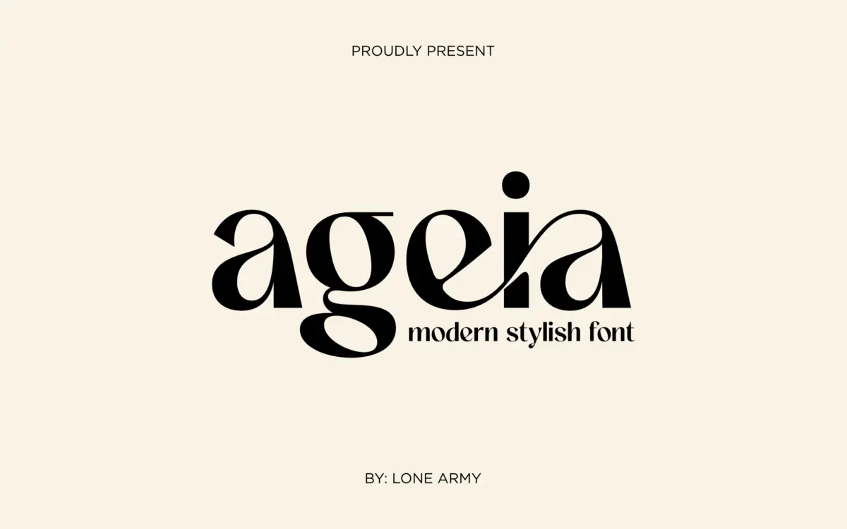
Ageia sits in the geometric-sans family that’s become the default vocabulary for modern branding, but it doesn’t try too hard to be different. Strokes are even, apertures are open, and the counters are wide enough to keep the letters from clogging up when set tight. The retro flair the seller mentions shows up mostly in a few rounded terminals and a slightly wider stance than you’d get from a strict grotesque — nothing that reads as pastiche, more a softening of the geometry so it doesn’t feel clinical.
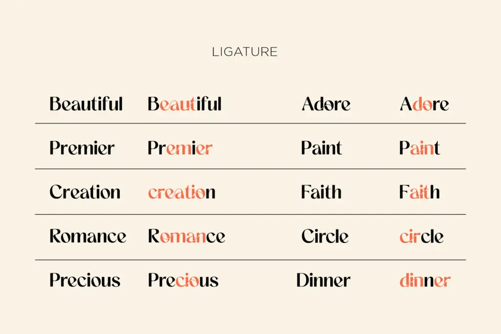
What separates it from the dozens of similar sans releases on the market is the ligature set. Rather than bolting on a handful of decorative swashes, the designer has built connections that behave like a script would, letting certain letter pairs merge into a single continuous stroke. Used sparingly, this gives headline setting a bit of movement without abandoning the sans-serif structure underneath it. Used heavily, it starts to read as a stylistic gimmick rather than a typeface decision, so restraint matters here more than usual.
Character set and features
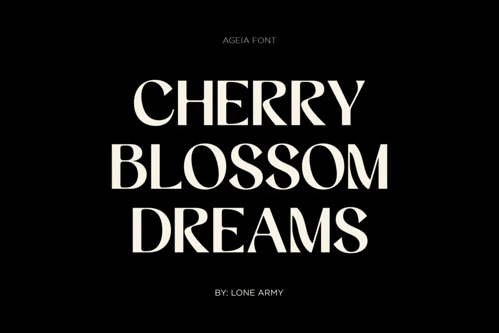
The core letterforms are straightforward and well spaced — nothing unusual in the lowercase, no eccentric bowls or unexpected axis shifts. The interest is entirely in the alternates and ligatures, which need to be accessed through OpenType features or a glyph panel, since they won’t appear by default in every app. That’s worth knowing before you commit to using them in a logo, because clients viewing a plain-text mockup in a program that doesn’t support the features will see a noticeably flatter version of the font.
Numerals and punctuation are unfussy and match the geometric skeleton of the letters, so they won’t clash if you’re setting prices, dates, or addresses alongside the display type. There’s nothing here that signals expanded language support or a large weight range, so treat Ageia as a single-weight display tool rather than a working text family — pushing it into long paragraphs will expose how thin the ordinary lowercase gets at small sizes.
Use cases
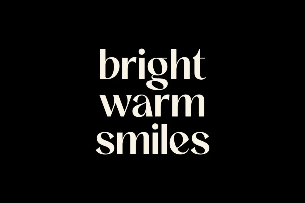
Ageia is built for short-form, high-visibility type: logotypes, headline lockups, packaging fronts, invitation lettering. The ligatures do real work in these contexts because you’re usually setting one word or a short phrase at a large size, where the connected strokes read as intentional design rather than a novelty. Fashion and lifestyle branding — the categories the seller name-checks — make sense given the warmth of the retro-adjacent details, but the font isn’t limited to any one industry; anywhere a brand wants a sans that feels considered rather than templated will get use out of it.
Avoid it for body copy, dense editorial layouts, or interfaces where legibility at small sizes is the priority — that’s not what it’s built for, and the ligatures in particular need generous point sizes to read as intended. As a headline or wordmark typeface with one strong trick up its sleeve, it earns its place; asked to do more, it starts to show its limits.
What we liked, and what we didn’t
Strengths
- Ligatures add real fluidity to short headline and logo setting
- Open apertures and even stroke weight keep it legible at display sizes
- Numerals and punctuation are unfussy and won't clash with the letterforms
Trade-offs
- Ligatures require OpenType feature support and won't show up by default in every app
- Not built for body text or small-size interface use
Ageia is a competent geometric sans with a genuinely useful ligature set that gives headline and logo work some personality. It's a single-purpose display tool, though, and asking it to handle body copy or long-form editorial work will expose its limits fast.
Verdict

Tantype reviews typefaces in depth — every font is tested in real branding, editorial and screen layouts before a word gets written. 555+ fonts reviewed and counting.