
Wild Oaklands: an inky handwriting script for authentic, real-note branding
Design style
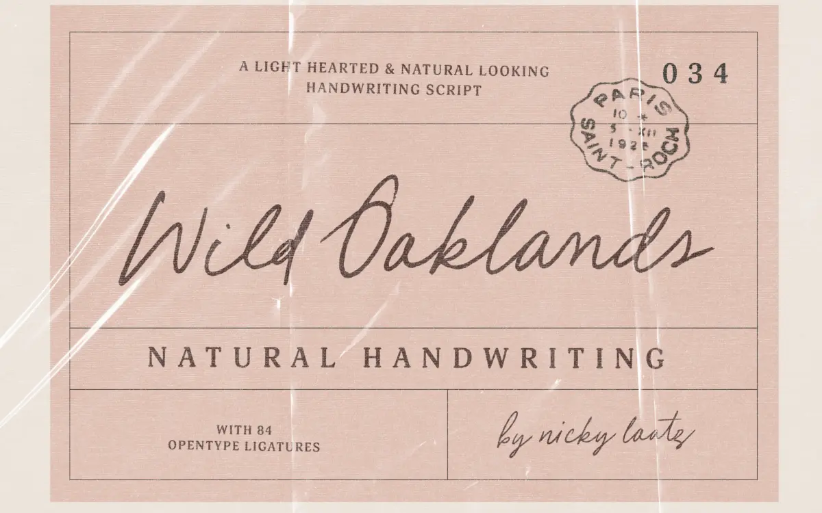
Wild Oaklands sits in the loose, monoline end of handwriting scripts: it wants to read as a note dashed off with a felt pen, not as a calligraphic performance. Strokes stay close to a single weight, with the sort of small pressure changes and slightly wobbly baselines that come from writing at speed rather than drawing letterforms slowly. Nothing about it is polished in the way a formal script would be, and that is the point. It reads as inky and imperfect, with corners that don’t quite close and joins that vary from letter to letter.
The regular and oblique versions give you two takes on the same handwriting rather than two distinct moods. The oblique leans the whole alphabet slightly forward, which is useful when you want the note to feel more urgent or more casual still — a sticky-note version of the sticky-note font. Used side by side they don’t offer much contrast for hierarchy work; they’re better thought of as alternates for different layouts than as a genuine duo.
Character set and features
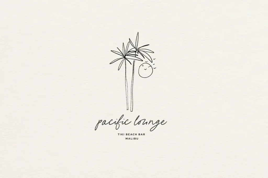
The 84 OpenType ligatures are the real engineering behind this font, and they matter more here than in most scripts. Handwriting fonts live or die on whether repeated letter combinations look mechanical, and ligatures are how Wild Oaklands avoids that. Turn them on and common pairs and short words connect and vary in ways that break up the telltale repetition of a single-letter script — turn them off and you’ll notice the font looks noticeably more like a font and less like handwriting, so this is not an optional extra. Anyone setting this in a layout tool needs to confirm ligatures are enabled before judging the typeface at all, which is worth flagging to clients too.
Beyond the ligature set, the letterforms carry the usual handwriting-script vocabulary: looping ascenders and descenders, open apertures, and terminals that trail off rather than stop cleanly. It’s built for short-to-medium runs of text rather than dense paragraphs — the imperfections that make a single word feel handwritten start to feel busy once you’re several lines deep.
Use cases
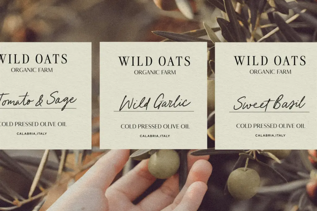
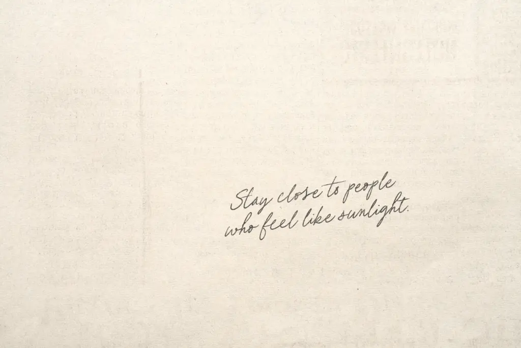
This is a font for the moments in a brand or a page where you want to sound like a person rather than a system: a signature-style sign-off, a handwritten-style quote pulled out of body copy, a label on packaging that wants warmth, a note card or invitation insert. It works well at the sizes real handwriting occupies — headline-adjacent, not body copy — and loses some of its charm if forced into long-form setting.
Logo use is plausible for brands built around approachability or craft — bakeries, small-batch goods, personal-care labels — but the looseness that makes it feel authentic also means it needs generous spacing and a clean background to stay legible at small sizes, such as on packaging text. Pair it with a plain sans or serif for any supporting information; asking this script to carry technical or dense copy will undercut the casual tone it’s built for.
What we liked, and what we didn’t
Strengths
- 84 ligatures genuinely disrupt repetitive letter patterns rather than being a marketing bullet point
- Reads convincingly as fast, casual handwriting rather than a stiff script revival
- Oblique variant gives a usable alternate mood without needing a second purchase decision
Trade-offs
- Regular and oblique are close in feel, so they don't offer real hierarchy contrast as a duo
- Loses legibility and charm in dense or small-scale text where the looseness reads as noise
Wild Oaklands does the handwriting-script job convincingly, mostly thanks to its ligature set doing the heavy lifting against repetition. It's built for short bursts of text — quotes, labels, signatures — and starts to fray if pushed into longer setting or small sizes without care.
Verdict

Tantype reviews typefaces in depth — every font is tested in real branding, editorial and screen layouts before a word gets written. 555+ fonts reviewed and counting.