
Enchanted Tales: a decorative serif built for ligature-heavy display work
Design style
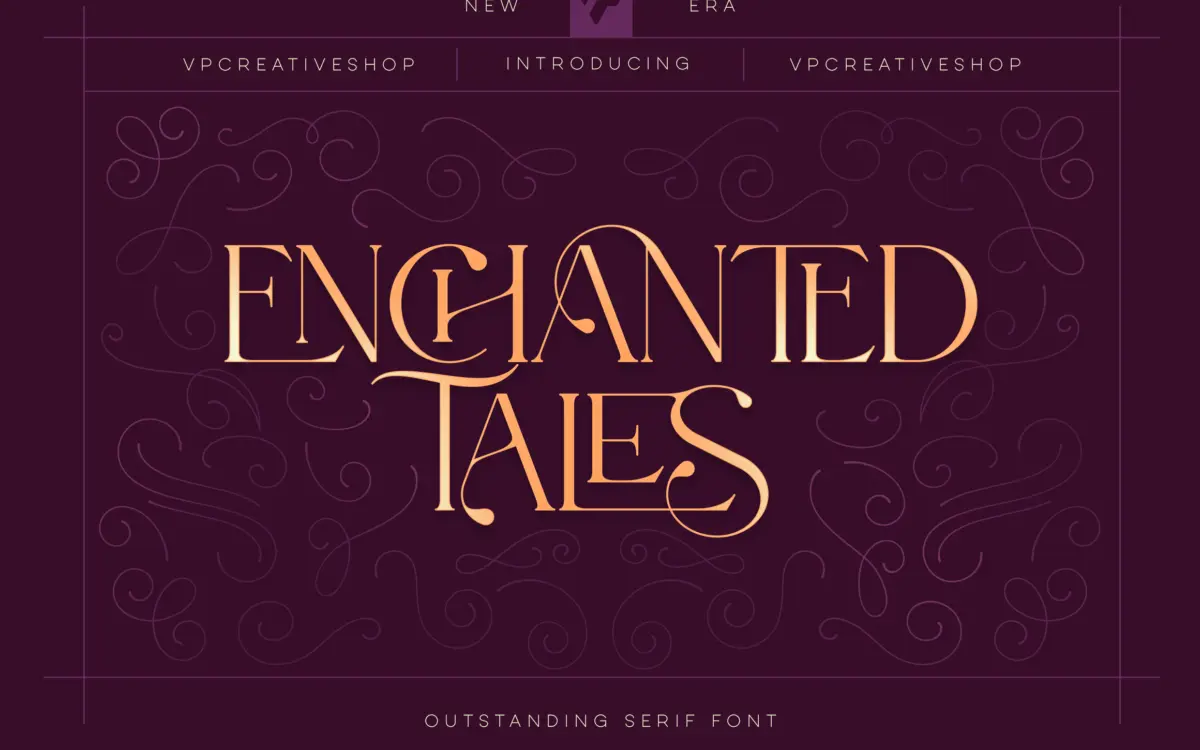
Enchanted Tales sits in the decorative end of the serif family — closer to vintage lettering and storybook cover typography than to anything you’d set a paragraph in. The letterforms carry the hallmarks of that lineage: flared serifs, a slight taper into the joins, and a general looseness in the curves that reads as hand-finished rather than mechanically drawn. It’s not a revival of a specific historical model so much as a mood board of them — part apothecary label, part fairy-tale title page.
The italics and swash capitals do most of the heavy lifting here. Where the roman lowercase is fairly restrained, the capitals and the alternate forms lean into flourish, with entry strokes and terminal curls that clearly want to be used at large sizes. This is a font designed around its accents and extras, not around its base letterforms — a common trade-off in the decorative serif category, and one worth knowing going in.
Character set and features
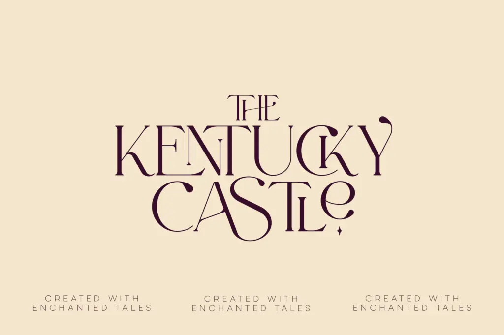
The headline feature is the ligature set: over 150 glyphs covering common letter pairs and some less common ones, built specifically so words don’t just sit next to each other but visually connect. Combined with a separate set of alternate glyphs for letterings and logotypes, there’s a genuine amount of room to customise a single word or short phrase — swap a capital, pull in a swash, let a ligature bridge two letters — without touching a vector tool.
Language support is broad, which matters if you’re setting names or short phrases in European languages with diacritics; it’s less relevant if your use case is a single English word on a poster. The catch with any font this dependent on ligatures and alternates is that you need an OpenType-aware application to access most of what makes it interesting. Drop it into a program that doesn’t support discretionary ligatures and stylistic alternates, and you’re left with a fairly ordinary decorative serif — pleasant, but not the font the glyph count promises.
Use cases
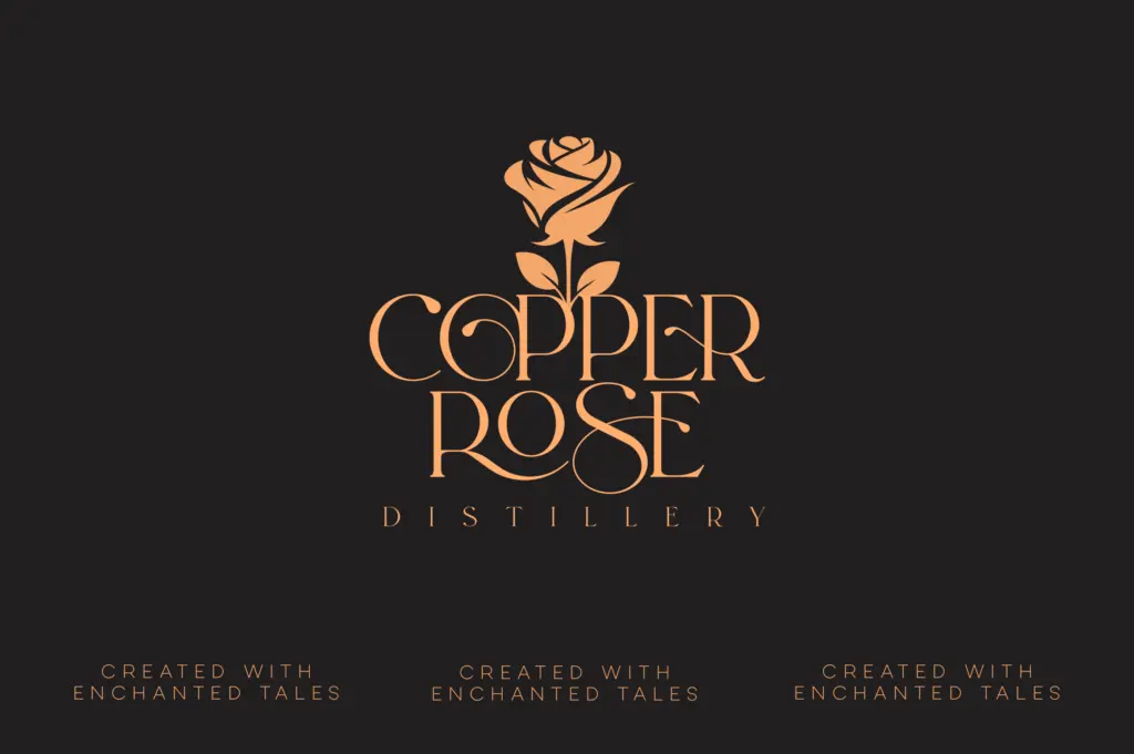
This is a font for short, considered pieces of text, not for setting copy. Book covers, wedding invitation lettering, logotypes, packaging labels, and title cards are the natural home for it — anywhere a single word or short line needs to feel crafted rather than typed. The ligatures and swashes are at their best when a designer is willing to hand-select which ones fire for a given word, rather than trusting the font to make every combination look considered on its own.
It’s less suited to body copy, UI text, or anything read at length — the ornamentation that makes it distinctive at 60pt starts to compete with itself at 10pt. Treat it as a display and lettering tool rather than a text face, and the ligature-heavy structure that seems like overkill in a spec sheet starts to make sense as a design decision.
What we liked, and what we didn’t
Strengths
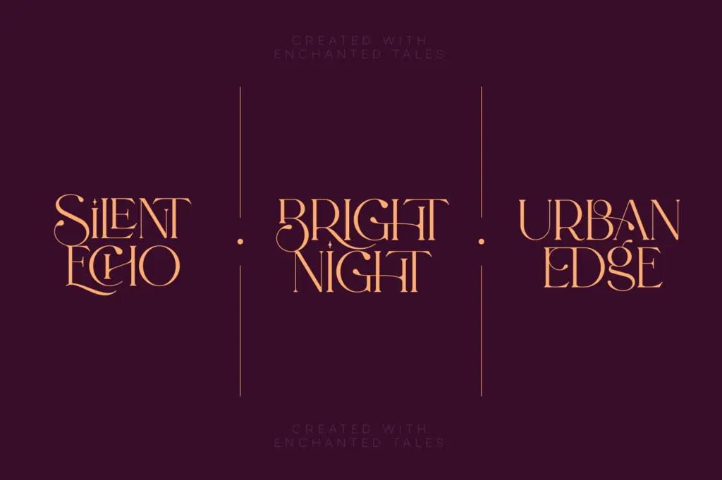
- Extensive ligature set gives short words a genuinely custom, hand-lettered feel
- Swash capitals and alternates offer real flexibility for logotypes and titling
- Broad language support suits multilingual branding and packaging work
Trade-offs
- Base lowercase is unremarkable without the ligatures and alternates switched on
- Not built for body text — legibility drops off quickly below display sizes
Enchanted Tales is a decorative display serif that leans almost entirely on its ligatures and alternates for character — features that need an OpenType-savvy workflow to unlock. Used deliberately on short lines, it has real charm; asked to set anything longer, it loses its footing.
Verdict

Tantype reviews typefaces in depth — every font is tested in real branding, editorial and screen layouts before a word gets written. 555+ fonts reviewed and counting.